Staff note: This post may contain affiliate links, which means Pentax Forums may earn a small commission if a visitor clicks through and makes a purchase. If you would like to support the forum directly, you may also make a donation here.
Many people claim that Agfa Vista Plus 200 is nothing more than rebranded Fujicolor 200. Some say that while Fuji makes the film for Agfa is responsible for its formulation. I decided to try this film for myself and I bought a 3-pack of it. Yesterday I got my first roll back from the lab and I camera scanned it today. I am very impressed with it! It feels like a punchy and contrasty version of Portra 160 with rougher grain. The film is very vibrant but without Ektar's saturation and cartoonish color scheme. Shadows and highlights are captured very well. This film feels like a high cut above regular old Fujicolor 200. If it weren't for the rougher grain I then would make this my favorite modern films. Disclaimer: I have plenty more to try so my opinion may change.

I would like to share some samples. All images were created from camera scans done with my K-30 and D FA 50mm f/2.8 macro at f/5.6. Processing was done in Apple Aperture. Other than color inversion I performed the follow processes:
White balance adjustment
Black/Grey/White tint adjustment
Auto levels
0.3 definition
0.5 RAW sharpening
Mid contrast adjustment
Exposure compensation
Dust removal
Red color channel hue adjustment to +20, saturation to -10, and dynamic range to +2
Edge sharpening - 0.4/0.3/0.4
It sounds like a lot but all put together it's pretty basic stuff.
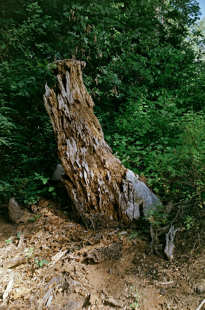
Here's a shot of an old rotting tree at a gas stop in Fresh Pond, CA.
IMGP0122 - Version 2 by
Never Off, on Flickr
I don't know how it shows up on other people's monitors but on mine there is a wonderful range of shadows and highlights! The colors are very vibrant, especially the green foliage.
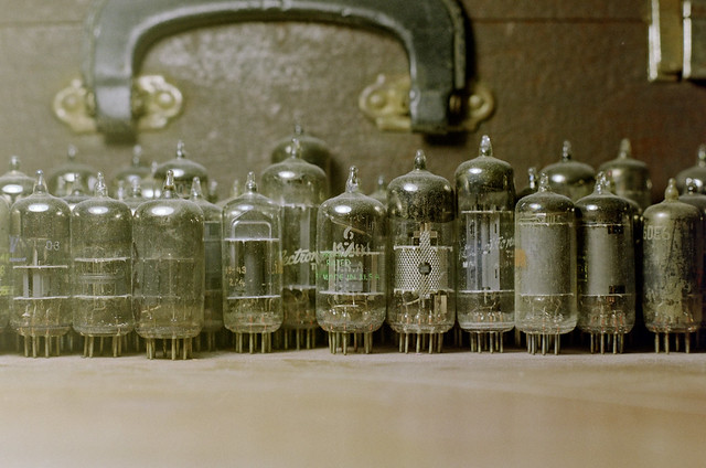
Here's a shot of my desk with some vacuum tubes.
IMGP0126 by
Never Off, on Flickr
I aimed a household desk lamp with a fluorescent bulb on the tubes. The shutter speed was very slow so I simply rested my Spotmatic on the table and set the self timer. I like how smooth the glare and haze is from left to right. The film captured it very well.
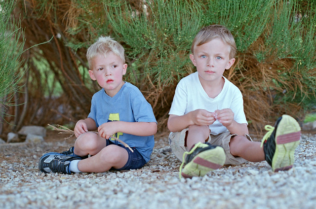
Here's a shot of my son playing with a friend at a local park.
IMGP0141 - Version 2 by
Never Off, on Flickr
This is the image that reminds me of Portra. The tones feel neutral for the most part except for the rosy cheeks and green bush in the background. My son's friend on the left was running around a lot. Hence, the rosy cheeks.
So, my modern color negative film ranking today is:
1) Portra : Very nice, smooth, even film.
2) Vista Plus : Punchier Portra. It's like Extar Light.
3) Ektar : Very, very smooth but way too contrasty and punchy. Over the top colors. Limited applicability.
4) Fujicolor 200 : When you just need film. Basic stuff. Not bad. Not good. Just film.
Last edited by 6BQ5; 08-31-2014 at 09:19 AM.


 When I shop for film I usually sort by cheapest price first and ask myself what haven't I tried in a while. I'll have to make a conscious effort to find this film now!


 Similar Threads


