Thank you for your entries. Great stuff this week, as usually, I must say.
But I have to judge the competition and this seems to be quite difficult.
ChristianRock: Due to exposition, the outside catches the eye first not the interior which is underexposed. But I like the composition and colours of your picture.
Slowpez: Well done Susan. Good example of finding interior outside with a lot of details. Must be quite important place for young people in the neighborhood.
Tamia: Nice shot with very interesting details. Especially slanted beams of roof structure that divide the frame. And nests. Masterpiece of bird's architecture.
Noelcmn: Good composition of the frame. I like the colours.
EBirdy:Good point of view. The interior is interesting with columns and lightning but strongly backlit doors dominates too much. You should, may be, consider to slightly uderexpose the frame to obtain deeper shadows. Anyway nice try.
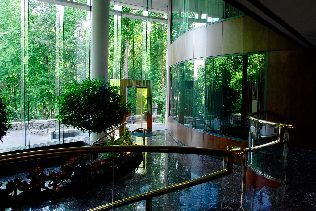
JensE: Good job Jens. You managed the distortion well. Very nice, warm coloured picture.
ttucker: Very nice job. I like the shadows and I think mirror ads some perspective which is very interesting. But composition of frame isn't perfect. Where is the floor? I miss it.
mattb123: Good job, I would really consider buying this property. Good frame and full of details. Great example of product photography.
As I mention above, all pictures are awesome but now I have to announce the winner.
First place: JensE

Second goes to CristianRock
And third is Slowpez

Thank you for participation and for your effort. Hope to see your pictures it this week competition. Thanks again.


 Post #1 by assa1
 Similar Threads


