Forgot Password
Pentax Camera Forums Home
 

Reply
Show Printable Version Search this Thread
12-28-2014, 02:08 AM   #1
Pentaxian


Join Date: Jan 2011
Location: New York
Posts: 4,834
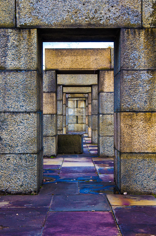
Overprocessed or not?
ISO: 50 

This is the upper level of an uncompleted Civil War era fort. It didn't look interesting when processed with my usual moderate slider settings. I considered B&W but on a whim pushed things the other way: Vibrance +100, Saturation +100. Such extreme settings usually scare me off but seem to work on this photo. Critique on processing and composition (and anything else) is appreciated.


12-28-2014, 03:23 AM   #2
Site Supporter
Site Supporter
Miguel's Avatar

Join Date: Sep 2007
Location: Near Seattle
Photos: Gallery
Posts: 2,743
The post work on this shot is a lot of fun. Looks quite metallic. The bit of sky, however, looks too artifacted, so I'd fix this.
The bigger issue to me is the black box in the middle of the path. Breaks up the scene with a thud.

M
12-28-2014, 06:47 AM   #3
Pentaxian
TaoMaas's Avatar

Join Date: May 2007
Location: Oklahoma City
Photos: Gallery | Albums
Posts: 3,574
I like the processing even if it is much stronger than what you usually do. It seems to work well for this shot. I agree with Miguel about the sky. It's too bright and is distracting. The black box breaks up the lines of the composition, too, but it bothers me a lot less than the sky.
12-28-2014, 07:01 PM   #4
Loyal Site Supporter
Jacquot's Avatar

Join Date: May 2008
Location: Sun City Center, FL
Photos: Gallery
Posts: 2,544
I feel differently, that the processing competes with the composition. I see the colors and detail, not the overall image. To me the depth is lost, and the moment. There is something that you saw and wanted to capture. Is this image it? That is the main thing.

12-28-2014, 07:07 PM   #5
Pentaxian
normhead's Avatar

Join Date: Jun 2007
Location: Near Algonquin Park
Photos: Gallery | Albums
Posts: 40,451
I think it's pretty cool.... the colour artifacts are quite artistic.
12-28-2014, 07:32 PM   #6
Site Supporter
Site Supporter


Join Date: May 2014
Location: Minnesota
Photos: Gallery | Albums
Posts: 2,047
The composition is great, the theme is abstract.
12-28-2014, 07:49 PM   #7
Site Supporter
Site Supporter
jheu02's Avatar

Join Date: Aug 2009
Location: North Carolina
Photos: Gallery | Albums
Posts: 3,027
Here's a thought based on other comments...what about a crop to make it more abstract? Leave the processing as is, but get rid of the sky and the block. Try various versions and see what you think. It wouldn't be a Civil War fort any more, but you may find a gem hidden in the rough. Here's 5 seconds of work but you'll have the full image to work with...cloning out the sky by "making" other blocks, etc.

Attached Images
 

Last edited by jheu02; 12-28-2014 at 08:11 PM.
12-28-2014, 09:29 PM   #8
Pentaxian


Join Date: Jan 2011
Location: New York
Posts: 4,834
Original Poster
Thanks, everyone.

QuoteOriginally posted by Miguel Quote
The post work on this shot is a lot of fun. Looks quite metallic. The bit of sky, however, looks too artifacted, so I'd fix this. The bigger issue to me is the black box in the middle of the path. Breaks up the scene with a thud.
I can fix the left portion of the sky but the center and right are blown out clouds with harsh CA around backlit weeds.The image is a DNG but I wasn't able to recover that part of the photo. The "black box" weighs approx 1300 pounds; moving it wasn't an option. Photoshopping the box out pushes processing too far for me.

QuoteOriginally posted by jheu02 Quote
what about a crop to make it more abstract?
That's an interesting take on it. It solves the sky and leftover block on the ground. Cropping emphasizes the back wall and I now see that my focus wasn't good, either.
12-28-2014, 10:35 PM   #9
mee
Veteran Member


Join Date: May 2010
Posts: 7,403
Its cooked like a chicken at KFC -- extra (tasty) crispy.

That said, I think it works for the image in an artsy way -- the overprocessing isn't unattractive to me... has more of an abstract feel to it.


That black box has to go though (can you heal brush it out??)
12-30-2014, 05:54 PM   #10
Senior Member
Matthew Saville's Avatar

Join Date: Jan 2014
Location: Southern California
Posts: 250
I definitely like that cropped version, although I would say that it's a bit too resolution-harming to be printed big like that. Maybe next time?
12-30-2014, 06:04 PM   #11
Pentaxian
mikeSF's Avatar

Join Date: Jan 2009
Location: East Bay Area, CA
Photos: Gallery
Posts: 6,622
i agree that the surreal look is somewhat interesting vs what the normally processed image may have been. clever.
comp is bugging me. a slightly longer lens would have allowed you to frame the lintels more uniformly for that infinity look(eliminating that sliver of blown sky). The black box is a bit distracting and perhaps could be cloned out.
the blue stones down front resemble tiles of fine lapis.
nice.
12-30-2014, 08:16 PM   #12
Pentaxian
pentaxian_tmb's Avatar

Join Date: Aug 2009
Location: Madison, Wisconsin
Posts: 436
QuoteOriginally posted by jheu02 Quote
Here's a thought based on other comments...what about a crop to make it more abstract? Leave the processing as is, but get rid of the sky and the block. Try various versions and see what you think. It wouldn't be a Civil War fort any more, but you may find a gem hidden in the rough. Here's 5 seconds of work but you'll have the full image to work with...cloning out the sky by "making" other blocks, etc.


Much prefer this version
Reply

Bookmarks
  • Submit Thread to Facebook Facebook
  • Submit Thread to Twitter Twitter
  • Submit Thread to Digg Digg
Tags - Make this thread easier to find by adding keywords to it!
critique, photography, settings

Similar Threads
Thread Thread Starter Forum Replies Last Post
Age old question Filters or not, not! jamesm007 Pentax SLR Lens Discussion 12 10-23-2013 03:30 AM
Abstract Overprocessed to perfection Trey45 Post Your Photos! 4 07-25-2013 06:11 AM
Shooting in dark underwoods - Flash or not or else? jpzk Pentax DSLR Discussion 31 07-28-2010 08:07 PM
Overprocessed portraits? sealisthenewbeaver Photo Critique 8 07-10-2009 01:28 PM
Garishly Overprocessed Mike Cash Post Your Photos! 3 12-11-2007 05:44 AM


All times are GMT -7. The time now is 02:34 AM. | See also: NikonForums.com, CanonForums.com part of our network of photo forums!
  • Red (Default)
  • Green
  • Gray
  • Dark
  • Dark Yellow
  • Dark Blue
  • Old Red
  • Old Green
  • Old Gray
  • Dial-Up Style
Hello! It's great to see you back on the forum! Have you considered joining the community?
register
Creating a FREE ACCOUNT takes under a minute, removes ads, and lets you post! [Dismiss]
Top