 Originally posted by Frogfish
I do see what Sparkle means in regard to some of the composition - but I think she's being a little too harsh in regards to exposure. It looks great on my Mac (but then Macs have great screens - on my wife's / daughter's Dell & Sony these may well look underexposed.
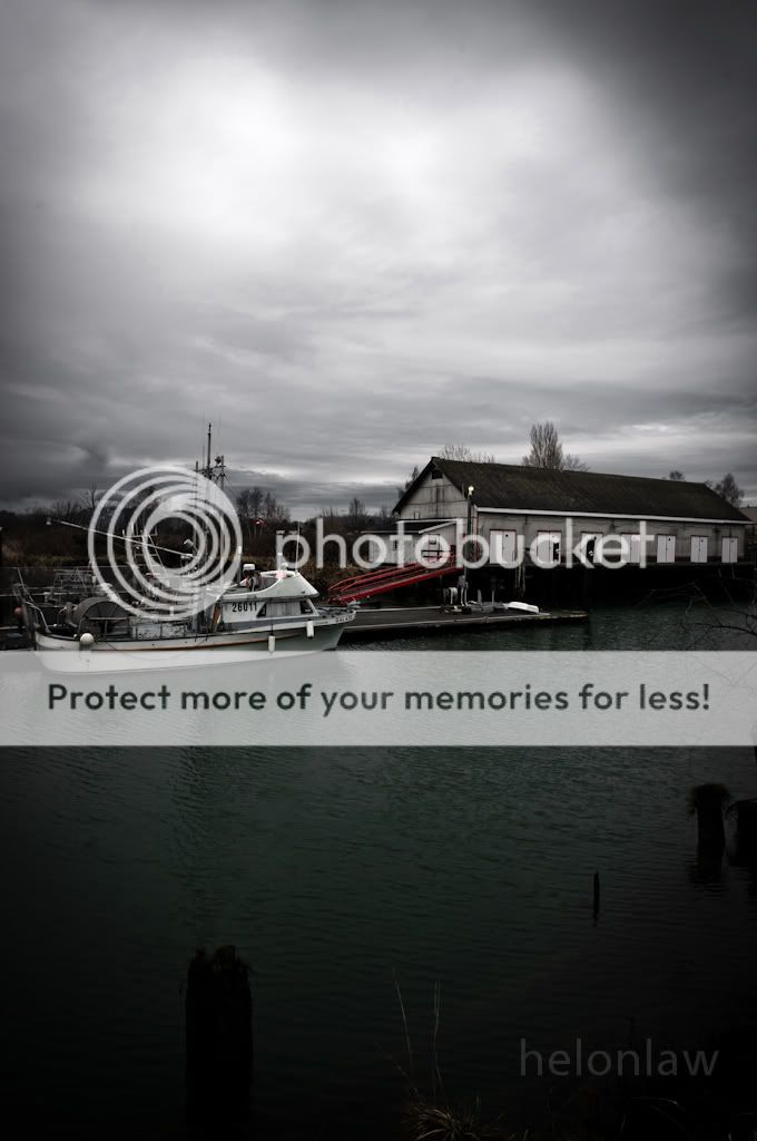
#3 - the shot is too centred. This could be really lovely if you decide to go either with sky or with water and crop most of the other away.
#4 - I love this. Great shot !
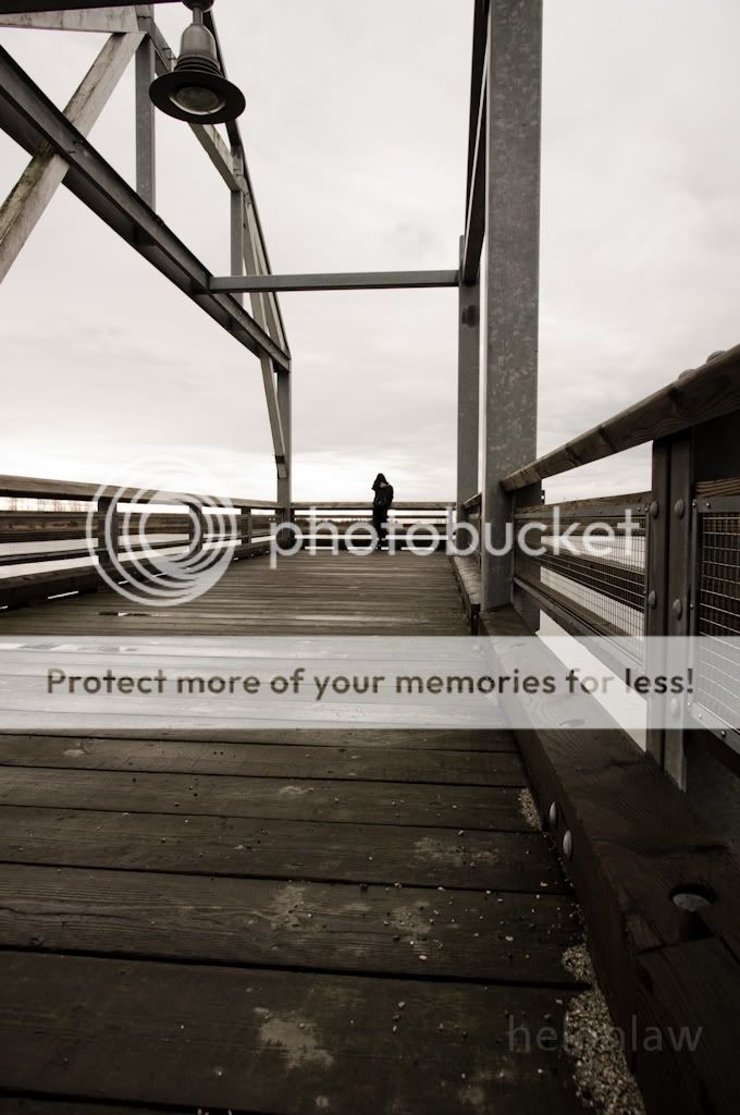
#5 - The subject is the girl and again she is too centred. IMO I would crop away part of the superstructure (bell area) and have her about 2/3 up the shot. Then I'd love it - great perspective and exposure.
Thanks for the comment!
Yeah it's true, monitors can be a pretty big factor

though funny thing is the macs at my school are significantly darker than my home monitor (HP).
#3 - I see what you mean, but I also feel sometimes that compositional rules like that (never, ever, ever center the subject!) are meant to be broken. I kind of like it how it is, with the bright sky and dark water at odd with each other, yet both are gloomy.
#4- thanks very much!
#5 - good point, I agree with this one. Thing is I had to shoot it quick as she's more than a bit camera shy

Originally posted by Sparkle The thing is, and I'll be frank here, I'm not quite sure what you were going for. The crop in #1 doesn't really do much for it to my eyes besides give it something of a pseudo-panoramic look, and the brightening of the grasses but keeping the skies seems like you're torn between going for a rustic look and my original gloomndoom. #2 looks more rustic, but again it seems to be straddling the line and just ends up blander. Same in #3, minus any rustic feel altogether. #4, I really don't know where you're going with the crop - it looks like you're just trying to adhere to rule of thirds without much regard for if it actually works for the shot. Brightening it but maintaining the blue cast isn't doing it any favours, either. And #5 confuses me the most - you speak of exposure correction, and yet you post one that's totally washed and burned out?
In my opinion, you also cropped the wrong way - I quite like frogfish's idea for a crop in this shot; cropping like so makes it more of a snapshot than anything.
Originally posted by timh I like the second and last ones the most, but they're all nice in series.
Prefer the original photos - Sparkle's brightening takes away the character and turns them into snapshots (in my opinion).
Thank you very much for the comment!

That's what I was thinking too.
Originally posted by Sparkle My last one was sepia. All done as a quick alternative perspective to give an idea of my preferences. To each her own.
If it's to each his/her own, and multiple commenters have had posted positive responses to mine, please don't impose your idea or preferences of "beautiful photography" and that my shots can only be "salvaged by PP". If you want shots with perfectly centered histograms of a gloriously beautiful valley and rainbow and everything, that's fine, but I'm not posting these to show off their beauty and perfection, quite the opposite really. However, I do appreciate your input - it's interesting to see different takes on my shots.


 Similar Threads


