Forgot Password
Pentax Camera Forums Home
 

Reply
Show Printable Version Search this Thread
  #1
A couple of my better recent shots. C&C encouraged.
Posted By: SWEngineer, 10-01-2007, 06:35 PM

Which do you prefer and why? If you don't like either, please explain

Personally, I like #2. It has better definition between the sky and the mountains in the background and it seems more dramatic IMO. I think it's more than just the higher contrast sky involved, but I can't identify it. Maybe the fisheye perspective holds it back though. Thanks in advance for sharing your thoughts.

Regards,

-Mark

#1


#2

Views: 2,775
10-01-2007, 06:46 PM   #2
Veteran Member
roentarre's Avatar

Join Date: Oct 2006
Location: Melbourne, Australia
Posts: 11,783
2nd shot is preferred to the 1st shot as I like punchy and constrastier images. Especially in black and whilte shots, I like granniess in the photos mainly it is more likely to provoke certain mood.
10-01-2007, 07:00 PM   #3
Veteran Member
vizjerei's Avatar

Join Date: May 2007
Location: Toronto
Photos: Gallery
Posts: 1,418
I like the 2nd also, I love the sky bring the different tone to the whole picture
10-01-2007, 07:00 PM   #4
Ole
Administrator
Ole's Avatar

Join Date: Sep 2006
Location: Copenhagen, Denmark
Photos: Gallery | Albums
Posts: 4,409
I agree with roentarre, #2 it is. Also because the tank point into the picture frame, not out of it.

10-01-2007, 07:03 PM   #5
Site Supporter
Site Supporter
Marc Langille's Avatar

Join Date: Dec 2006
Location: NW Arkansas, USA
Posts: 4,710
#2 is my vote. As James indicated, all of those qualities make it the better image. It's a great shot!!

BTW, is it me or is image #1 is tilted...??? If so, that's generally a no-no for landscapes showing in the background.

Cheers,
Marc
10-01-2007, 07:07 PM   #6
Veteran Member


Join Date: Sep 2006
Location: Portland, Oregon
Photos: Gallery
Posts: 475
I like number 2 - though I want to take one more step to the left to get a little more of that little fluffy cloud that's half cut off by the tank. I find the foreground and tilt in number 1 distracting, and like the higher contrast of number 2 better as well.
10-01-2007, 08:19 PM   #7
Veteran Member


Join Date: Oct 2006
Location: Albuquerque, NM
Photos: Gallery | Albums
Posts: 308
Original Poster
thanks for the responses so far

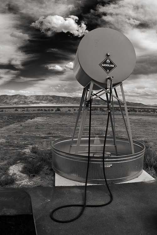
Seems everyone prefers the contrast in #2. I've tried #1 with more contrast in the sky and it does help, except the dark sky starts to merge with the mountains. Even so, I'll have to follow through on it AND straighten the horizon. Not sure how I overlooked it being that far off.

roentarre - Not much grain in these (IMO). But worth trying out. Thanks for the idea.

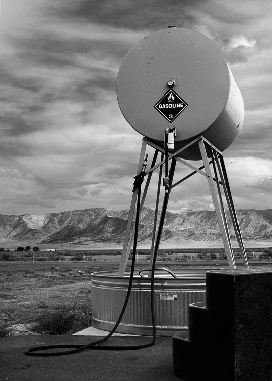
vijerei -I'm glad you like the sky in #2. I fear some might find it overdone, but I like it too!

Ole - I hadn't thought about the tank in #1 pointing out of the frame. Maybe that's part of the "drama" in #2 (pointing in / keeping your eyes in). Great observation.

Marc - Thanks for the accolades and being the 1st to point out the tilted horizon in #1. I'm not too picky about 'rules', but it does seem out of place here.

Betsy - I think I'd have lost the nice mountains or the positioning of the hose on the ground if I'd stepped left. I guess this is a matter of missing the decisive moment as the cloud rolled past. I assume the dark staircase is the objectionable foreground element in #1. I agree it isn't adding much, but hard to keep out the pic except to get closer & use a shorter lens as in #2.

Thanks to the folks above. Anyone else have an opinion? I'd love to hear from you.

-Mark

10-01-2007, 08:42 PM   #8
Veteran Member
jshurak's Avatar

Join Date: Jul 2007
Location: philadelphia
Posts: 626
They're both great! Number 2 is indeed very striking. It displays a feeling of a surreal and windswept sky. I love it.
10-01-2007, 10:17 PM   #9
Inactive Account


Join Date: Jul 2007
Location: Hamilton ,New Zealand
Posts: 24
No 2 does it for me also- not only the darker sky but also the steps not being in front to distract your eye .
10-02-2007, 01:57 AM   #10
Pentaxian
Arpe's Avatar

Join Date: Sep 2006
Location: New Zealand
Photos: Gallery | Albums
Posts: 4,452
I prefer the compo of no.2, but I just can't like that sky, it just looks so wrong to me, way too dark between the clouds, too unnatural. But that's just me, of course. I tend to not like unnatural photos that are obviously modified. I admire the skill involved in making those images, just don't like them.
10-02-2007, 07:12 PM   #11
Veteran Member


Join Date: Oct 2006
Location: Albuquerque, NM
Photos: Gallery | Albums
Posts: 308
Original Poster
jshurak - the clouds are great, aren't they. They were a big part of my interest in taking the shot. The rest of the scene just came along for the ride.

Stewart - thanks for chiming in. Any ideas what to do with the steps? At least they are dark.

Arpe - good to hear an opposite point of view on the dark sky. Is sky #1 ok for your taste? I may argue with you some on "unnatural... obviously modified". Yes, mine's photoshopped, but a deep red filter with B&W film and darkroom skill would come close to this, I bet. But I respect & value your opinion, regardless.

Thanks again, all. Hope you enjoyed the photos and discussion.

-Mark
10-02-2007, 09:28 PM   #12
Site Supporter
Site Supporter
Eaglerapids's Avatar

Join Date: Apr 2007
Location: Idaho,USA
Photos: Gallery
Posts: 1,619
These photographs are amazing to me in a way that I have a hard time putting into words. At first I liked no 2 better but now no 1 is my favorite. Maybe it's the scale, the tank looks huge in no 1.
But what I really like in both is the sharpness, man, everything is sharp and the clarity.....
You've taken a couple of pictures of a gasoline tank sitting in a bucket and I can't stop looking at them. SW, I'm not trying to be facetious here at all. These are some of the most unique photos I've seen in a long time, wow.
10-03-2007, 09:02 PM   #13
Veteran Member


Join Date: Oct 2006
Location: Albuquerque, NM
Photos: Gallery | Albums
Posts: 308
Original Poster
#1 revised

Eaglerapids - wow. you are too kind. And you have a good point about the tank appearing larger in #1. Now it does so even more:

After mulling over everyones input and tempering to my own taste, I've revised #1 to get the version below. I think it's a big improvement in many ways. I still like #2 better, but the new #1 now better complements it IMO. I really appreciate the input folks. Thanks again.

-Mark

10-04-2007, 08:51 PM   #14
Site Supporter
Site Supporter
Eaglerapids's Avatar

Join Date: Apr 2007
Location: Idaho,USA
Photos: Gallery
Posts: 1,619
Perfect SW, great photo:-).
10-04-2007, 09:59 PM   #15
Senior Member
Petthefish's Avatar

Join Date: Jul 2007
Location: Portland, or
Photos: Gallery
Posts: 155
I love #2 The clouds just pop rp
Reply

Bookmarks
  • Submit Thread to Facebook Facebook
  • Submit Thread to Twitter Twitter
  • Submit Thread to Digg Digg
Tags - Make this thread easier to find by adding keywords to it!
camera, photo, sky

Similar Threads
Thread Thread Starter Forum Replies Last Post
Nature A couple recent early spring shots odgc8 Post Your Photos! 4 04-20-2010 08:34 PM
Black & White Couple of B&W's and a few color shots... JohnBee Post Your Photos! 5 03-05-2010 12:56 PM
A couple of shots C&C welcome. Ecosse Post Your Photos! 8 02-26-2009 01:26 PM
Been quiet for a while, here's a couple recent shots Moggman Post Your Photos! 5 08-28-2008 10:32 AM
Afternoon with an ME - C&C encouraged monochrome Post Your Photos! 3 07-29-2008 08:19 PM


All times are GMT -7. The time now is 09:48 PM. | See also: NikonForums.com, CanonForums.com part of our network of photo forums!
  • Red (Default)
  • Green
  • Gray
  • Dark
  • Dark Yellow
  • Dark Blue
  • Old Red
  • Old Green
  • Old Gray
  • Dial-Up Style
Hello! It's great to see you back on the forum! Have you considered joining the community?
register
Creating a FREE ACCOUNT takes under a minute, removes ads, and lets you post! [Dismiss]
Top