| Pentax/Camera Marketplace |
| Pentax Items for Sale |
| Wanted Pentax Items |
| Pentax Deals |
| Deal Finder & Price Alerts |
| Price Watch Forum |
| My Marketplace Activity |
| List a New Item |
| Get seller access! |
| Pentax Stores |
| Pentax Retailer Map |
| Pentax Photos |
| Sample Photo Search |
| Recent Photo Mosaic |
| Today's Photos |
| Free Photo Storage |
| Member Photo Albums |
| User Photo Gallery |
| Exclusive Gallery |
| Photo Community |
| Photo Sharing Forum |
| Critique Forum |
| Official Photo Contests |
| World Pentax Day Gallery |
| World Pentax Day Photo Map |
| Pentax Resources |
| Articles and Tutorials |
| Member-Submitted Articles |
| Recommended Gear |
| Firmware Update Guide |
| Firmware Updates |
| Pentax News |
| Pentax Lens Databases |
| Pentax Lens Reviews |
| Pentax Lens Search |
| Third-Party Lens Reviews |
| Lens Compatibility |
| Pentax Serial Number Database |
| In-Depth Reviews |
| SLR Lens Forum |
| Sample Photo Archive |
| Forum Discussions |
| New Posts |
| Today's Threads |
| Photo Threads |
| Recent Photo Mosaic |
| Recent Updates |
| Today's Photos |
| Quick Searches |
| Unanswered Threads |
| Recently Liked Posts |
| Forum RSS Feed |
| Go to Page... |
PentaxForums.com → Photo Sharing and Galleries → Post Your Photos!
→
My Recent Photos (Critique Appreciated) (9 Images)
 |
| Search this Thread |
| #1 | |||
| |||
| Views: 1,884 | |||


| 10-25-2007, 08:58 AM | #2 |
|
I love the color and technique used on your first shot but I wish you had shot it in a vertical plane. The third shot is perfect exposure wise with even a slight blur in the hands showing action. Generally I would question cutting him off mid legs, however this seems to work in your shot and I'm not sure why. I'll take a look at your Flickr images later. Gotta run.  | |


| 10-25-2007, 09:03 AM | #3 |
|
They are very fine images. Artistic and well presented.
| |

| 10-25-2007, 09:44 AM | #4 |
|
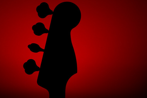
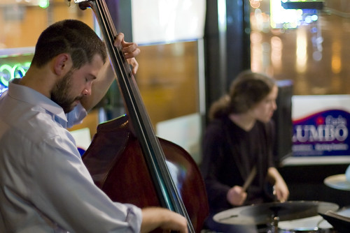
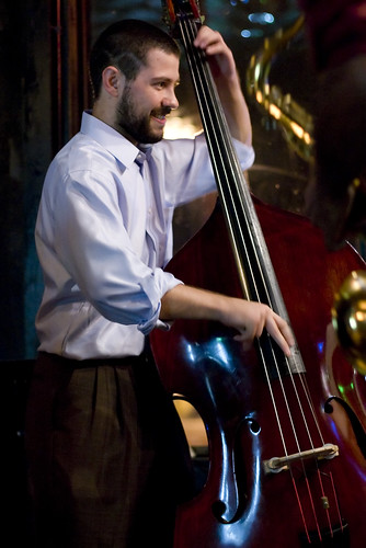
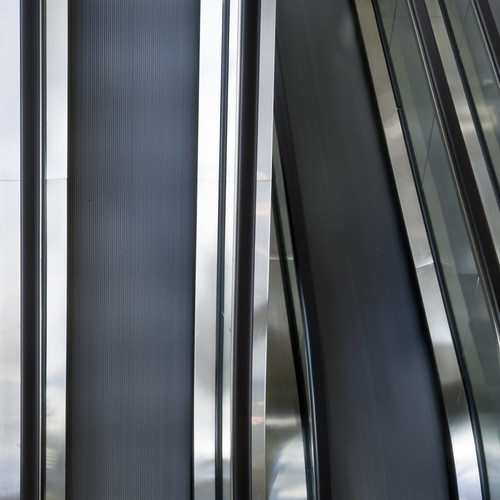
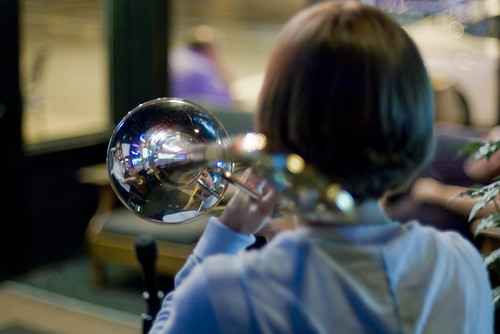
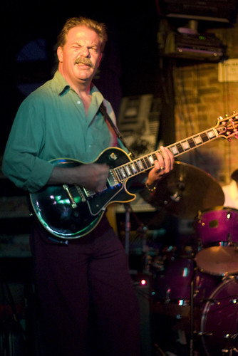
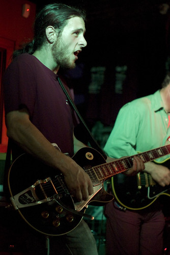
Ok, the bass guitar head silhouette is a well-executed piece of backlighting, giving a clean, simple and therefore effective 2D composition. The sharp lines make a bold pattern, and the way the light is at its most intense directly behind the shape emphasises the main subject. The tuning pegs being at different angles add interest without distracting, and the off-centre positioning, close to 1/3 of the way across, allows the eye to drift across to the empty area and back again. There's nothing in the photo to distract from the main subject. On this basis, I think it works well. In #2, I'd say the composition is much weaker. The colour of the green background to the left is disproportionately bright and out of focus; too much of the bass has been cut off, also the bass player's arm, and his eyes are closed. These, together with the out of focus drummer and background just dilute any impact it might have had. In my view, there is too little in the way of a main theme, and too much in the way of distractions, for this one to have much merit. #3 is much better, for all the reasons #2 is poor. #4 made me laugh. Good detail, sharp, good bold colour. It's a highly symmetrical composition, so it's spoiled slightly by the slight ACW rotation of the word, relative to the nicely lined up board. And the knife looks dirty, which distracts a little too. Every detail has to be right in shots like this, otherwise the simplicity which contributes so much is marred, and it longer quite hits the mark. #5 is a completely abstract composition. This would work in my view if the dents (joins?) in the metal were absent, if the lines in the right hand half were also straight, and if the exposure was better on the right. I find myself thinking it's neither one thing (a recognisable item) nor the other (a pure study in lines and angles) so it doesn't have much impact. It would be great in a "what's this" competition, but not otherwise to my eye. #6 is unusual as portraits go, since the lighting is harsh, but still effective, in that its edginess is complemented by the busy design on the T-shirt. The lack of eye contact adds to a 'teenager with attitude' mood, although the expression could just as easily be seen as contemplative. A touch more sharpening would give the image more punch though. Apart from that, it's effective in my view, with no distractions. #7. The idea is excellent, since the trombone is highly reflective, and its bell is quite rightly the sharpest and brightest part of the picture. At first glance it looks like a bubble in the air, so attracts a great deal of the eye's attention. However, the rest of the background is highly distracting, which weakens the overall composition substantially. #8 would have been an excellent capture, with the squint looking into the light a great comic moment. Unfortunately, it's just not quite sharp enough to have the real impact that it would have done, had the face been razor sharp and the hands still moving. Terribly difficult these ones - you have to see and capture in an instant, and perfection is almost impossible. Again, excellent idea, strong composition, since the expression and the light take you straight to where the action is, but it's just let down slightly by the lack of sharpness where it counts, and also to some extent the distracting background. #9 is let down IMO by the green cast, and the distracting, chopped off musician on the right. So in summary, 1,3,4 and 6 are strong; 1 and 6 particularly so. The others contain good ideas but don't quite hit the mark for a number of reasons - the often uncontrollable distracting backgrounds being the most significant. | |
| 10-25-2007, 01:23 PM | #5 |
|
ChrisA, no fair!!! How come sjl7678 gets critique for free and I have to beg??? :-D
| |

| 10-25-2007, 01:50 PM | #6 |
|
sjl7678, I posted that and then climbed into the shower and suddenly realised that I have just done to you exactly what upset me most on my own post, namely zipping in, looking at your pictures and then commenting on something on my own agenda which had nothing to do with your images. I was discourteous and selfish, and I apologise sincerely.  Unfortunately I am on my way to work right now, but as soon as I get home I promise I will come on again and do what I can to rectify my behaviour. Given time-zones, that will probably be before you wake up anyway! :-) | |
| 10-25-2007, 07:30 PM | #7 |
|
ChrisA, thank you for one of the most insightful C&Cs I've seen posted. I've learned a lot from this. I've been trying to take a great photo for a long time and maybe I've come close once or twice by accident, I still haven't done it and what is worse I never knew WHY they weren't good. This is the kind of c&c that a person who really wants to learn can get some ideas from. It also shows just how freakin hard it is to get a great photo, at least for me. They don't just happen. When I first viewed #2 I loved it. I can feel exactly what 7678 was trying to convey and he did it well. I'm into the music through the bass player. That photo means a lot to 7678 because he was there and he felt it too. I like his framing of the shot, he nailed it. I don't mind the bass player's eyes closed, I think 7678 got the decisive moment there, in fact. But if 7678 is truly interested in taking his photo's to a higher level you've shown him the way in a very cool manner. If I had taken this photo I would have been pleased with what I had mentioned and probably wouldn't have even seen the things you point out. But I want to get better and your post shows me the way. #1 is a cool photo. The big thing I don't like about it is I've been trying to think of a way to take a cool photo of my guitar and while I was thinking, 7678 did it! #8 is strange to me because when I'm playing my guitar and look at my friends, that is the expression I commonly see on THEIR faces, lol. My guess for #5? Escalators. | |

| 10-26-2007, 01:40 PM | #8 |
 I love the color and technique used on your first shot but I wish you had shot it in a vertical plane. The third shot is perfect exposure wise with even a slight blur in the hands showing action. Generally I would question cutting him off mid legs, however this seems to work in your shot and I'm not sure why. I'll take a look at your Flickr images later. Gotta run. Ok, the bass guitar head silhouette is a well-executed piece of backlighting, giving a clean, simple and therefore effective 2D composition. The sharp lines make a bold pattern, and the way the light is at its most intense directly behind the shape emphasises the main subject. The tuning pegs being at different angles add interest without distracting, and the off-centre positioning, close to 1/3 of the way across, allows the eye to drift across to the empty area and back again. There's nothing in the photo to distract from the main subject. On this basis, I think it works well. In #2, I'd say the composition is much weaker. The colour of the green background to the left is disproportionately bright and out of focus; too much of the bass has been cut off, also the bass player's arm, and his eyes are closed. These, together with the out of focus drummer and background just dilute any impact it might have had. In my view, there is too little in the way of a main theme, and too much in the way of distractions, for this one to have much merit. #3 is much better, for all the reasons #2 is poor. #4 made me laugh. Good detail, sharp, good bold colour. It's a highly symmetrical composition, so it's spoiled slightly by the slight ACW rotation of the word, relative to the nicely lined up board. And the knife looks dirty, which distracts a little too. Every detail has to be right in shots like this, otherwise the simplicity which contributes so much is marred, and it longer quite hits the mark. #5 is a completely abstract composition. This would work in my view if the dents (joins?) in the metal were absent, if the lines in the right hand half were also straight, and if the exposure was better on the right. I find myself thinking it's neither one thing (a recognisable item) nor the other (a pure study in lines and angles) so it doesn't have much impact. It would be great in a "what's this" competition, but not otherwise to my eye. #6 is unusual as portraits go, since the lighting is harsh, but still effective, in that its edginess is complemented by the busy design on the T-shirt. The lack of eye contact adds to a 'teenager with attitude' mood, although the expression could just as easily be seen as contemplative. A touch more sharpening would give the image more punch though. Apart from that, it's effective in my view, with no distractions. #7. The idea is excellent, since the trombone is highly reflective, and its bell is quite rightly the sharpest and brightest part of the picture. At first glance it looks like a bubble in the air, so attracts a great deal of the eye's attention. However, the rest of the background is highly distracting, which weakens the overall composition substantially. #8 would have been an excellent capture, with the squint looking into the light a great comic moment. Unfortunately, it's just not quite sharp enough to have the real impact that it would have done, had the face been razor sharp and the hands still moving. Terribly difficult these ones - you have to see and capture in an instant, and perfection is almost impossible. Again, excellent idea, strong composition, since the expression and the light take you straight to where the action is, but it's just let down slightly by the lack of sharpness where it counts, and also to some extent the distracting background. #9 is let down IMO by the green cast, and the distracting, chopped off musician on the right. So in summary, 1,3,4 and 6 are strong; 1 and 6 particularly so. The others contain good ideas but don't quite hit the mark for a number of reasons - the often uncontrollable distracting backgrounds being the most significant. sjl7678, I posted that and then climbed into the shower and suddenly realised that I have just done to you exactly what upset me most on my own post, namely zipping in, looking at your pictures and then commenting on something on my own agenda which had nothing to do with your images. I was discourteous and selfish, and I apologise sincerely. Unfortunately I am on my way to work right now, but as soon as I get home I promise I will come on again and do what I can to rectify my behaviour. Given time-zones, that will probably be before you wake up anyway! :-) ChrisA, thank you for one of the most insightful C&Cs I've seen posted. I've learned a lot from this. I've been trying to take a great photo for a long time and maybe I've come close once or twice by accident, I still haven't done it and what is worse I never knew WHY they weren't good. This is the kind of c&c that a person who really wants to learn can get some ideas from. It also shows just how freakin hard it is to get a great photo, at least for me. They don't just happen. When I first viewed #2 I loved it. I can feel exactly what 7678 was trying to convey and he did it well. I'm into the music through the bass player. That photo means a lot to 7678 because he was there and he felt it too. I like his framing of the shot, he nailed it. I don't mind the bass player's eyes closed, I think 7678 got the decisive moment there, in fact. But if 7678 is truly interested in taking his photo's to a higher level you've shown him the way in a very cool manner. If I had taken this photo I would have been pleased with what I had mentioned and probably wouldn't have even seen the things you point out. But I want to get better and your post shows me the way. #1 is a cool photo. The big thing I don't like about it is I've been trying to think of a way to take a cool photo of my guitar and while I was thinking, 7678 did it! #8 is strange to me because when I'm playing my guitar and look at my friends, that is the expression I commonly see on THEIR faces, lol. My guess for #5? Escalators. You should do the shot with your guitar but change something about it to make it your own. I'd like to see it if you do. You're right on five; escalators turn into slides when you use a slow shutter. Thanks everyone for the awesome advice. Chime in if you have more! | |
| 10-26-2007, 03:24 PM | #9 |
| I always worry about oversharpening my images... Sometimes I have a tough time telling where to stop. Any advice for that? The larger the image, the more you can get away with, but the more progressively you want to apply it (so a Radius and Threshold of more than 1, unless there is a lot of extremely fine detail). Sounds obvious, but a kitten should not look like a porcupine. I'm not an expert, by any means. Most of what I do is trial and error, erring on the side of a natural look. | |
|
| Bookmarks |


| Tags - Make this thread easier to find by adding keywords to it! |
| camera, critique, photo |
 Similar Threads
 | ||||
| Thread | Thread Starter | Forum | Replies | Last Post |
| Nature Recent birdie images | danielchtong | Post Your Photos! | 2 | 11-10-2010 01:17 PM |
| Nature 6 lenses, 10 recent images | flippedgazelle | Post Your Photos! | 15 | 10-20-2009 09:54 AM |
| First photos with my K-m. Critique wanted | cinaibur | Post Your Photos! | 13 | 03-05-2009 03:12 PM |
| Recent images around Arizona | FHPhotographer | Post Your Photos! | 6 | 08-22-2008 12:44 PM |
| Some Recent Images | Nightwatch | Post Your Photos! | 2 | 04-21-2007 03:13 PM |


