 Originally posted by travis_cooper
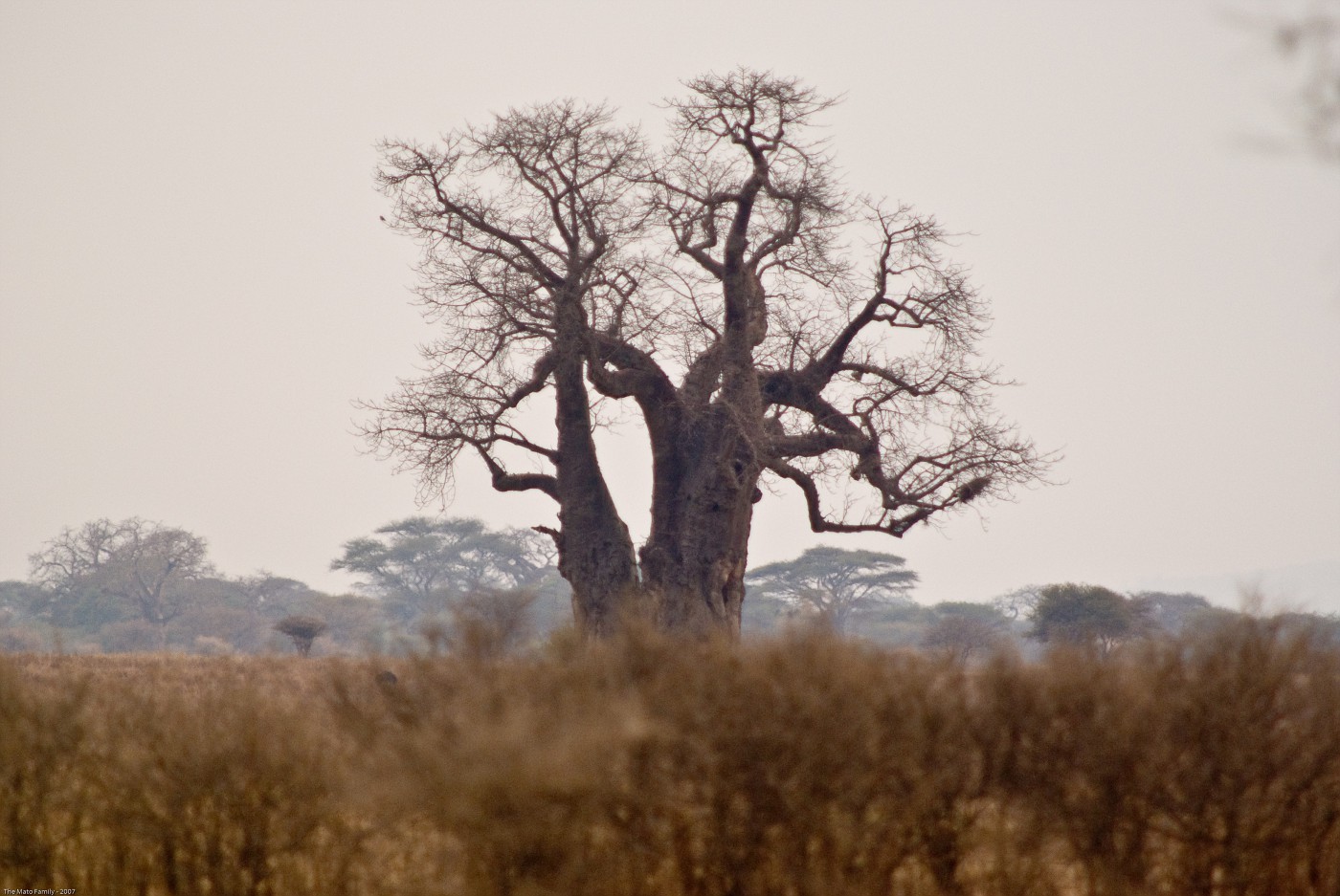
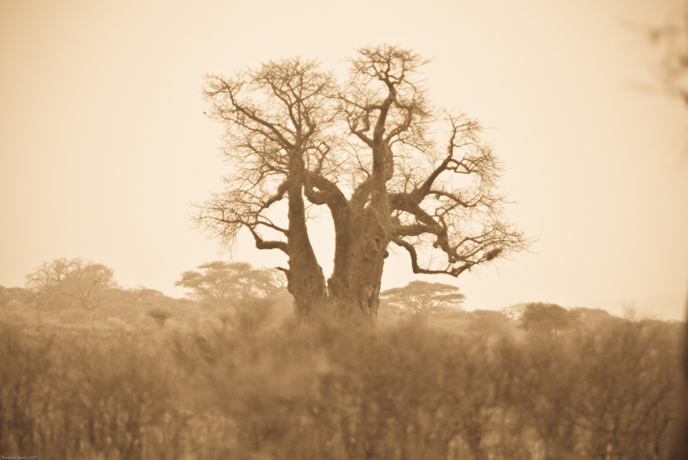
Maybe a tritone could also be consiered a split-tone, I'm not sure. Basically anything that is just two tones. But that picture looks like it is B&W, maybe it is just my un-calibrated monitor here at work. Yes to me it is duotone, but we want to try and get non-B&W shots for this one.
Hi Travis. I hate to admit I didn't pay much attention to the Dec. side challenge. It would have been fun. As for duotones, while not an expert, I do have a few thoughts I hope you find useful.
First, here's a nice link that discusses (one way) how to do duotone conversions in PhotoShop:
Duotone Tutorial
A "true" duotone is simply an image printed on paper using two different inks instead of just one. Typically black is still one of the inks, but it doesn't have to be. Two grayscale versions of the image (a separation) define the density (amount) of each ink needed to create the final print. The tutorial link above essentially uses the PS tool to create an actual duotone separation. It then uses the "preview" image as the digital output (for web display, inkjet, etc).
So how do you define a digital duotone? Take a B&W image and tint it with a single hue and you get a digital duotone indistinguishable from a "true" duotone preview. (There must be a hundred ways to tint a B&W image using PS). Black makes up one ink with the other ink color not well defined. Both density maps also remain fully undefined.
Mike's example image very closely mimics a duotone. Crank up the saturation on it (~ 75%) and you will find that it "uses" a blue dark ink and a warm (yellowish tan?) light ink. If you think it more resembles a tritone, remember that some of the image will have a 'balanced' mix of the two inks [e.g. cyan + yellow = green].
So for the side challenge, is a tinted B&W enough? Or do you want a "true" duotone (2 grayscale separations with ink colors clearly defined + "preview")? You can do the latter even in programs that do not formally support duotone or other separations (e.g. CYMK), but you have to be very clever. (Or like I did, learn from a clever someone else -- Richard Lynch via his book "Hidden Power of Photoshop Elements 2" in my case). Either way, it requires a B&W starting image. Good B&W conversion skill will go far regardless of the route to a digital duotone.
So, please clarify what you are looking for in this challenge & I promise to participate this round.

Regards,
-Mark


 Similar Threads


