 Originally posted by GeoJerry
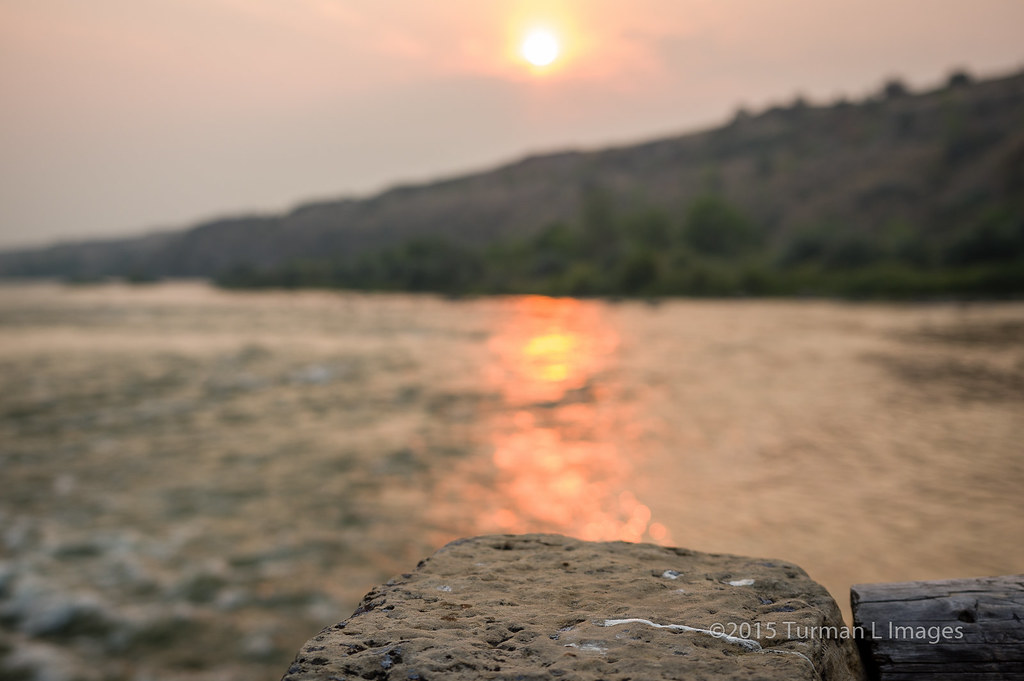
Kind of a cool quirky shot... I might try a couple of things here.
1) Crop out the branch on lower right and some on the left, and try portrait format instead. I think that would focus the eye on the main elements: heat and sad face.
2) Add a bit of saturation to the sky and reflection (not too much) to emphasize heat to the viewer.
3) Increase contrast between the white sad face and the rock, either by darkening the rock or lightening the face or a bit of both. That would really drive home the theme of the image. I have to admit I didn't notice the face and instead my eyes fell on the bright light, and I missed the irony until I read your description.
I have to agree with you Jerry, the smoke does cause lost of contrast I should have fixed it more.
I did wake up to this image being in flickr explore so I have to be happy about that!
I'll probably make a virtual copy with a bit more contrast, and maybe a different crop.
Thanks Jerry!


 Similar Threads


