Forgot Password
Pentax Camera Forums Home
 

Reply
Show Printable Version Search this Thread
  #1
High Contrast - what to do?
Posted By: dbh, 07-28-2008, 10:21 PM

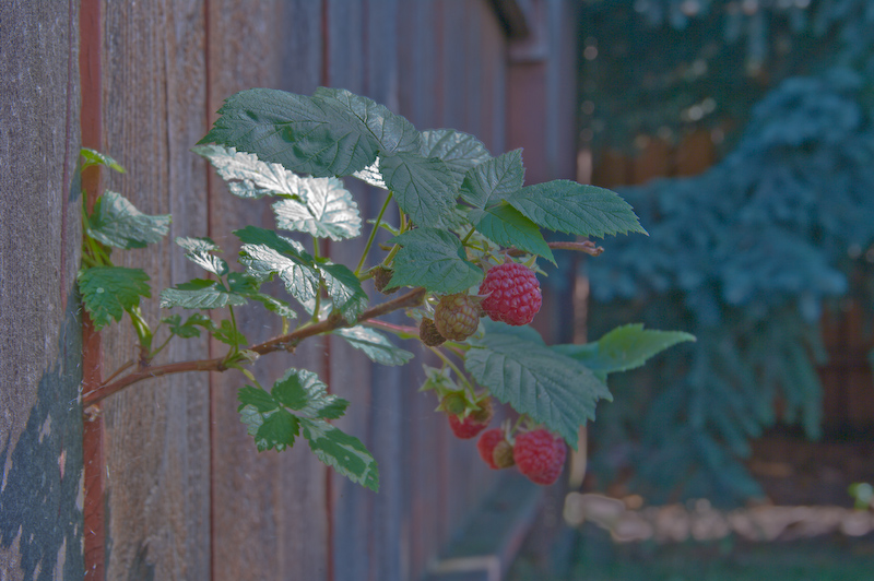
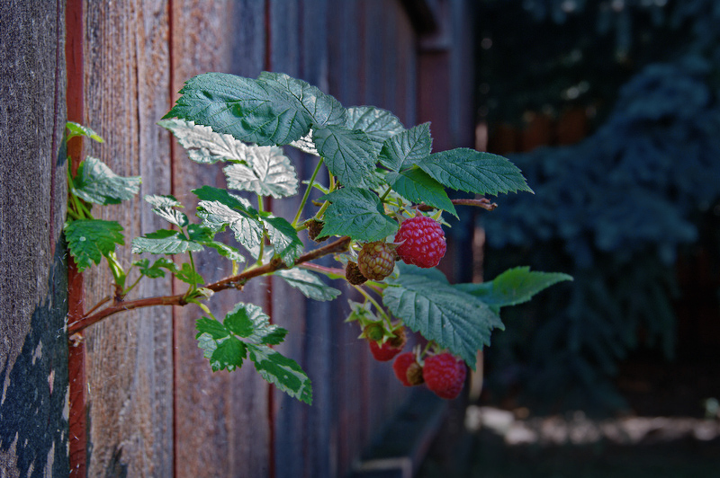
So I saw this bright sunbeam lighting up a raspberry branch in the backyard. Cool, thought I. Here's a challenge. I took a number of images and chose two that were particularly bad - both blown highlights and very dark shadows.
After a bit of playing around with PP I recovered a substantial amount of detail from both ends of the histogram. Unlikely I could have gotten there without the raw PEF file to draw from.
Here they are.

First shot unprocessed:
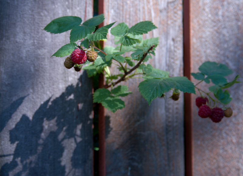

and after tweaking:


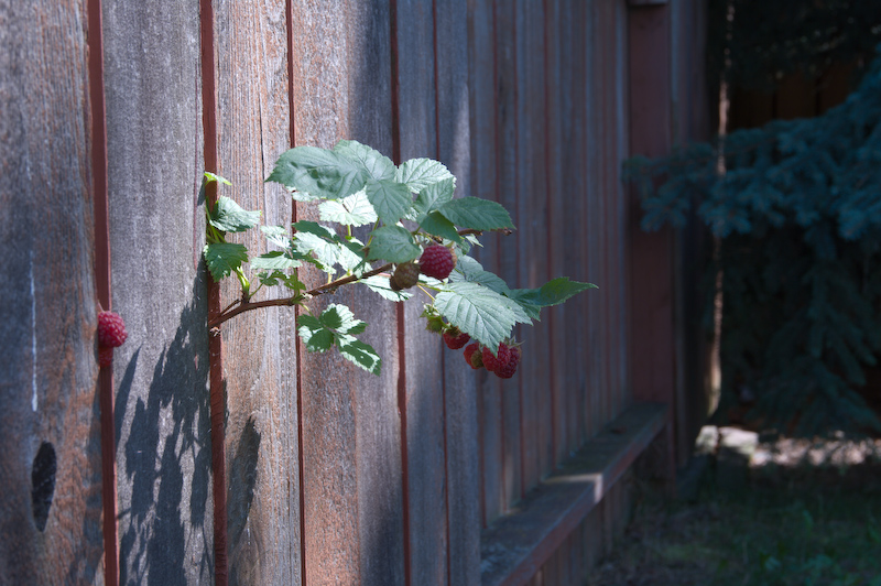
Second shot unprocessed:


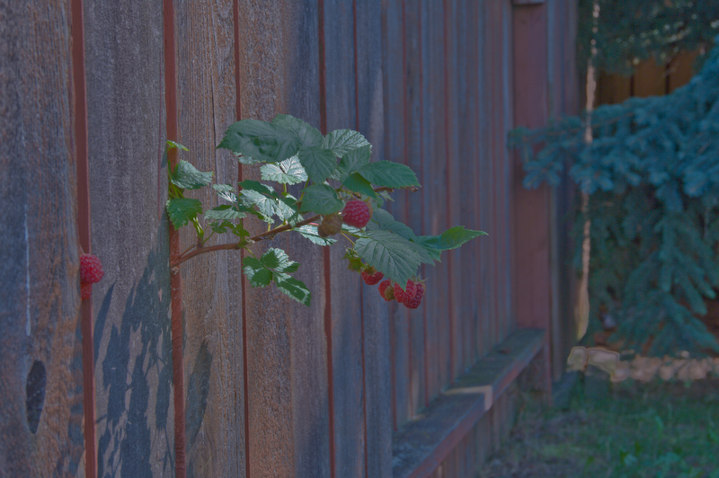
and after the same tweaking:


Amazing what you can pull out of these files when you want to, but 2 things bother me still. The drama of the bright high contrast scene is gone and there appear to be some strange artefacts down near the bottom of the trees on the right.

I think I'll play with them some more...
--
dbh - never did anything like this with my old slides.
Views: 1,975
07-28-2008, 10:32 PM   #2
dbh
Inactive Account


Join Date: Jan 2007
Location: Edmonton
Photos: Gallery
Posts: 404
Original Poster
This is a minimally processed shot of the same little scene taken from a different angle.


Moments after this shot was taken, those berries were gone.
--
dbh - mmm they were tasty
07-29-2008, 01:13 AM   #3
Senior Member


Join Date: Oct 2007
Location: Tallinn
Posts: 265
The artefacts are from overexposure. Not even RAW files can save all of this dynamic range.
And clipped higlights don't look pretty if you try to make them less bright - they will still be blobs of one colour. You don't have the normal smooth colour/brightness transitions in clipped areas - they are all just maximum possible pixel values in the file.
07-29-2008, 02:20 AM   #4
Senior Member


Join Date: Oct 2007
Photos: Albums
Posts: 257
Well here's a take.


Edited off the second jpeg. Increased contrast (curves), DECREASED saturation, some limited selective curves, a channel mix of mostly greens and reds (in monochrome and held back to value mode)... mostly to put back in what was originally taken out by the DBH. Had I done this again, I would have composited the first with the second. 80% of the first one is better than the second. Done in the gimp. Didn't spend too much time on it, just wanted to see what was possible.

Frank.

07-29-2008, 06:08 AM   #5
Veteran Member
alohadave's Avatar

Join Date: Jan 2008
Location: Quincy, MA
Photos: Gallery | Albums
Posts: 2,024
dbh, did you use the Shadow and Highlights tool? It can be very tricky to use that tool effectively, without it looking like a bad HDR shot.

You have effectively lowered the contrast so much that the light and shadows are near the same levels and it give the whole image a gray overtone.

Personally, I would expose for the brightest leaf and let the background fall into shadow since there isn't anything in it that adds interest to the picture.
07-29-2008, 07:09 AM   #6
dbh
Inactive Account


Join Date: Jan 2007
Location: Edmonton
Photos: Gallery
Posts: 404
Original Poster
Thanks everyone for the advice and especially Frank for the example and Dave for the exposure suggestion. I found the brightly lit leaf at odds with getting a nicely exposed raspberry. Pulling back the leaf and keeping the berry is where I needed to stay focused. Yes I used those sliders - I tweaked nearly everything!
Brightness, contrast, exposure, recovery, etc.

There were so many possibilities that I guess I had a paralysis by analysis moment. A quick flick could have enabled my autobracket and I could have solved the problem with the 3 bracket shots. Not like the scene was very dynamic.

Living and learning.
Thanks again.
--
dbh
07-29-2008, 08:23 AM   #7
Otis Memorial Pentaxian
stevebrot's Avatar

Join Date: Mar 2007
Location: Vancouver (USA)
Photos: Gallery | Albums
Posts: 42,007
QuoteOriginally posted by Frank Fletcher Quote
Well here's a take.

Edited off the second jpeg. Increased contrast (curves), DECREASED saturation, some limited selective curves, a channel mix of mostly greens and reds (in monochrome and held back to value mode)... mostly to put back in what was originally taken out by the DBH. Had I done this again, I would have composited the first with the second. 80% of the first one is better than the second. Done in the gimp. Didn't spend too much time on it, just wanted to see what was possible.

Frank.
Ahhh...much better!

Reply

Bookmarks
  • Submit Thread to Facebook Facebook
  • Submit Thread to Twitter Twitter
  • Submit Thread to Digg Digg
Tags - Make this thread easier to find by adding keywords to it!
camera, contrast, photo, shot

Similar Threads
Thread Thread Starter Forum Replies Last Post
High Contrast JMR Post Your Photos! 13 02-02-2009 12:42 AM
Some High Contrast Photos.... AlexanderMayorov Post Your Photos! 13 12-18-2008 01:19 AM
High Contrast Mugshot GEli Post Your Photos! 0 01-06-2008 11:00 PM
High Contrast Mike Cash Post Your Photos! 5 01-01-2008 01:52 AM
K10D High contrast problem Pelham Pentax DSLR Discussion 25 05-05-2007 12:58 AM


All times are GMT -7. The time now is 04:52 AM. | See also: NikonForums.com, CanonForums.com part of our network of photo forums!
  • Red (Default)
  • Green
  • Gray
  • Dark
  • Dark Yellow
  • Dark Blue
  • Old Red
  • Old Green
  • Old Gray
  • Dial-Up Style
Hello! It's great to see you back on the forum! Have you considered joining the community?
register
Creating a FREE ACCOUNT takes under a minute, removes ads, and lets you post! [Dismiss]
Top