Forgot Password
Pentax Camera Forums Home
 

Reply
Show Printable Version Search this Thread
  #1
My first go at B&W conversion
Posted By: dbh, 07-28-2008, 11:47 PM

The original:


my attempt at a black and white version:


I played around with the blue to get the sky how I wanted it, the red to adjust the door on the engine and the green to darken the grass and trees.

C&C and suggestions most welcomed and appreciated.
--
dbh
Views: 1,908
07-29-2008, 12:02 AM   #2
Veteran Member
devisor's Avatar

Join Date: Mar 2007
Location: Norway
Photos: Gallery
Posts: 1,470
nice..

but I think you could do better, by adding more contrast to the image.. and maybe a bit filmgrain.
07-29-2008, 04:45 AM   #3
Inactive Account


Join Date: Oct 2006
Location: Alberta
Posts: 2,140
I like it, good subject for B&W too. Were you down there on Saturday? I drove by and couldn't believe how crowded the parking lot was.
07-29-2008, 05:01 AM   #4
Pentaxian
Moderator Emeritus


Join Date: May 2007
Location: Edmonton Alberta, Canada
Photos: Gallery | Albums
Posts: 10,643
I like the BW shot but agree that it could use more contrast in some parts of the image. The issue is the vast difference in exposure between the foreground subject and the sky/clouds. So since you asked for C&C I tried something with your shot.

First I used shadow and highlight. 40% on shadow and 60% on highlight. It really flattens and dulls the image. Then went to the channel mixer to get the look below. 68% red 32% green, 28% blue and a slight reduction in constant -5% I think. Then +3 contrast +3 brightness.
Name:  2713268476_884cb2c5cf_o pp.jpg
Views: 405
Size:  171.6 KB


Last edited by Peter Zack; 07-29-2008 at 05:12 AM.
07-29-2008, 07:22 AM   #5
dbh
Inactive Account


Join Date: Jan 2007
Location: Edmonton
Photos: Gallery
Posts: 404
Original Poster
QuoteOriginally posted by devisor
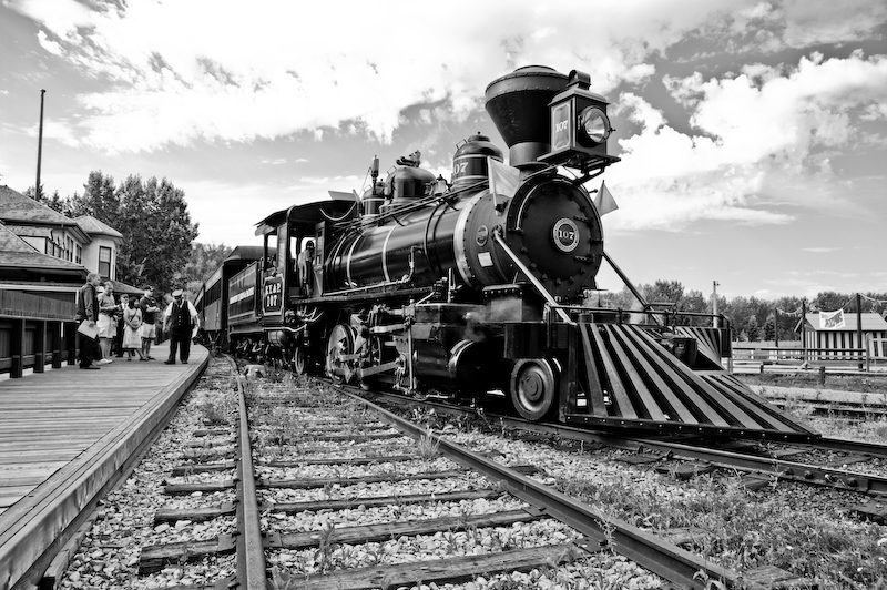
 Quote
nice..

but I think you could do better, by adding more contrast to the image.. and maybe a bit filmgrain.
Thanks. I was wondering if I had too much contrast! It definitely looks like a converted digital image. I guess I was hoping for a more nostalgic look, given the subject.
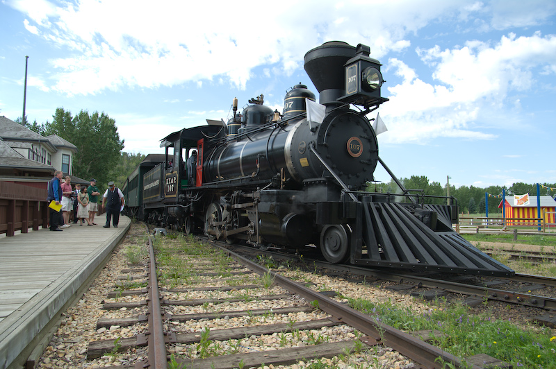
QuoteOriginally posted by scott-devon Quote
I like it, good subject for B&W too. Were you down there on Saturday? I drove by and couldn't believe how crowded the parking lot was.
About a month ago I signed up for the steam train breakfast which started at the Selkirk Hotel and ended with about a dozen of us climbing all over the train, chatting with the folks who run it and maintain it, and going for a spin in it. Started at 8:30 before the park opened. Loads of fun. I think they are doing it again in August. I highly recommend it - give them a call.

QuoteOriginally posted by Peter Zack Quote
I like the BW shot but agree that it could use more contrast in some parts of the image. The issue is the vast difference in exposure between the foreground subject and the sky/clouds. So since you asked for C&C I tried something with your shot.

First I used shadow and highlight. 40% on shadow and 60% on highlight. It really flattens and dulls the image. Then went to the channel mixer to get the look below. 68% red 32% green, 28% blue and a slight reduction in constant -5% I think. Then +3 contrast +3 brightness.
Attachment 16093
Hey, subtle but better I think. I see more contrast in the sky but less in parts of the engine. I like how the trees at the back look better in your version as well.
I wasn't paying a lot of attention to the sky and considered cropping some of it at one point.

This was kind of fun, although I don't think I'll end up doing a whole lot of it. I just like colour too much!

Now I'm thinking of adding some blur and grain and a tinge of sepia...
--
dbh - that park has to be the city's best kept secret.
07-29-2008, 07:51 AM   #6
Veteran Member
deejjjaaaa's Avatar

Join Date: May 2007
Location: steel city / rust belt
Posts: 2,043
QuoteOriginally posted by dbh Quote
I guess I was hoping for a more nostalgic look.
07-29-2008, 08:48 AM   #7
Veteran Member
maxwell1295's Avatar

Join Date: Jan 2008
Location: Long Island, New York
Photos: Gallery
Posts: 2,703
It's amazing how a relatively ordinary color shot can look amazing after a B&W converson. I tend to do that with quite a few of my shots.....probably because a lot of my shots are ordinary!

Reply

Bookmarks
  • Submit Thread to Facebook Facebook
  • Submit Thread to Twitter Twitter
  • Submit Thread to Digg Digg
Tags - Make this thread easier to find by adding keywords to it!
camera, photo

Similar Threads
Thread Thread Starter Forum Replies Last Post
Anotehr attempt at B&W conversion. C&C welcome ikonographics Post Your Photos! 2 07-02-2009 12:53 AM
Help with B&W Conversion joelovotti Photo Critique 10 05-14-2009 05:28 PM
B&W Film vs Color Neg to B&W Conversion?? k100d Film SLRs and Compact Film Cameras 14 05-06-2009 08:52 AM
My P&S IR Conversion Das Boot Photographic Technique 3 03-07-2009 08:01 PM
B&W Conversion synnyster Photo Critique 7 11-14-2007 09:44 AM


All times are GMT -7. The time now is 09:31 PM. | See also: NikonForums.com, CanonForums.com part of our network of photo forums!
  • Red (Default)
  • Green
  • Gray
  • Dark
  • Dark Yellow
  • Dark Blue
  • Old Red
  • Old Green
  • Old Gray
  • Dial-Up Style
Hello! It's great to see you back on the forum! Have you considered joining the community?
register
Creating a FREE ACCOUNT takes under a minute, removes ads, and lets you post! [Dismiss]
Top