Thank you Georg, JMR, Peter, Jimbo, Marc, slopez and cupic for your comments.
Monocrome, I think I will print this up and see how it looks on paper. Thank you.
Jer, I think Lightroom has really expanded my pp desire and abilities too. Except I am very put off with the recent upgrade. It has such severe memory leaks that I had to uninstall and roll back to version 2.1. Adobe has botched every single "upgrade" they've released to Lightroom. But the last one was the worst for everyone!
Hamid, my husband really is a great guy. He can be kinda grumpy at times. His nickname at work is grumpy.

But he makes up for it in lots of ways.

I processed the original photo in Lightroom only. Adjusted exposure and did my basic pp and ran COL fried eggs preset filter and adjusted the effects. Here is one that I pushed the exposure more on to lighten it. I do like the overall effect but I don't like that the overall adjustments brings more pink into the back petals. The noise is increased too from the push. If I was good, I could open up my Paint Shop Pro Photo X2 and use an adjustment layer, mask off the background petals etc., but working around those petals could be more tedious than I'm up for.
In any case, here it is a little lighter.
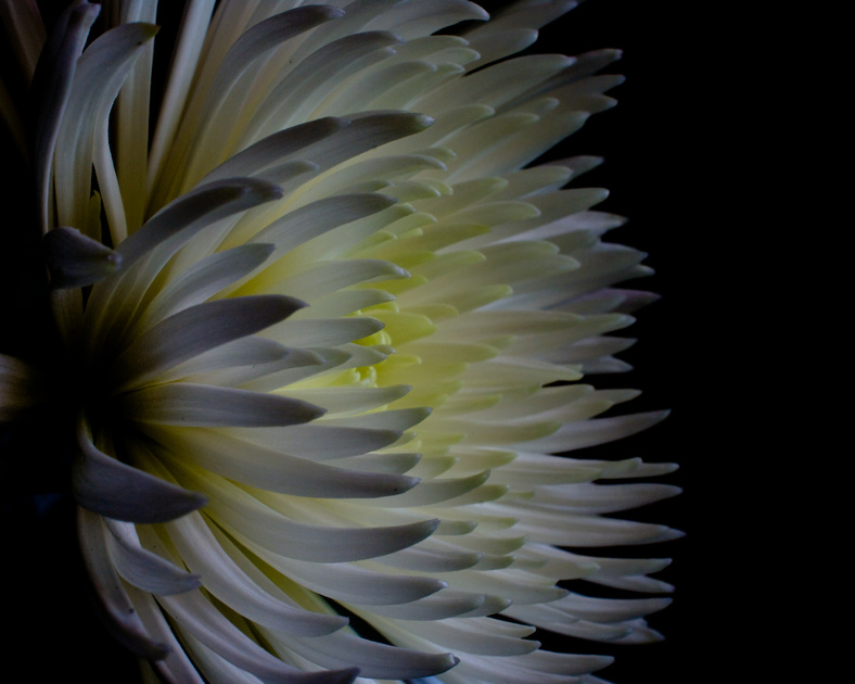
Your feedback is much appreciated!


 Similar Threads


