 Originally posted by WMBP
Dave,
What ways are you thinking of, if I may ask?
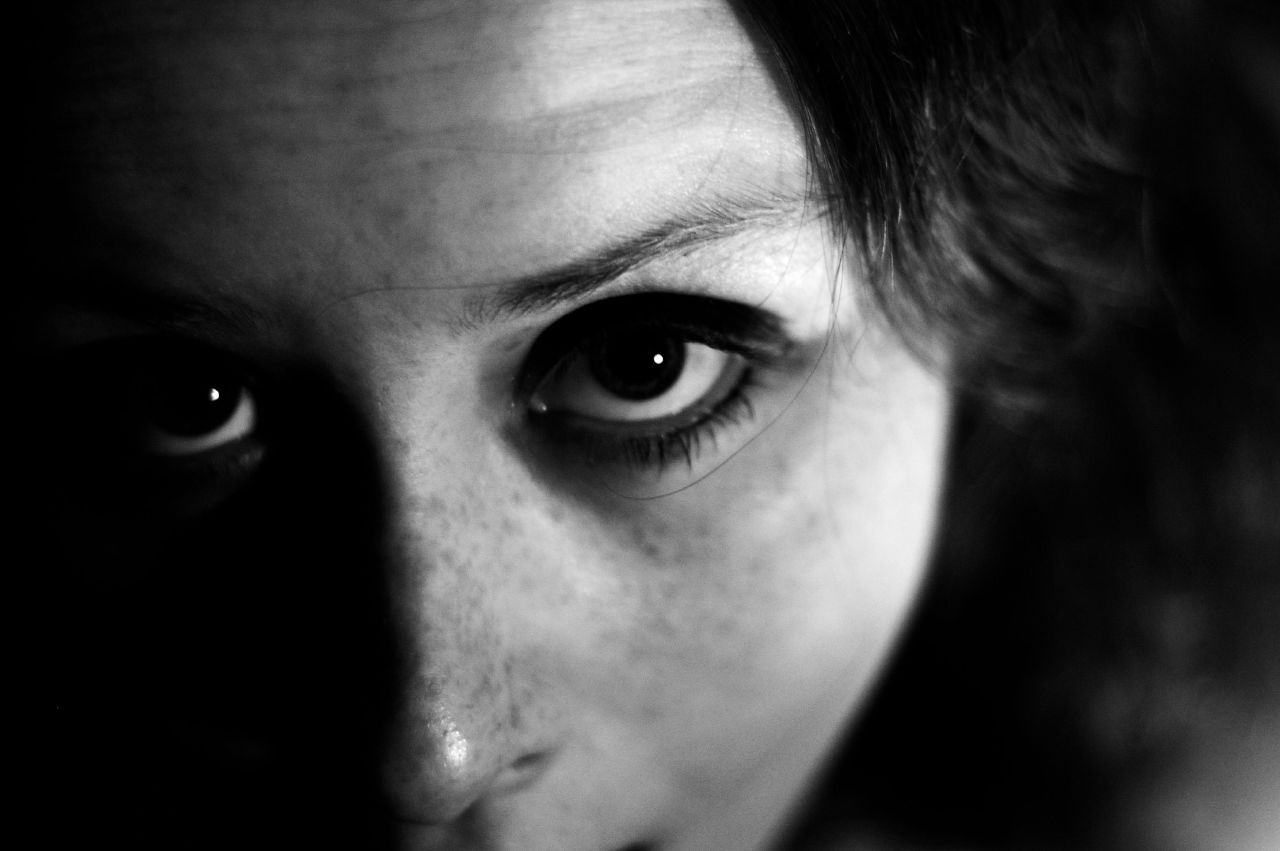
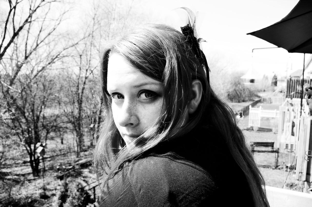
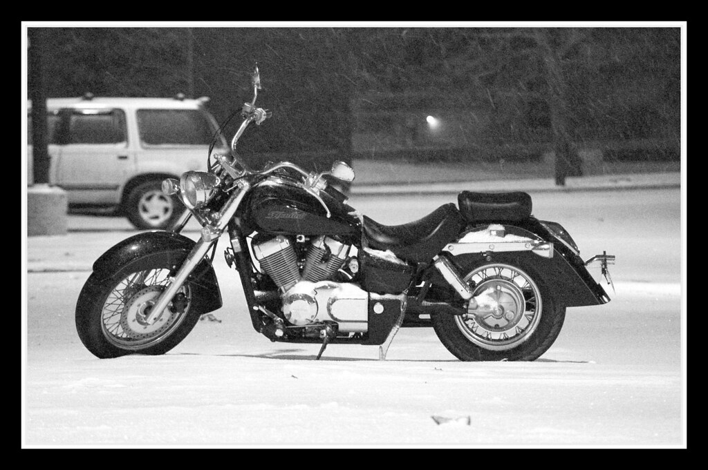
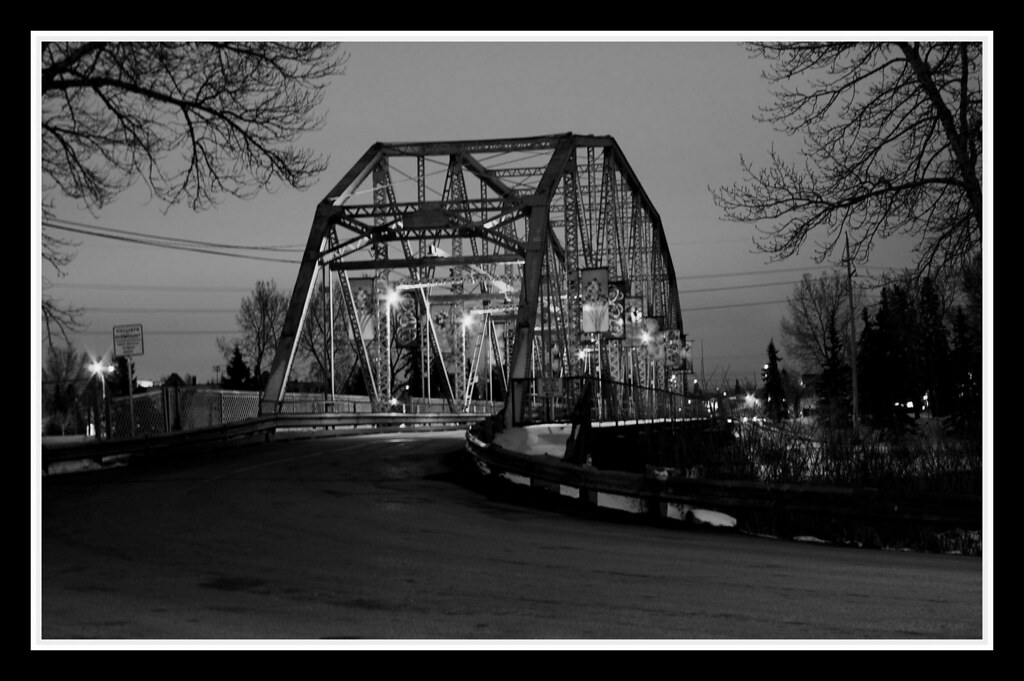
I like b&w very much, when it's appropriate - that is, when the colors are a distraction, or when b&w has a positive benefit like creating that lovely noir mood. To convert, I am simply using the grayscale "treatment" option in Lightroom - and THEN I'm messing with adjustments to tone curves, etc. I have been satisfied with my results so far, but perhaps I'm missing something....
Will
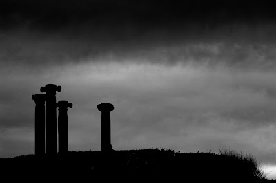
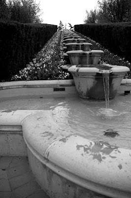
P.S. Like all the photos posted so far. My favorite, I think, is Dave's shot of the old piano.
Will, thanks for the comment on the piano shot.
In Photoshop there are some quick, very effective means of getting better B&W results. First of all, it is "desaturate" it the worst way to get B&W in most apps. It will render red, green and blue of similar brightness as the same shade of gray. Grayscale is a little better, but not much.
The simplest good way is to add a blank layer over your color image, fill it with black and change the blend mode to "color". This doesn't give much control over which colors are lightened/darkened, but gives results very similar to shooting B&W film.
In Photoshop versions before CS3 the best way was to use channel mixer, which gives control over the individual tones in the image. In CS3 there is a new B&W tool that works much like Channel Mixer, but with more control and some standard B&W presets.
The Lightroom version is much like the B&W tool in CS3, but with maybe even more control. Although in Lightroom you don't have layers so you can't do cool effects by blending two different versions of an image.
The are some other means of getting cool B&W in Photoshop, but they are a little more tricky.


 Similar Threads


