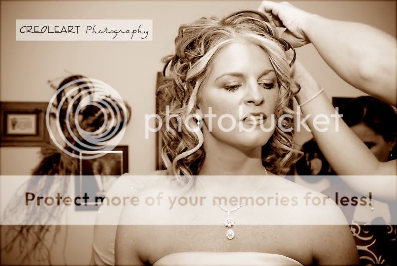
#1. The shot itself works quite well. I rather like the composition. Except for that person behind the hairdressers arms. The other side of the picture is nice though, with the frames on the wall.
Not related to this image per say though, when doing hairdressing shots, try to get the hands and what the hairdresser does to the hair in the picture. One way could be to shoot from behind and get the face of the bride in a mirror or the other way around.
Another thing to keep in the back of the head is that this "journalism" way to photograph preparations etc before the wedding, is to tell the story about whats going on. This picture is more of a portrait of the bride (and I assume there are plenty of portraits of the bride anyways

). To change the perspective during all these events during the day is a key element. When walking into the hairdresser, you are shooting the dressing of the hair, not the bride (although, she needs to be part of the picture at all times, or she won't pay).
The postprocessing of the picture is ok. I would maybe have tried to even out some of the tones on her chest. Which I boldly will assume have gotten worse during the conversion to black and white.
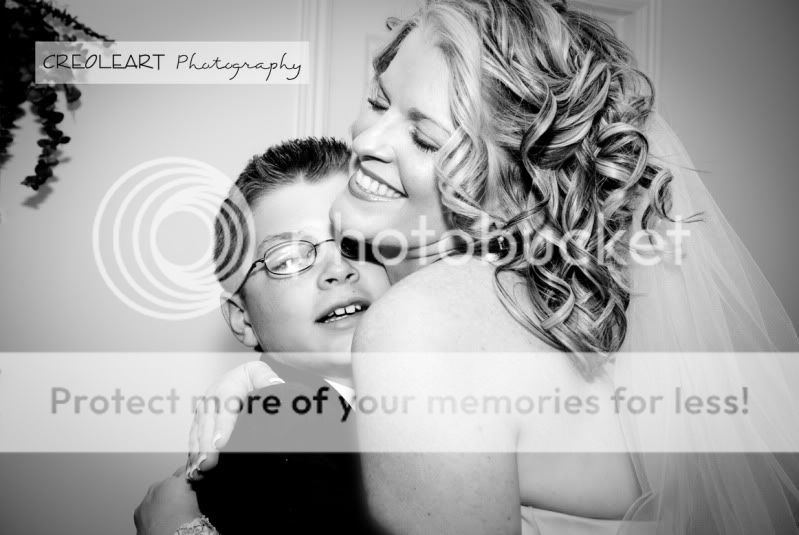
#2. This shot seem to be a bit of a spur of the moment. I don't know if it is intentionally. But the leaning door, the cropped hand/arm of the bride. Makes it look like it was a quick shot. Nothing wrong with it. Thats my impression. I like the image itself, it shows emotions and it is a happy picture. Except for the poor fella that wants to get away, ofcourse, we always want to get away.
. There are two things that bothers me when it comes to the composition. The flower on the wall. And the right hand of the bride. You were a bit too close. And as with #1, you focused too much on the bride, rather then the event that took place. A more wideangle lens would have been good here. To get some more of the enviroment in. And if you had waited or been a bit quicker, maybe that unfortunate placement of the hand might have been better.
Postprocessing, once again, the face look smooth like a filmstar portrait. But there are tonality problems with the shoulder and arm also the boys face seem to have some problems. I am not really sure why this picture is black and white at all really. Maybe you should try to get rid of the flower on the wall, while at it. And I do not at all agree with the amount of vingette. Also there is a spot to the left of the head of the boy, get rid of it.
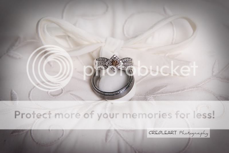
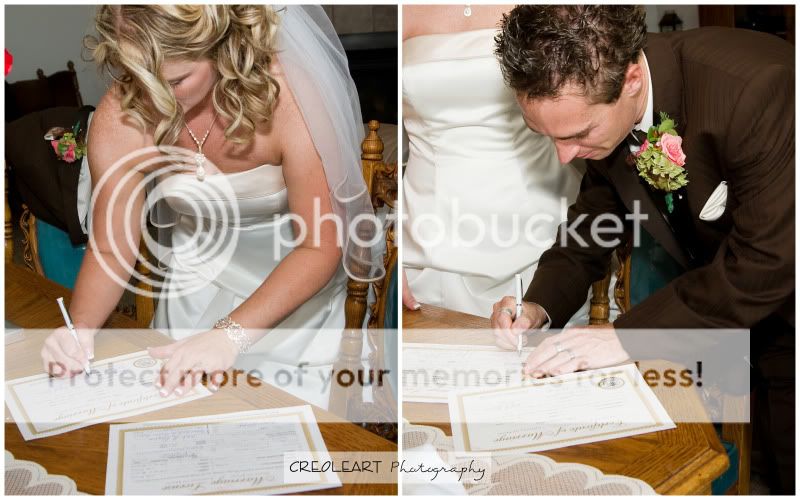
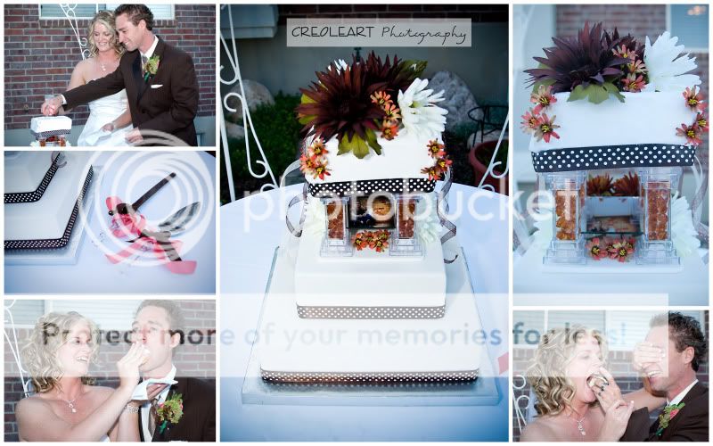
#3. Not much to say about this. One of the shots that always is included at a wedding shoot. It's not bad and it's not excellent. It's simply a shot of the rings. Maybe a slight change of your point of view, would have made the brides ring look more like a ring, since you cannot see that it acctually is a ring now.
Postprocessing is fine. Might be a bit too much vingette again. But appearently thats what the bride wants nowdays
.
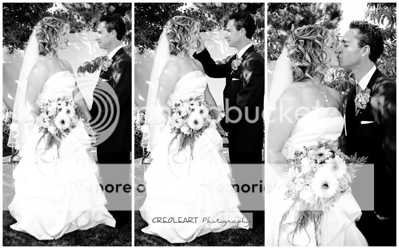
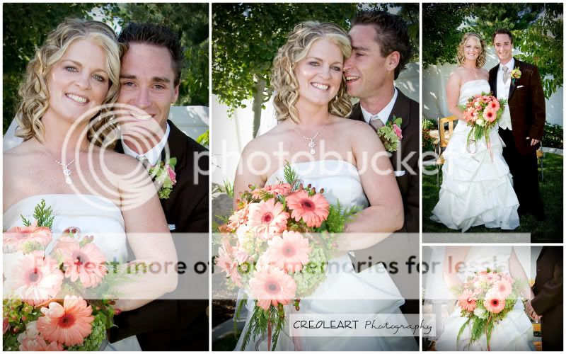
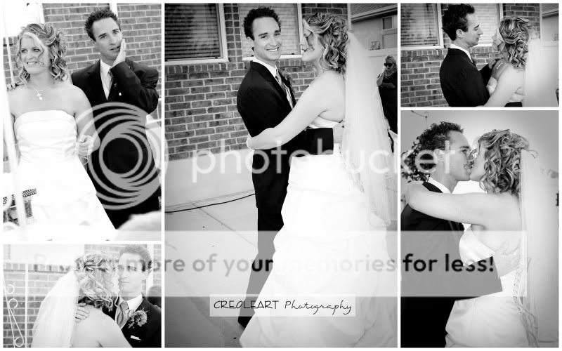
#4. Best so far. Here you got the story, rather then a portrait. Love it. Very passionate. It's a bit of a shame that you didnt find the perspective until the third picture though.

The two first have a bright white background that shoots out of their eyes. And the background at waistlevel and behind the bride is a bit annoying. None of these problems exist in the third picture that excel the other two (yeah, ok there is something behind the veil, but that can be fixed). The third picture is a bit closer and successfully, by crop, clean up the background. And something I really like about the third picture is that you have a dark background behind the blonde hair and a light background for the dark hair. Congratulations. It is quite hard to tell from the small pictures, but I think you might have blown some highlights on the wedding dress though. Which is fine, for computer display but might cause trouble when printing. The exposure of the third is also the best, I don't think much of the dress is blown out there. Note how the heads and shoulders form a heart.
Postprocess. I would crop the two first to match the third pictures crop. I would also consider to atleast have one of the frames in colour to show of that nice bouqet of flowers. I am not sure, but I would probably try to remove that white thing behind the bride in the third picture. It is a shame to let it stay when the picture is so good otherwise.
#5. Nice colours, nicely exposed. I'd crop the left picture and maybe darken the background slightly to get rid of the red stuff. Id maybe try to crop the right picture to remove that halfpaper in the bottom left corner.
Postprocessing, well these two images are the ones I feel would have made it best in black and white, yet these are for some reason the ones you kept in colour. These have the journalistic feel to them. And usually black and white makes it easier to focus to the motif, by removing distracting colours in the background (the reds in the back of the bride.
#6. Rather flat lighted and something I really miss is a distinct catchlight in these pictures. Especially on the groom. The pictures are well executed. I like that you got the sunshine on the flowers. And the flowers really pop out and get justified in colour. The top right one, I so wish that you had told them to sit down in that bench instead. To change the pose from the others.
Postprocessing, I would get rid of the leftmost picture. It makes no sense to me to have it included. It's too similar to the others and not as good as the others, so why include it? It just drags the others down, imho.
I would perhaps have changed the top right for a picture of the church or something. It gets a bit repetative. And as stated earlier. I really would have loved it if they had a relaxed position in the sofa behind them in that picture, to get another pose then the other ones. But really. Get rid of the left one.
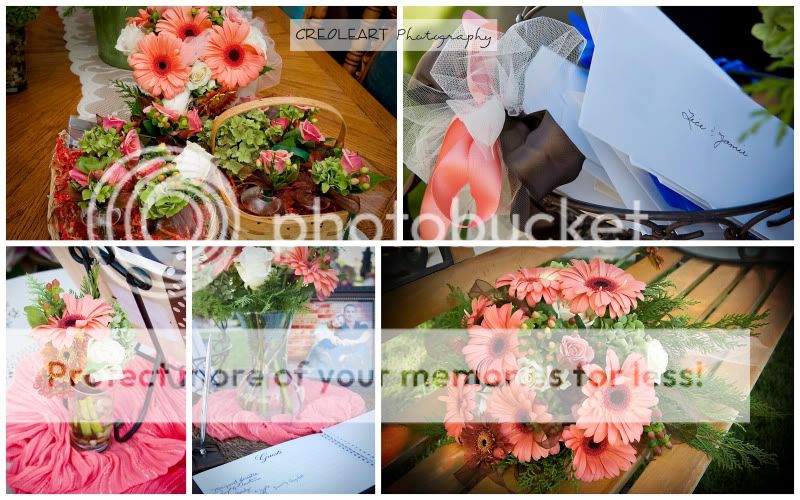
#7 Lots of flowers. But the same ones. Left three is not interesting. The two on the right would be enough for a picture. The three to the left does not have the passion or thought as the two on the right. The top to the left looks like it was shot during preparation. The middle at the bottom lacks light and contrast, it has nothing to do in the company of the others. Left bottom corner has a boring perspective. The two to the right are excellent. They are interesting and well exposed.
Postprocess. Ditch the halfdone images and use those that shines. The two on the right really is this image. We all get bad and good shots during an event. The hard part is to chose which ones are which. You seem to decide on more is better, but in this case, the viewer looks at the three first images and wont bother with the two on the right, you have hidden the two good ones behind three bad ones.
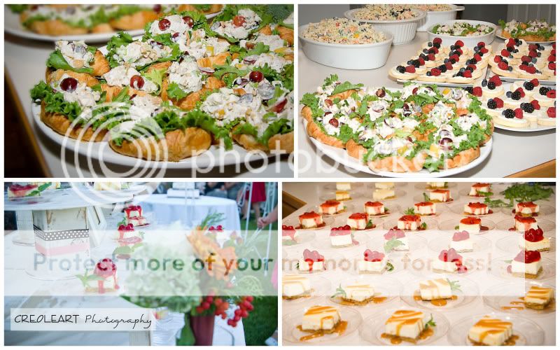
#8. This is interesting. You got two good shots. Top left and bottom right. Both are well executed and near perfect crop as is. And then you have two halfdone jobs on the other diagonal. You see, the two good ones, are good pictures of food. Makes me want to eat. The other two makes me think that you got bored of photographing food and just took the pictures to fill up the memorycard. I would crop the bottomleft one tighter to get rid of the corners. I dont really like the green stuff that interrupts my flow in cake. And I dont like the opposite corner either with the table that runs off in the wrong direction. I say, make this a 2 images picture or find two better then the ones you chose.
Postprocessing. Of the two Images I like, the bottom one has alot better light/contrast. Make it even on both of them. Other then that, I think they are fine.
#9. Nice series with the bride and the groom. The cake pictures are quite hard for me to decide on I kind of like the tool shot. I wish youd had a bit more cake on it though. The small picture of the whole cake has to go. It lacks contrast, the background is awful when you try to "sell" the food to the viewer. And the perspective is no fun at all, just as with the earlier food pictures, this one looks like you got tired of shooting the cake and just took some more to fill the card. Compared to the ones of the knifes, what do you think yourself? The bride and groom pictures are good, they, once again, show the story rather then a portrait.
Postprocessing. This picture shares a problem you had in picture #6, #7, #8 and that I saw in a quick glance will be in the upcoming #10 aswell. You have to decide which pictures are the best ones and use them and let go of the rest. In this case, I would see if I had an image like the ones with the knifes that showed a bit more cake and go with that. Use the three pictures of the couple and one of the cake. Too many images just makes the viewer confused. And really, when you have some good shots, use them. Don't use "fillers" to fill up space.
#10. Nice set of images. I really like the expression you caught of the groom in the picture in the top left corner. This picture could easily be on its own and does not need to be part of a collage. Remove it and let it be its own, because it has a completly different story then the rest. Bottom left, same as with the earlier collages, this image is worse then the others and has to go. The three to the right is what makes this collage interesting and have a common story and look. I would make this collage a triptyk and only use those three images. Once again there are too many images to get a calm look at it. And they don't seem to be equal in quality or motifs.
Postprocessing. Appearently you have seen yourself that this image consist of 3 interesting images and two less interesting. Since you only put the vingette on the three that match.
If your going to keep the 5 together, I suggest that you use the same postprocessing on them. On the biggest of the pictures (the one in the middle) I would clean up the ground.
Overall conclusion,
Your problem is not photographic knowledge. You know how to take a photograph. You know what you want and you want to show off. Which is all grat. However, you have a problem with concistency and a problem to chose whats a good image from a bad image. You need to get more selective and not let your good pictures be dragged down by having bad pictures next to them. If you can control the exposure and quality in 3 out of 4 images. Don't put the fourth in, because thats the image that will be remembered.
If you get bored of a motif, move along and go back later. Some of the images you have shown here, was shot from your eyelevel, where you were standing, straight on the motif. Thats boring and a sign that you got bored or lost interest in the motif. Be consistent in your postprocess. If you use vingettes in some shots and are going to show it next to other similar pictures, use the same vingette on all. If you are making black and white conversions and are going to show them next to others, use the same settings (dont tone 1 sepia, 1 blue, 1 untoned etc).
Consistency, quality and pickyness. Thats what you want.
For being a second wedding, you have done a great job, don't overdo it. I am sure that you will porvail as a wedding photographer, with some training.
Thats my 2c.


 Similar Threads


