Forgot Password
Pentax Camera Forums Home
 

Reply
Show Printable Version Search this Thread
  #1
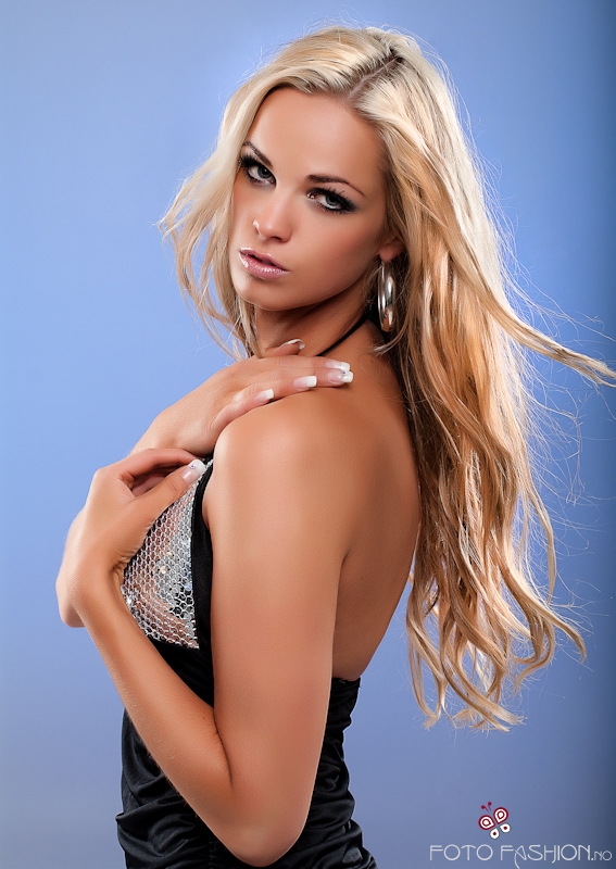
wich one do you like
Posted By: devisor, 11-03-2009, 11:24 PM


Views: 2,761
11-03-2009, 11:31 PM   #2
Ash
Loyal Site Supporter
Ash's Avatar

Join Date: Mar 2007
Location: Toowoomba, Queensland
Photos: Gallery | Albums
Posts: 23,920
Can I say 'both'?
Eric, this is a stunning soft portrait with impeccable lighting, posing work and makeup.
I like #2 because of its bold colours - would do well on a glossy print, but I also like #1 as the desaturated look adds an element of texture and contrast not as evident with the full colour one.
Just excellent.
11-03-2009, 11:55 PM   #3
Veteran Member


Join Date: May 2008
Location: Sydney Aus
Photos: Gallery
Posts: 527
I prefer 2 too. But maybe too plastic on both? just a little?
11-04-2009, 12:46 AM   #4
Veteran Member
devisor's Avatar

Join Date: Mar 2007
Location: Norway
Photos: Gallery
Posts: 1,470
Original Poster
thx.. nah, not for this kind of image.. and you are looking on a lores image .

11-04-2009, 01:41 AM   #5
Veteran Member
spyglass's Avatar

Join Date: Jun 2007
Location: British Columbia, Canada
Posts: 747
Hey Eric,

I like the 2nd shot. It offers a warmth. I also feel the colour in the 2nd shot plays the hairs and skin against each other nicely.


Spyglass
11-04-2009, 05:24 AM   #6
Veteran Member
cupic's Avatar

Join Date: Apr 2008
Location: Australia-NSW
Photos: Gallery
Posts: 4,824
I like a few wrinkles so neither


cheers
11-04-2009, 05:25 AM   #7
Site Supporter
Site Supporter
eccs19's Avatar

Join Date: Jul 2008
Location: Lisle, Ontario
Photos: Gallery
Posts: 1,510
Those are lovely shots. The only thing that I find a little strange is her left hand. Her right elbow seems to blend in and give her a strange looking hand. I only wish I could do a shot even half as good as these are.

11-04-2009, 09:14 AM   #8
Veteran Member


Join Date: Sep 2007
Location: Edmonton, AB, Canada
Posts: 408
#2 offers warmth and vibrance. But everybody takes photos that offer this experience. I don't think it is YOU though. #1 feels more like you and is more into your style.

I like #1 because it is cold, perhaps metallic. It is different.
11-04-2009, 09:17 AM   #9
Veteran Member
Pentax_XTC's Avatar

Join Date: Jan 2008
Location: Duluth, GA
Posts: 365
I like both, but I prefer the style of #1. It seems more formal and edgy with the muted tones.
11-04-2009, 07:01 PM   #10
Senior Member


Join Date: Jul 2009
Location: fort worth tx
Photos: Gallery
Posts: 107
i like them both but there is somthing with the hands that seems off if i had to pic #2
11-04-2009, 07:50 PM   #11
Inactive Account


Join Date: Jan 2008
Location: Ontario, Canada
Posts: 1,972
I prefer #1 by a landslide. #1 she looks like a elegant statue...#2 she looks like a wax figure.

If you're torn between the two...go with #1 with the girl being slightly more saturated.

c[_]
11-04-2009, 08:35 PM   #12
Veteran Member


Join Date: May 2007
Location: Central NJ
Posts: 470
IMO #1 works better. Both have the soft photoshopped look on the skin, but with #2 you add in a bit too much saturation and her skin looks sunburnt almost. The weird oversaturated skin tone draws my eye to her shoulder area due to the red vs blue contrast being great. In #1, I'm drawn to her face first. That fact, plus you get a little more contrast between the right elbow and left wrist. In #2 it looks more like a giant mutant hand than a hand and elbow.


Although I tried #2 in photoshop and desaturated just the blues, and it looks pretty nice.
11-04-2009, 11:23 PM   #13
Veteran Member
devisor's Avatar

Join Date: Mar 2007
Location: Norway
Photos: Gallery
Posts: 1,470
Original Poster
thx all

I think I'm landing on the first one also
11-06-2009, 07:06 AM   #14
Veteran Member
sawtooth235's Avatar

Join Date: Apr 2008
Location: Orange Park, Florida
Photos: Gallery | Albums
Posts: 886
Eric,

I prefer the desaturate number one. It has a different feel to it than a straight rendering.

Ray
11-06-2009, 07:13 AM   #15
Veteran Member
Pentax_XTC's Avatar

Join Date: Jan 2008
Location: Duluth, GA
Posts: 365
after looking at this again I have to say definately number 1. Not only does it draw more attenion to the model's face (as raz-0 has already pointed out), but the first one is more of your style and you do it so well.
Reply

Bookmarks
  • Submit Thread to Facebook Facebook
  • Submit Thread to Twitter Twitter
  • Submit Thread to Digg Digg
Tags - Make this thread easier to find by adding keywords to it!
camera, photo

Similar Threads
Thread Thread Starter Forum Replies Last Post
Wich cameras i83N Pentax Medium Format 5 02-17-2010 09:51 AM
Two 18-55 lenses. wich is best mba1971 Pentax SLR Lens Discussion 7 10-21-2009 11:52 PM
Misc The Wich graphicgr8s Post Your Photos! 13 10-15-2009 05:40 PM
wich t c is better zmohie Pentax SLR Lens Discussion 4 02-17-2009 12:18 PM
wich is better? devisor Post Your Photos! 11 09-13-2008 06:54 AM


All times are GMT -7. The time now is 02:09 PM. | See also: NikonForums.com, CanonForums.com part of our network of photo forums!
  • Red (Default)
  • Green
  • Gray
  • Dark
  • Dark Yellow
  • Dark Blue
  • Old Red
  • Old Green
  • Old Gray
  • Dial-Up Style
Hello! It's great to see you back on the forum! Have you considered joining the community?
register
Creating a FREE ACCOUNT takes under a minute, removes ads, and lets you post! [Dismiss]
Top