Forgot Password
Pentax Camera Forums Home
 

Reply
Show Printable Version Search this Thread
  #1
Photoshop Revisits
Posted By: Black Magic, 11-12-2009, 11:40 PM

I recently got a chance to play around with CS4, and man do I love it! So, I revisited some photos of mine that I thought could use some spicing up with photoshop magic. C&C welcome.

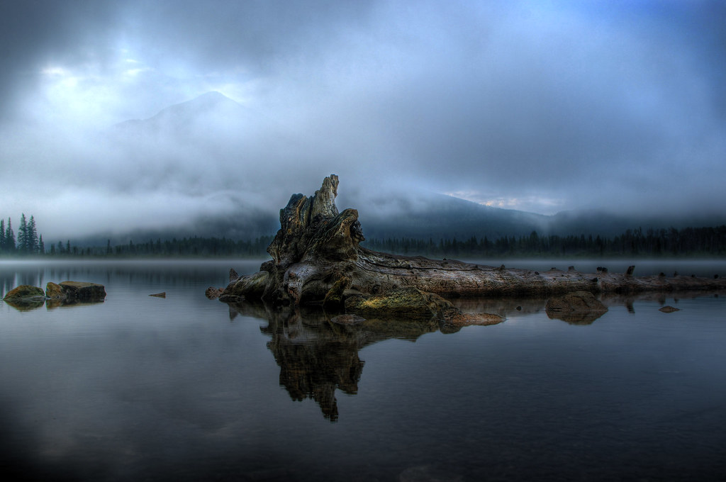
I posted this pic a while back, but it has since been touched up in CS4 to remove some sensor dust, boost contrast and add some dodging and burning.


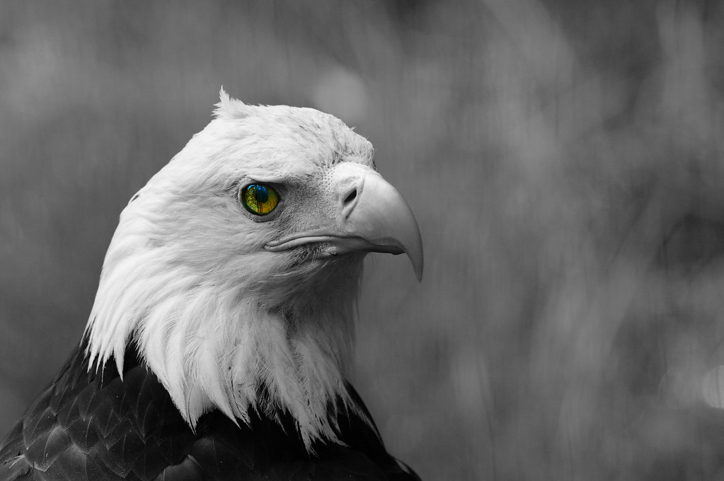
Now, I know a lot of people on this board absolutely HATE selective colouring, but I really didn't like the original colours in this photo except the eyes, and I thought the total B&W conversion was missing something. So...


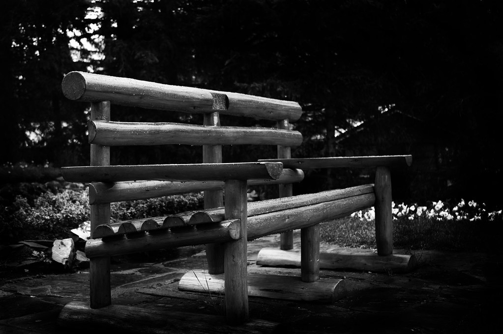
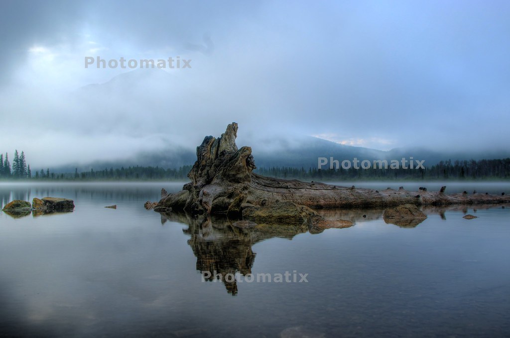
Used CS4 to convert to B&W and remove some distractions with some burning.


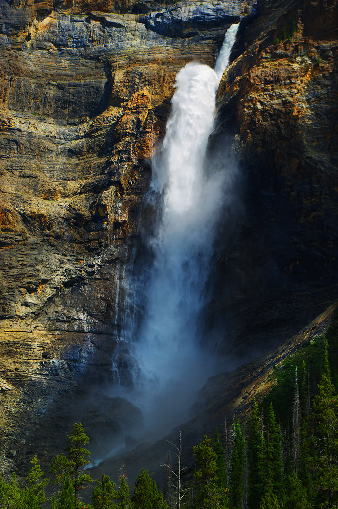
Used CS4 to dodge some detail, boost contrast and saturation.


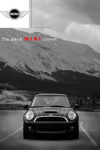
This last one was just for fun. Found this mini in a parking lot, took a pic, and decided to turn it into a mini advert. What you can't see is that the front is CAKED with bugs


Views: 2,378
11-13-2009, 12:48 AM   #2
Damn Brit
Guest


These are really very good, I'll leave first until last because I like it a lot (with provisions).
BTW, if you really want CC, post in Critique, it's getting quite busy now.

The eagle, I'm not too sure about. Perhaps you should consider doing something to the eye to really make it pop. At the moment it's handicapped by being so small in the frame so it could do with a boost.

The bench I think you need to soften the edges of and get rid of some of the shine. I find the top edge of the top rail and the shine on the middle rail especially distracting.

The waterfall has some blown areas in the sunlit section of water.

Now the first image, I think what's stopping it from being great is that it needs tightening up. Crop from the right to just before the rock, that will balance it with the left hand edge of the frame. Crop some out of the sky and darken up that bright area (I think it's distracting), the small amount of brightness around the peak is more than enough. Crop about half of the water between the bottom edge and the reflection.
I think that will really concentrate it into a powerful image that way.
11-13-2009, 03:30 AM   #3
Forum Member
teedee's Avatar

Join Date: Nov 2009
Posts: 51
i really like the first shot, but like damnbrit i think the composition suffers a bit.
did you take more shots of this scene?
i usually dont mind centercompositions and im not a raving rule-of-third-freak
but im not too sure about this one.
i think crop the water all the way up to the center rock would make a big different.
11-13-2009, 05:25 AM   #4
Veteran Member
Taff's Avatar

Join Date: Aug 2008
Location: Perth Western Australia
Photos: Gallery | Albums
Posts: 1,612
Hi there, would you mind showing the first image before reprossesing?

Taff

11-13-2009, 08:44 PM   #5
Senior Member
Black Magic's Avatar

Join Date: Jan 2009
Location: Regina, Saskatchewan, Canada
Posts: 107
Original Poster
Taff, Here is the image before I did a lot of editing with photoshop. This image was an HDR composed of 3 images. This is what photomatix "spit out" after processing


And here are some crops. Better? Worse?


11-13-2009, 10:22 PM   #6
Veteran Member


Join Date: Sep 2007
Location: La Crescenta, CA
Posts: 7,450
That last crop is quite strong, IMO.
11-13-2009, 10:26 PM   #7
Ash
Loyal Site Supporter
Ash's Avatar

Join Date: Mar 2007
Location: Toowoomba, Queensland
Photos: Gallery | Albums
Posts: 23,920
I will agree with the last crop.
It works very well.
Gary's gone through the critique, which just leaves me with the praise: WELL DONE! The first 2 are just brilliant - the eagle eye coloured on its own looks a little evil, but with the whole eagle coloured this would be an awesome pic.

11-14-2009, 02:30 AM   #8
Pentaxian
mikeSF's Avatar

Join Date: Jan 2009
Location: East Bay Area, CA
Photos: Gallery
Posts: 6,620
gary's tips were spot on - tightening up #1 really did wonders for it. that is a beautiful shot and i love the way the mountain is perfectly veiled by the passing clouds.
11-14-2009, 05:58 AM   #9
Veteran Member


Join Date: Apr 2008
Location: USA
Photos: Gallery
Posts: 1,901
I like the original before the HDR on the first one but you could add a little more contrast and tweak the lighting a tad. Also, I like the rocks on the left side so I would like to see a crop in the other direction.

The eagle could maybe use a crop also as the background on the right is a little busy and if you could try to get a lillte more detail out of the blown feathers.

quote Damn Brit "The bench I think you need to soften the edges of and get rid of some of the shine. I find the top edge of the top rail and the shine on the middle rail especially distracting."

It hard not to get blown areas in watrfalls unless your working in cloudy skies and or use a ND filter/polarizer. Kind of hard to recover after there blown.

BTW, looks like you were visiting some beautiful country.

Last edited by OrenMc; 11-14-2009 at 06:46 AM.
11-14-2009, 06:23 AM   #10
Pentaxian
Moderator Emeritus


Join Date: May 2007
Location: Edmonton Alberta, Canada
Photos: Gallery | Albums
Posts: 10,643
Geez, I'm glad I looked at the shots before I read the comments. I'm really wondering if every shot has to be so perfect that it no longer represents what was really there? I use PS and LR too but my impressions of the images above are somewhat different.

In one I love the 'look' of the scene and the final crop is best. My first impression of the shot was that the stump end of the tree was too centered and with the new crop, the tree now leads you off to the right to explore the rest of the scene. Well done.

With the Eagle, I'm not a big fan of selective colour but this works OK. I might have left the entire bird as colour and just changed the background. Dunno without seeing the original.

The bench is OK but there's a lot of negative space and just plain black in the shot. The "shine" isn't an issue to me but the shots lacks something. There's not much to draw you in.

The waterfall is fine. Blown highlights? It's white water for .... sakes. It's exactly what I would have expected. Even your eyes would see it this way. There's more than enough detail in the water to give it texture.

The Mini cooper is a fun shot and would be great if the car was on a roadway with the mountains in the background. Fun idea though.
Reply

Bookmarks
  • Submit Thread to Facebook Facebook
  • Submit Thread to Twitter Twitter
  • Submit Thread to Digg Digg
Tags - Make this thread easier to find by adding keywords to it!
burning, camera, contrast, cs4, lot, mini, photo, photoshop, pic
Thread Tools Search this Thread
Search this Thread:

Advanced Search


Similar Threads
Thread Thread Starter Forum Replies Last Post
Which freeware photoshop alternative can apply photoshop plugins in batch raider Digital Processing, Software, and Printing 1 01-28-2010 10:54 PM
Opening Photoshop-saved RAW in Photoshop jzietman Digital Processing, Software, and Printing 4 12-09-2009 10:49 PM
Photoshop Help! ceericks Digital Processing, Software, and Printing 5 11-02-2009 11:29 AM
Photoshop.. o.O Ryan Digital Processing, Software, and Printing 17 05-11-2009 04:09 PM
Photoshop 5.0 help please! Techguy Pentax DSLR Discussion 4 01-10-2008 12:55 AM


All times are GMT -7. The time now is 08:48 AM. | See also: NikonForums.com, CanonForums.com part of our network of photo forums!
  • Red (Default)
  • Green
  • Gray
  • Dark
  • Dark Yellow
  • Dark Blue
  • Old Red
  • Old Green
  • Old Gray
  • Dial-Up Style
Hello! It's great to see you back on the forum! Have you considered joining the community?
register
Creating a FREE ACCOUNT takes under a minute, removes ads, and lets you post! [Dismiss]
Top