 Originally posted by Suzu
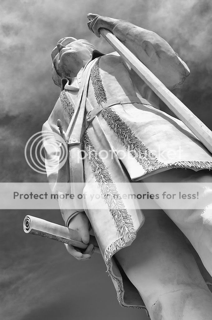
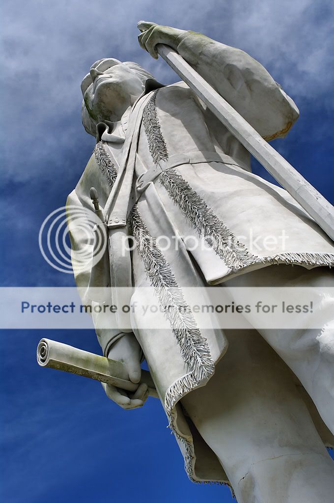
I love the contrast of B&W but color sure works with these statues and your angles

Thanks, Suzu.
Jer
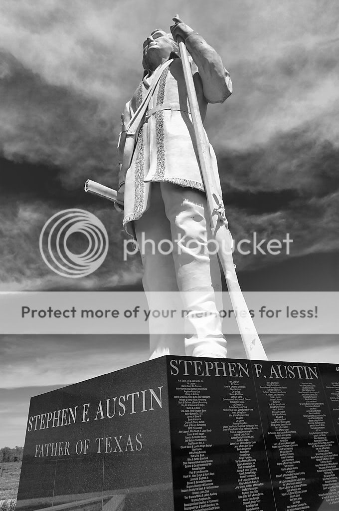
Originally posted by JMR These are mighty fine. I usually prefer colour, but BW in this instance reinforces the character of the statues and helps keep the focus on the noble resolve of the composure. It is stately, but also dynamic because of the clouds and your oblique angle, and the angle of the light. You can crop this 7 ways to Sunday and each will look good, depending on what you want to convey most.
JMR
Hey, JMR - I appreciate the very kind words. I lean toward the B&W ones as well.
Jer
Originally posted by daacon Well done Captain Sparrow .... I prefer the BW ones which is rare for me ....
AAAAARRRRRRGGGGGG . . . . thankee, matey.
Jer
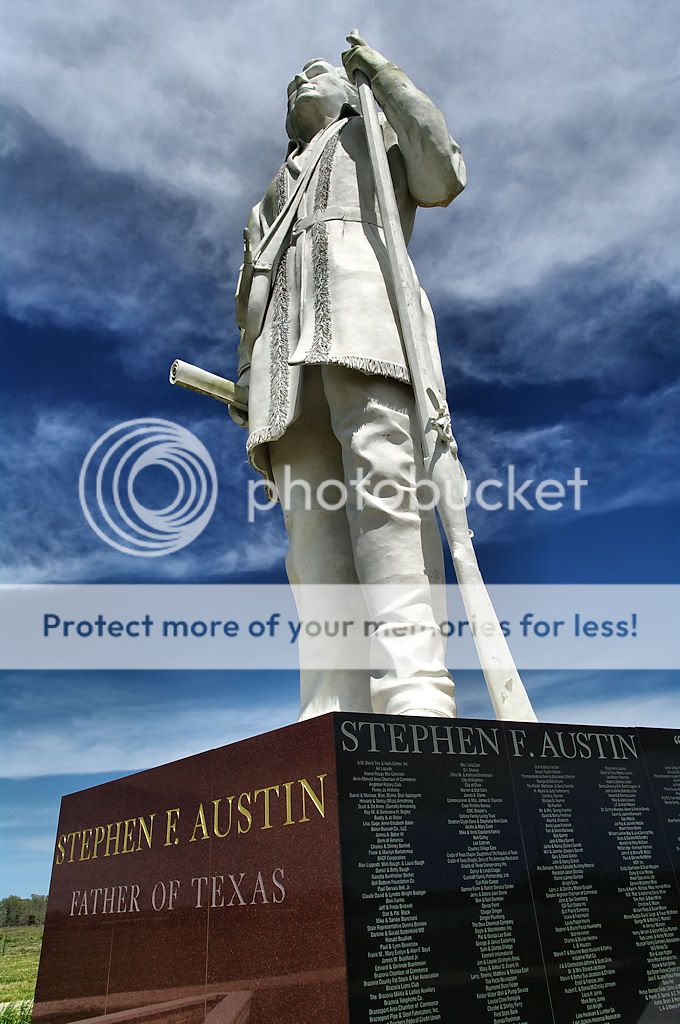
Originally posted by SpecialK Color, in both cases, because they have a great blue sky, and even the stone has nice colors.
Thanks; I appreciate the feedback.
Jer


 Similar Threads


