And I thought this was a tough challenge to shoot for...turns out to be much tougher to judge!
There were a lot of entries (19), many of them taken within the active week (14), 13 of which were judgable (jheu02 submitted a new entry). Now, on to the judging...
DanLoc78...first I have to ask, what was going through your mind as you captured this image? It's terrible! I haven't seen a photo this bad in years. This photo gets last place, and it was a pretty easy decision. You should be ashamed of yourself. I really think you should stop contributing to the Project 52 immediately.
Sheela – great sky, love the whispy clouds and that you’ve really exposed the sky well. Nice composition with the headstones leading all the way up to the tree, and you even see a few headstone silhouettes at the top of the hill. Good detail in the shadows, and nice light on the tree and some of the tips of the headstones.
Duh Vinci – I like the idea of using a lens baby type effect, but the blurred portion of the photograph looks kind of like motion blur to me and it distracts a bit too much from the book atop the headstone IMO. Nice black and white, I like the contrast and the textures you’ve captured. I also like that the book appears to be turning the pages...metaphor perhaps? I like the mood. well done.
Joe (JMSchrei) – First, let me say, I like this image a lot. Love the perspective and composition, and I really like the choice of primary subject. Also, it looks like you’ve achieved a nice exposure in tough conditions (great sky btw). However, if not for the theme I would have no way of knowing this was taken in a cemetery. Considering the theme, maybe a wider shot showing this statue but including some of the tombs around it may have been more effective at capturing the theme.
Clou – I love the lean on this tombstone, that and the weathered stone really hint at its age. Also very much appreciate you posting an image to encourage participation! Thank you!
Cyy47 – while obviously not taken during the timeframe, thanks for contributing to the thread! Are you a first time poster in the P52? If so, welcome, and hope to see you back again. Nice photo you’ve shown us, I kind of like the fact that the name of the person being honored is somewhat hidden by the shadows. Obviously a nice reflection with great light. The tree without leaves helps set a nice mood as well. Nice capture.
Tamia – I like this take on the theme, thought inducing, nice composition, and nice contrasty black and white. extra points for thinking outside the box!
Jools - Unfortunately the photo was outside the timeframe since it was captured in 1899. Kidding! Man, I'm on a roll today (too bad I'm the only one who thinks so). I like your perspective and the overall mood. Also dig the lighting and the apparent motion in the clouds. The perimeter of the tree in the background looks clipped in some way...was the sky taken from another photograph and put into this one? Overall nice capture.
Bramela - I really like the textures and the weathered details in this photo. You've also captured a nice sky at the expense of some harsh shadows.
Corey - pretty stunning really. Love the details of the ornamental heart down to the subtle and not-so-overwhelming vignette. Neat color choice for the final image, has a great mood to it, and i really like the composition as well.
tim.anderson - first time P52 poster? If so, welcome! I like this perspective, shot from the viewpoint of those small headstones. good choice for a BW conversion, really has a nice mood to it. Great depth of field as well.
Oula (ovim) - nice perspective here, looks very wide angle. You've got some interesting foreground elements with a nice reflection in the well and still have shown the graveyard element in the background. nicely done!
Iris - sidenote: love that we have so many regular contributors!! iris, i really love the contrasting colors and textures of these beautiful old stones with the lush, green grass. The tombstone in the background does distract a little bit from the one in the foreground though, just IMO.
jheu02 - talk about architecture in a graveyard! that's quite a structure. i like the perspective. Is the lean in the structure physical? or is it lens distortion? or both. nice framing from the from the wall (or curb?) at the bottom of the frame, the plant in the lower left, capturing the entire height of the structure, and showing us some other tombs in the background.
Rense - I like the tentative step of the woman in the frame, and your contrast (as in Tamia's shot) of life/death. It's a nice, contrasty BW with a little bit of added vignette, which I like. I also like your choice of composition, your foreground subject is very interesting, and of course you have the woman in the background.
JanVan - this is a very unique take on the theme, and a very unique style of cemetery. There is a lot to look at in this photo. A frontal shot (which it seems wasn't possible) might have shown more, but maybe it adds to the image that some parts of each little area are hidden.
ramseybuckeye - nice mood to your photograph. i like that the tombstones are leaning as it really shows their age. looks like tough lighting conditions, but the result is kind of a neat silhouette effect on the tombstones.
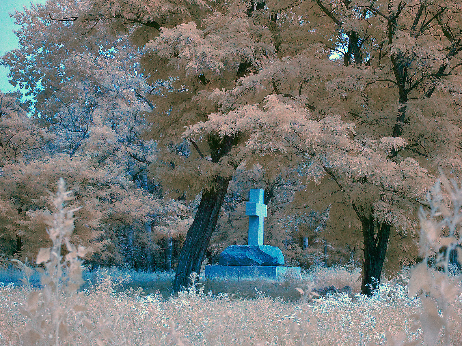
tsuki - your photo has a dreamlike quality to it. I am partly colorblind but even I can tell that the colors have been altered significantly. I like the way it looks, and I like how you've framed the primary subject matter right between the two trees. I only wish those two foreground weeds were not there.
Sorry judging took so long! I wanted to get to every photograph though. Please don't take my comments too seriously, I am no pro! But I do appreciate constructive criticisms of my own photography, so I would hope everyone else does too.
Without further ado, your winners for this tough challenge:
3rd: Tsukiouji
2nd: Jheu02

1st: ceericks
Congrats to the winners. Corey, you have won the honor of judging the next theme, our final look at architecture for 2010 with architecture: streetview.
Thanks for participating everyone!
The winning photo will be added to the Project 52 Public Gallery momentarily.


 Post #1 by DanLoc78
 Similar Threads


