Forgot Password
Pentax Camera Forums Home
 

Reply
Show Printable Version 7 Likes Search this Thread
2 Likes  
P52-3-15 Colour: Red WINNERS!
Posted By: jheu02, 11-15-2010, 11:55 AM

First off, thanks everyone for participating and making my job of judging tougher than expected. Throughout the week I enjoyed looking at the entries and entering my own, only to later find out I'd be judging. So when I went back through the photos several times, I kept going back to this statement (emphasis mine):

"we want to explore what colour does in our photos..."

I also would look at the entry for what my eye was drawn to, and whether it made me think of Red and its being a necessary color, or could some other color also have replaced it. Obviously, someone could have posted a shot of a red piece of paper and I would naturally think of the color, but other photography ideas like subject, composition, focus, etc would also have to come into play. With my thought process now in your heads, here's the comments in order of posted pic and then the winners:


Rense: very good color and composition, and I like the OOF end of the stem of the subject leaf. Unfortunately, the red here, though ever present, just becomes a background...my eye keeps getting drawn back to the sweet gum (?) leaf. Bonus points for early entry.

bbluesman (Mark): Intriguing shot of the drum and stick. Understated red but I kept going back to this shot. My eye did keep getting drawn between the OOF red to the in-focus yellow rope though, and I feel the photo would have been equally good if the end of the stick was a different color. So, though I love the shot, overall I didn't feel the red "made" it.

Tamia: very nice composition and definitely a red subject! I liked your use of DOF and lines to draw me into the shot where I also found more red. Invites one to reach out and eat one (only to find the tart taste of a crabapple ).

wllm: Nice composition also with the leading lines of the red/while bike rack leading to (fortunately) a red bike. Don't know if you purposely placed the bike there, or it just happened to be there, but good eye for catching it. The background is a bit distracting though, and though the red contributes, for me this is a great "leading lines" type of shot.

Paleo Pete: I like your lady bug, but I would have liked to see a tighter crop, getting rid of most of the right side. The OOF bokeh on left is a good background to highlight the red bug, but I found that my eyes kept getting pulled away from our red friend by the green leaf and orangish stem.

Bramela (Bruce): I also enjoyed this photo in your SiN album. Similar thoughts as Rense's shot though. While the predominant colour is the red/fuschia scheme, it falls into the background and for me this is a great capture of the swirling details of the flower stamens (or is it the pistels...I never was good at remembering flower parts). Eyes go between these and the moth.

SpecialK (Kyle): Nice '57 Chevy, and it's red, but the background throughout the frame is distracting. The red just can't overpower it for me. I think this could be a good subject, but from much closer and at a different angle to highlight a smaller portion of the car, and deal better with the background.

jmschrei (Joe): The use of red here really does draw the eye (all Pentax biasses aside). But that's also due to wise choice of DOF and the greyscale background subjects. They're just dark enough and OOF enough to not be distracting from the primary red Pentax, and secondary red Manfrotto logo. Another case where, had Pentax chosen Yellow, this shot would work well.

Iris: Another fine subject for red. I liked your choice of DOF to really minimize the potential for distraction, AND that it's basically all darker and in the same color scheme so that the eye keeps getting drawn back to the red berries. A minor nit would be that the two OOF brownish leaves to the left of the secondary berry could be a little darker by either burning in or a mask and curves adjustment, but they're OOF enough to not distract too much.

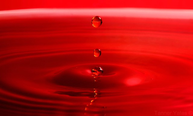
yeatzee (Tanner): Excellent job. Whether the red is from a large bowl that held the water, or simply a product of post-processing, it's very effective. Placement of the drops centered, allows an almost mirror image for the ripples. The drops are perfectly frozen in time and lighting is spot-on. Though I imagine the shot could look great in other colors, there is definitely something about the red that makes it stand out. Watch for a couple hot pixels in there.

photolady: Another SiN shot entered in P52. Depth of field and dark background remove the distractions from your subject, and the red, while present, is a definite supporting color. Overall though, I don't feel that the red here, if replaced with some other color, would be missed.

jax zee: A red rose definitely fits the color theme and the soft focus is definitely appropriate to the softness of the petals. Also, a nice control of background by limiting its physical presence and making it OOF. I can't really fault the photo for anything, but it also doesn't really speak to me either, and I don't know why, because I do like photographing flowers. Perhaps it's just a bit "too normal" of a vantage point that makes it almost seem common to me.

DanLoc78 (Dan): Had it been taken with a Pentax.... Japanese maples are a favorite red of mine. I also like the secondary red, the control of the sun flare and OOF areas. The red here definitely helps IMO since, if this had been say a silver maple with yellow leaves), they might wash out a bit more with the bright background.

virgilr: Composition! Curves! Lighting! DOF! This shot has it all. Overall great shot of an everyday item. The red definitely adds to the warmth of the shot.

casil403 (Lisa): Definite use of red here, but unfortunately, for me the shadows detract a bit. I think also the close crop, while probably needed to highlight the red, takes them out of the greater context of setting, which you described in the text about Remembrance Day. Not being there for the shot I can't say for sure if you could have managed it, but I would like to have had the red poppies in the context of tombstones/fields to tell the story w/o using words.

StevenVH: The red of the lone berry does draw attention to your subject, but the bright background and small relative size allows my attention to be drawn away again. A nice minimalist photo, but I don't think the red is a necessary element. It would have been equally good with a brown seed pod, or single yellow leaf for example.

VaughnA: Interesting story about the aloe bloom, and a nice use of red to provide the backdrop for the shot. The rec compliments the green nicely. I like the placement of the bloom with its entry lower right and sweeping up to the upper left. Again, another good minimalist photo.

mummarazzi: That is definitely a red building. Unfortunately, that's all it is. The photo doesn't really speak to me except for looking abandoned. I actually think this could work as a B/W photo though.

ovim (Oula): Who knew that a ball of red yarn could look so interesting. Great use of focal point, DOF, and neutral background. I almost wish there was an OOF cat or at least the paw in the background to finish telling the story.

ceericks (Corey): Good on ya for having your camera at the ready. A couple minutes later and the leaf could have been blown away leaving you without a shot. Nice focus and interesting bokeh in the reflection, but I have mixed thoughts about what the red really does here. Perhaps it's the blue that makes the red so-so. Go get your car painted and try again . Another good example of minimalism though.

MikeS (Mike): Traffic! Movement in the frame is evident in the 10" exposure, but I would have preferred to see it leading into the screen vs horizontally across it (leaves it a bit flat). While red is a primary color here, you've got a bit too much competition from the off-white road(?) band on the bottom third of the photo. Definitely has potential shot a little differently.

So now I have to choose...(it was easier giving comments than actually picking who would get the top spot...I was torn).

Honorable Mention: (a tie)

Tamia


Iris


3rd Place: VaughnA


2nd Place: yeatzee

1st Place (and next week's judge): virgilr

Views: 6,481
11-15-2010, 05:52 PM   #16
Site Supporter
Site Supporter
Tamia's Avatar

Join Date: Dec 2009
Location: Here, there, and everywhere.
Photos: Gallery | Albums
Posts: 4,384
Thanks for such an excellent job commenting and judging, John, and thanks for the HM! Congrats Iris, VaughnA, Tanner, and Virgilr!

11-15-2010, 06:46 PM   #17
Site Supporter
Site Supporter
ramseybuckeye's Avatar

Join Date: Apr 2009
Location: Hampstead, NC
Photos: Gallery
Posts: 17,292
I couldn't find any red subjects during the time frame of the contest, I jsut wasn't creative enough. Nice job everybody! I did not envy your job here John, but you did well!
11-15-2010, 08:01 PM   #18
Site Supporter
Site Supporter
jmschrei's Avatar

Join Date: Apr 2010
Location: Calgary, AB
Photos: Gallery | Albums
Posts: 4,884
Wow that was a fun theme. Awesome entries and great job judging John. Congratulations to Virgilr, Yeatzee, Vaughn, Tamia and Iris!
-Joe
11-15-2010, 08:47 PM   #19
Otis Memorial Pentaxian
photolady95's Avatar

Join Date: May 2009
Location: Cruising the forum watching his back
Photos: Gallery | Albums
Posts: 12,712
Congrats to the winners!!

Thanks John for the comments on mine and for judging this.

11-15-2010, 11:31 PM   #20
Forum Member
jax_zee's Avatar

Join Date: Jul 2009
Location: Milwaukee, WI, USA
Photos: Gallery | Albums
Posts: 78
1st off, I'd like to say congrats to the judge who did an exceptional and well thought out critique of the individual participants in this comp! I've just begun participating in these events and can truly appreciate the effort and in depth thought that goes into the decision making...and of course the final decision. All great works and a BIG congrats to the finalists and the runner(s) up!!!
11-16-2010, 04:38 AM   #21
Site Supporter
Site Supporter
Rense's Avatar

Join Date: Dec 2008
Location: Zetten - The Netherlands
Photos: Gallery | Albums
Posts: 9,050
I must say this was one of the themes I wasn't sure of..... It seemed to simple, and as if it hadn't too much to offer for the P52 challenge. But seeing the entries and the judging, I think even these simple themes are good to do....

I really, really loved the total set of entries!!
11-16-2010, 05:51 AM   #22
Site Supporter
Site Supporter
jheu02's Avatar

Join Date: Aug 2009
Location: North Carolina
Photos: Gallery | Albums
Posts: 3,027
Original Poster
QuoteOriginally posted by Rense Quote
I really, really loved the total set of entries!!
I wholeheartedly agree! It was very tough to judge because each shot had something unique about it that I liked, whether subtle or bold. So part of the final decision came down to, "could I enjoy this photo if the red was replaced by some other color". And thus, there were some that I just couldn't see enjoying as much without the red.

11-16-2010, 09:32 AM   #23
Veteran Member
Paleo Pete's Avatar

Join Date: Jun 2010
Location: Texas
Photos: Gallery | Albums
Posts: 2,880
John - Thanks for the critique, and a great job of judging a really tough one. You KNOW I should have won right? Just kidding, of course.

I wish I could have cropped the ladybug tighter, I wanted to but that was a small as I could get without introducing noise. Ladybugs are pretty small...

Great job, I'm glad I didn't have to make the choices you did.

And of course the day after I posted, I went out and found gobs of other red subjects...

Great pictures everyone, I liked all of them, and virtually all of the winners were awesome. I don't know how John ever decided...I agree with his choices though, Yeatzees water and virgil's cup were both just amazing. I would not have been able to decide between those two, a quarter would have been flipped...
11-16-2010, 09:43 AM   #24
Veteran Member
StevenVH's Avatar

Join Date: Jan 2009
Location: N Carolina, USA
Photos: Gallery
Posts: 475
My thanks and congrat's too. Well done all!

cheers
11-16-2010, 04:41 PM   #25
Veteran Member
yeatzee's Avatar

Join Date: Feb 2009
Location: Temecula
Photos: Gallery | Albums
Posts: 3,675
QuoteOriginally posted by jheu02 Quote
yeatzee (Tanner): Excellent job. Whether the red is from a large bowl that held the water, or simply a product of post-processing, it's very effective. Placement of the drops centered, allows an almost mirror image for the ripples. The drops are perfectly frozen in time and lighting is spot-on. Though I imagine the shot could look great in other colors, there is definitely something about the red that makes it stand out. Watch for a couple hot pixels in there.

2nd Place: yeatzee


1st Place (and next week's judge): virgilr
I didn't even realize this was a contest Thanks Jheu! Glad you liked it.... it was actually my first attempt at water droplet photography Quite fun I must say, and VERY rewarding.

Congratz to virgilr! Fantastic image, with definitely a "red mood" which prior to today I did not think was possible
11-16-2010, 07:29 PM   #26
Veteran Member


Join Date: Feb 2008
Location: Lachine, Quebec, Canada
Photos: Gallery | Albums
Posts: 453
What wonderful comments and a spirit of sharing here! Makes me all verklempt.. ;-) I seriously didn't think I had a chance in h-e double hockey sticks with all the shots that had posted previously, especially you, yeatzee! Same feeling I get when I listen to Protest the Hero (indi prog band from Ontario)- who are a group of really young musicians with so much talent and I've been playing guitar for 25 years...

I just wanted to embrace the tones of red- I'm more of a high-contrast kindof guy, and to me reds into their depth and the darker tones are what I find most intriguing- It was fun because I just kept shooting and shooting and moving the object and light and camera angles until I felt like I was falling into the red, with the bold curve of the handle of the cup there like a lifeline. I really tried to let my feelings get caught up in what I was seeing in the viewfinder, not being too analytical. What a joy that I get to share all my weirdness with such a cool community!
11-16-2010, 07:58 PM   #27
Site Supporter
Site Supporter
jmschrei's Avatar

Join Date: Apr 2010
Location: Calgary, AB
Photos: Gallery | Albums
Posts: 4,884
QuoteOriginally posted by virgilr Quote
What wonderful comments and a spirit of sharing here! Makes me all verklempt.. ;-) I seriously didn't think I had a chance in h-e double hockey sticks with all the shots that had posted previously, especially you, yeatzee! Same feeling I get when I listen to Protest the Hero (indi prog band from Ontario)- who are a group of really young musicians with so much talent and I've been playing guitar for 25 years...

I just wanted to embrace the tones of red- I'm more of a high-contrast kindof guy, and to me reds into their depth and the darker tones are what I find most intriguing- It was fun because I just kept shooting and shooting and moving the object and light and camera angles until I felt like I was falling into the red, with the bold curve of the handle of the cup there like a lifeline. I really tried to let my feelings get caught up in what I was seeing in the viewfinder, not being too analytical. What a joy that I get to share all my weirdness with such a cool community!
This is what I enjoy so much about Project 52. The topics and themes allow you to push yourself out of your comfort zone, try out new techniques and explore themes in a creative way. I really feel that I am competing against myself more than anything while finding inspiration in the varied approaches others take to the same theme. And yes, it is a competition but you will find out very soon that winning and thus judging the next week's theme is infinitely more difficult than simply entering!
-Joe
11-16-2010, 08:54 PM   #28
Veteran Member


Join Date: Feb 2008
Location: Lachine, Quebec, Canada
Photos: Gallery | Albums
Posts: 453
So true, Joe- for me, my comfort zone isn't really defined, every time I pick up the camera I'm outside of it!

I know what you mean about judging- I've had this task before me a few times before, and it is NO walk in the park- shooting is much easier than judging!
11-17-2010, 08:42 AM - 4 Likes   #29
Site Supporter
Site Supporter
jheu02's Avatar

Join Date: Aug 2009
Location: North Carolina
Photos: Gallery | Albums
Posts: 3,027
Original Poster
QuoteOriginally posted by ovim Quote
Congrats to virgilr, yatzee, VaughnA, Iris and Tamia! And great judging/comments jheu02 (+rep)!
I'm glad all seemed to appreciate the comments and judging. It was a tough challenge! But only one +rep. Sheesh!

Guess I'll just have to do some lens reviews.
11-17-2010, 09:19 AM   #30
Veteran Member
DanLoc78's Avatar

Join Date: Apr 2008
Location: Philadelphia
Photos: Gallery
Posts: 915
QuoteOriginally posted by jmschrei Quote
This is what I enjoy so much about Project 52. The topics and themes allow you to push yourself out of your comfort zone, try out new techniques and explore themes in a creative way. I really feel that I am competing against myself more than anything while finding inspiration in the varied approaches others take to the same theme. And yes, it is a competition but you will find out very soon that winning and thus judging the next week's theme is infinitely more difficult than simply entering!
-Joe
winning certainly does come with a price, doesn't it?
Reply

Bookmarks
  • Submit Thread to Facebook Facebook
  • Submit Thread to Twitter Twitter
  • Submit Thread to Digg Digg
Tags - Make this thread easier to find by adding keywords to it!
background, bit, color, dof, eye, leaf, oof, photo, shot, subject

Similar Threads
Thread Thread Starter Forum Replies Last Post
P52-3-16 Colour: colourful Rense Weekly Photo Challenges 63 11-22-2010 02:04 PM
P52-3-15 Colour: Red Rense Weekly Photo Challenges 46 11-16-2010 03:23 PM
WINNERS P52-2-38: Automobiles Rense Weekly Photo Challenges 10 04-12-2010 09:35 AM
WINNERS - P52, Opposites DanLoc78 Weekly Photo Challenges 9 02-12-2010 03:34 PM
P52-2-27 Frame it WINNERS Rense Weekly Photo Challenges 9 01-20-2010 06:56 PM


All times are GMT -7. The time now is 02:36 PM. | See also: NikonForums.com, CanonForums.com part of our network of photo forums!
  • Red (Default)
  • Green
  • Gray
  • Dark
  • Dark Yellow
  • Dark Blue
  • Old Red
  • Old Green
  • Old Gray
  • Dial-Up Style
Hello! It's great to see you back on the forum! Have you considered joining the community?
register
Creating a FREE ACCOUNT takes under a minute, removes ads, and lets you post! [Dismiss]
Top