An outstanding collection of images based on a theme that is broad in its interpretation. As Rense rightly predicted this one would be tough to judge so I tried to focus in on the impact of all the range of colours in the images, as well as the representation of a broad range of colours (“rainbows of colours are obligatory”, said Rense!). Composition and emotional impact played a role in my judging, as well as the expression of a unique view of the subject at hand.
A few quick comments on each image, from my own, subjective option:
Ash- Colour and form, moving together in a wash of geometry, with leading lines that meet but break out of the conformity of composition. A wonderful abstract image with a juicy-fruit taste! Wonderfully done. I would have liked to have seen a bit more play of intensities and contrasts of colours of this subject with a bit of PP work, but all in all another shot to be proud of!
Bbluesman- I admire the composition and subject in your shot- however I felt that the colourful aspect of the shot was overwhelmed by the character of the subject, my eye being drawn to the face and eyes of your subject, which was marvellously captured! Perhaps an image of the subject in full costume with more colours throughout would have made the range of colour more of a contribution.
Bramela- Excellent close-up image, alive with detail, nicely composed. I felt however that the range of colours represented wasn't up to the level of those the competition demanded.
DanLoc78- How fun! These guys looked camped out waiting for their owner to come home! This image just needed something to draw me in a bit more, and the 50/50 split on the horizontal of the image was nicely balanced, but tended to overshadow the subject(s).
dunerunner- Excellent tones and range of colours I admire the strength of the composition to the right. My eye was absolutely drawn to the subject of the main leaf and I felt that the only thing lacking was a broader range of colour in the subject, although what you captured here is something that has subtle tonal ranges that are very evocative.
Iris- Wonderful gusty image! I loved the glowing light, the figures looking down from the illuminated perch. I kept looking into the image for it's details and very much enjoyed it. Only detracting factors for me where the branches to the right side of the image, and I would have preferred that the subject (pagoda) would occupy more of the frame, emphasizing the intense colours present.
Jheu02- Colorful intense image. I felt that the zoom-blur effect in all detracted from the composition- nevertheless, the image does exhibit ingenuity and strong use of colour!
Jmschrei- This image just needed a bit of refinement, finding one clear aspect of the scene before you and emphasizing it in the photo. Perhaps a tighter shot from a lower angle, with the fan billowing out the curtain?
KarenH- I really enjoyed this photo! Wonderfully composed, very colourful The only thing that I find a little distracting is your reflection in the bell, as it takes away a bit from the imaginative aspect of your image.
MikeS- Great repetition and form, and most definitely hitting the mark with the subject of the competition! Another great abstract- and to make it more of an abstract than a photo of optical media, maybe a bit more time in PP to take me someplace else? Remove the real from the shot, maybe.
Mummarazzi- The only other portrait in the competition, and wonderful rainbow colours abound! I would have loved a few other shots of this from different angles, again, to take my eye more into the colours that are surrounding the child than the child itself- I kept coming back to the expression in the mirror.
Ovim- You hit my soft spot- I have a big Maine Coon Torby just like this cat! Well composed for your concept of “dreaming in colour”, but the colour needed to be a bit more of the star than being quite so dreamy. Still, a great pet shot!
Ramseybuckeye- Another great entry in the “nature” department for this competition. I just would have liked to see a broader range of colours represented, and a bit more of a definite subject in the image. I think a crop to the left side of the image where the broadest range of colours live in the shot would have pushed this one up a notch.
Rense- Excellent composition, another wonderful abstract image. This one just falls short in the refinement of details for me- I would love to see those rays of colour coming from a pure black space (without the highlight edges of the interior circle of the CD) – so that the reflective bead is what my eye is immediately drawn to, in a pool of intense colour That being said, an arresting image brought forth again!
Spongefingers- I so admire this image for it's absolutely out-there subject matter, careful DOF to highlight the most colourful elements and composition that pulls the eye right in to this little mysterious scene. I really would have liked this shot over a more neutral background, however, to make the colours “pop” even more. One last tiny detail that would have made this shot rock even more is if the large brown shell chunk (to the right) would have been moved into the background and the large green shell (in the background to the right) been brought forward. Still, a wonderful display of colourful elements from your unique perspective!
Tamia- I so enjoyed the tableau feeling of this image, and all the elements and the subject of the photo fit the theme of the competition to a tee! This image just needs a touch of refinement- I would say removing the bin of paints would help tremendously, bringing the water jar/glass into it's place. This is a shot to be proud of, and I would love to see a bit more work on this subject, trying a few different perspectives.
Tsukiouji- Another outstanding tableau, carefully prepared and executed with lovely balance of the colourful subjects within the composition. I would have maybe liked to see a “void” space in behind the camera instead of the camera case, to bring more attention to the vibrant colours in the image. Nicely done!
VaughnA- Although not the most intensely colourful image in the competition, the use of the range of colours coupled with the composition and having the colours work in a defined role in the image works exceptionally well. The subject isn't perfect ( a battered and dried up rose), and the image provokes questions as to why the rose has been left so hastily and uncared for, as well as having great technique to draw the viewer in. So well done at many levels.
Wllm- got the Pantone swatch shot in first! This is another fantastic abstract, shot at the perfect angle, perfect DOF and the composition with it's sweeping lines so draw the eye in to a pleasing shot- and, as per the competition, a true rainbow of colours!
So, wow, this wasn't easy at all, but here are my picks for this competition:
Honourable mention (two, because they both stand strong on their merits!)
Tamia  wllm
wllm 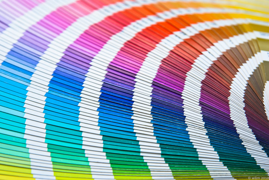 Third place: Ash
 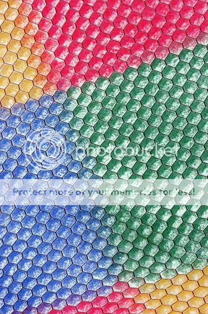 Second place: Spongefingers
 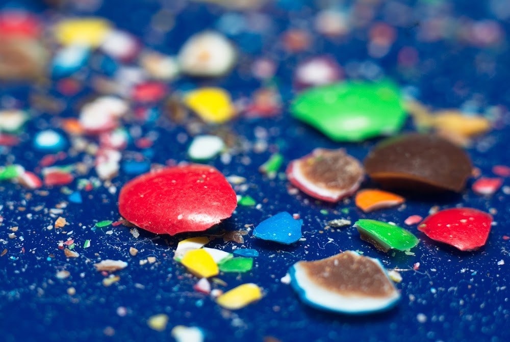 First place (and next weeks judge): VaughnA


 Similar Threads


