Thank you to everyone who entered the PROJECT 52-6-3-Color - Blue contest this past. I've learned from this experience and hope to give you inspiration to keep competing.
My personal critiques
@normhead: Nice a sharp shot. The background contrast though isn't appealing as it's too mottled and grey. A straight profile of animals seems too common. A tilt or head lean to capture a bit of the left eye would've really drawn this picture to me. Positioning of the photo is excellent.
@mtux: You taught me Single In. Thank you. I think the positioning needs to be runner on the left and viewing to the right for greater impact or personal connection. Also, there seems to be too much equality in the spacing above and below the the runner. Crop the top or bottom off some to cut into the runner more. Maybe crop off the left half as well to really draw the eyes to the runner, which does seem to be your real focus.
@rbefly: Coolio. You had me going huh trying to sort this one out. Could've been carpet. The problem is the twigs make it feel dirty. I also think the bottom sunshine is distracting of the shading you mainly were trying to capture. Try cropping it out. Good color accuracy.
@tessfully: Sweet, beautiful nature formation. Love the clarity. Getting closer for more detail and setting your focal point or visual center for something not picture centered would give more impact.
@Tamia: Nice framing, position, colors. I think shooting this during the golden hours would be a nice visual impact.
@noelcmn: This is a tough shot to pull off. Center/center is typical. To much side to side looks off. I feel it's so close, but not sure how to adjust your positioning for more impact. When seeing this though, I'm not sure what the story is being told. I'm wondering what the view from the other direction looks like. I wonder if a setting or raising sun silhouette could've given this more impact. Maybe more starkness in the background.
@ramseybuckeye: I'm not always looking for these see throughs. When I catch others doing them, I'm happy for them. I think the fore hole is too centered in the image. I wonder how focusing on the back side of the fore hole would do for the visual impact. Was there anything of interest that could've been caught through the hole by changing your vertical plane? I finally caught that hanging bark on the right. I think shift the picture are more to the right and up so that the hole and the bark become abstract art would liven this up.
@patrick9: This leaves me wondering what it is initially. Soon, I'm distracted by the blurriness of the left draped fabric. The backlighting is kind of cool, but maybe should be coming more across the silverware handle. Catching the text in the acrylic is slick. Because this is a long object, I'd think shooting portrait in the same direction would carry more emphasis. The landscape positioning lessens the visual impact. Rotate the camera 90º from this same point, keeping the bottom left how it is now and experiment with vertical positioning and angle.
@Maria27: Childhood again! It's fun to see adults shooting toys. The view seems too flat, maybe more angle down or come up would improve perspective. I find the aperture too in between. The out of focus aren't out of focus enough or the picture as a whole isn't focused well enough. Turn the heads of the little men into the camera lens with a body twist to boot. Bring some more humor out of this.
Winners
Third: @mtux 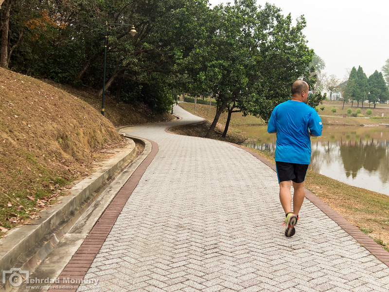 Second: @Tamia
  First and next P52-6 judge: @tessfully
After seeing these, I thinking I'm readily of the step closer school. See next post cropping examples.


 Similar Threads


