First of all I would like to thank everyone who entered this week's competition. It was a great fun for me to review your pictures and to discover more and more new aspects the longer I looked at them. Here are my thoughts on your pictures:
jcdoss:
It is good that part of the wood is also sharp, because so you have the contrast between the rough wood and the smooth red stuff (how do you call that in English?). Glossy red - matt wood colour, sharp match - smooth bokeh... good use of contrasts.
Actually, the shiny red heads in your picture made me look at my matches at home. I thought the matches you get here look different - but they don't. I just never had a close look before. That is an important thing about macro photography: reveal something new and surprising in something you think you know. A simple every day object turned into a grat macro photo. Well done!
Tamia:
You had to get creative, and I think it turned out very well! The sparks look like an actual firework. With a black background, I would believe it is a real one. However, it is good that the background is not black. I think exposure is perfect in your picture. The sparks are bright, but not too much. The sink and your hand are visible, but not too dominant. They give the picture a slight surreal feeling, which I thing improves the picture. It makes it even more interesting.
patrick9:
Give my regards to your neighbours, good that they decided to burn some wood. Campfires fascinated men for several thousand years, and it is not different for me. Sitting at a fire and staring into the glow brings me into a very special mood where the mind gets blank and everything around me disappears. Your photo had just this effect. Reviewing your picture, I cought myself getting into the staring-at-the-glow mood. Thank you for bringing a campfire into my home! The intact wood in the foreground with the flames licking above is a nice extra touch.
Bill2849:
Yours is a simple picture, and this is meant as a compliment. Reduced to all that is neccessary, there is nothing that could distract the eye. I like that the flame is not in the middle of the candle holder, it underlines its roughness. The structure of the glass distinguishes the candle holder from the flame. At the same time, the glass transports and augments the colour and the warmth of it. I like it!
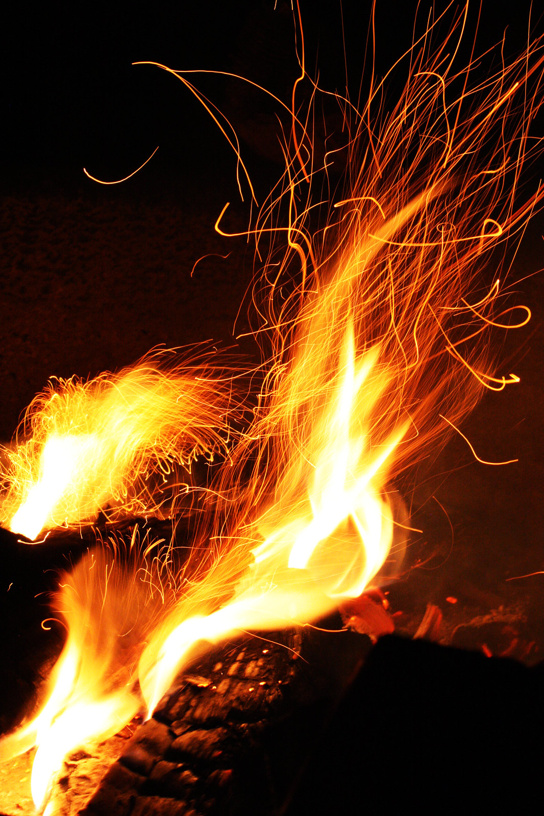
scomatic:
Your picture shows this week's theme in its purest way. The flames, the fire is the art. The wood or charcoal is very dark, reduced to background, leaving all attention to the flames. And they are indeed spectacular, extending into lines of glowing particles. Composition, balance of light and colour is perfect in your picture. It is very beautiful!
mtux:
I do so much like this picture! The shallow depth of field, the smooth bokeh, the beautiful colours, the reflection on the underlay... If I had to critisize anything (well, I have, it's my job as this week's judge) than - considering this week's theme - that the focus of the picture is on the rose and the light comes second. But that is critizising on the highest stage. It is a great picture.
Helena:
the german word for these things is "Wunderkerze" which means literally "candle of wonders". Here they are usually only used at new years eve, but sometimes restaurants or ice-cream parlours use something similar to decorate their food at special occasions (like birthdays).
Considering that you had only one sparkler I can only say wow. Light is perfect, good composition, and the spark on the left flying downwards gives a nice extra touch to the picture. A pity that the stick itself is a little unsharp, but again, for only one try it is very well done!
noelcmn:
In case you got the idea for your picture from Helena, you owe her a big thank you, because the picture turned out to be great! The glowing stick is an interesting contrast to the sharp lines of sparkles flying away. I have some association looking at your picture, but I cannot nail it what it is exactly. So I keep thinking and thinking... thank you not for this!
 IsaacT:
It shows two matches, right? You have indeed captured some beautiful flames. The swirling flame on the bottom right is really very nice. I also like that part of the flames is in focus, and the large one in the upper part is slightly not. It adds some depth to the picture, making it more interesting. It is also nice that the two matches look different, one black and one reddish glowing. It is one of these pictures that get more and more interesting as longer as you look at it. I like that!
Well, so much for the fun part. Enjoying your pictures is one thing. But now I have to decide on a winner. That is going to be the cruel part for me. How to decide between all these nice pictures? But it has to be done, so here are this weeks results:
First, two
honourable mentions of pictures, that had not enough "fire" for me to win - considering this week's theme - but are still great pictures:
jcdoss: I even learned something about my matches!
mtux: I am so in love with this picture.
And now...
3rd place Tamia: I do so like the slight surreal touch!
2nd place Bill2849: Simple and beautiful.
1st place and WINNER scomatic: Art of Fire in its purest beauty!
Congratulations!


 Post #1 by Dieterson
 Similar Threads


