Thank you everyone for participating in this challenge. I enjoyed very much looking at your pictures! Judging brings some unpleasant tasks - especially deciding on just one winner out of many great photos. However, it means also that for this one challenge I take my time for every picture and see where my thoughts and emotions go.
Here are my comments for your entries:
Rimfiredude:
I like your picture because it shows what we can do today. When my parents where young, tomatoes in winter were unthinkable, today it is such an ordinary thing that no one spends a thought about it. The colors - the warm red of the tomatoes and the cold white of the snow - underlines this, and it is aesthetically nice.
Outis:
You gave us a good example for a very practical use of an arrangement, displaying the scale with the pin. I like that the details of the fabric become visible in the macro shot. Looking at your photo, I noticed that I became more and more fascinated by the pin head. The reflections on the head reveal fine irregularities. The fine details of the fabric looked suddenly very coarse against this.
K David:
I recently did a shot of a single floating dandelion seed, so I can quitewell imagine the effort you put into this picture. You wrote that it took three days to get this shot. I believe it. Nevertheless, it was worth the trouble. It is a great shot! Very good composition, the dandelion is sharp and has no seed left, part of the seeds sharp and the rest melts more and more into the background. It is a timeless and very dreamfully picture. I like it very much!
charliezap:
You call it a disarranged arrangement... I would say, if anyone had to arrange a tipped over glass of toothpicks, it had to look exactly like that! Both the toothpicks and the counter top are colorful, but in a different way. Still (or even because of that), they go very well together. The lights and shadows on the top create interesting additional effects. Even though it is a very colorful picture, it is not too much, you found a good balance, which I like!
Tamia:
Very creative idea! I like the light setting you chose for this picture. The sparks look very fireworky, but with your hand and the sink slightly visible - in perfect balance to the brightness of the sparks -, the picture gets an additional dimension. It looks slightly surreal, with I think is a very good thing!
atupdate:
Thank you for sharing with us how you set up this shot! Your entry shows that arranging a shot can also mean to create a perfect naturally-looking picture. Besides looking natural, it is simply a very beautiful shot, too... in the end, this is what really counts, and your efforts were well worth it! I like it a lot.
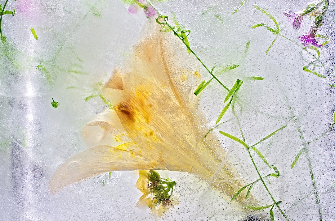
tessfully:
I really hope you get bored more often...

Your picture is very beautiful and very creative. The frozen sparkling water is a perfect material to embed flowers. It enhances and underlines the warm and fresh colors, while it contrasts the spring time feeling in a wonderful way. It seems to me like a relict of an earlier time, where coldness and ice have overcome the delicateness of nature, at the same time preserving its volatile beauty. I like it very much!
smf:
I think it is a very nice photo. The fine, sharp details of the petals contrast well with the blurry background. Your picture is composed of the three basic colors red, blue and green, covering the whole spectrum of visible light. This gives a very saturated impression, and I like especially that all the colors are represented more or less equally. Using green, red and blue, I often find that the result is often too heavy, too saturated, but not in your picture. It is pleasant to look at, and still you managed to keep the colors vivid. Well done!
SpecialK:
I like the colors. You wrote this is a warmer version. I do not know the other version, but in thos one the tone is very pleasant and seems very suitable to me. I think you did a good job picking a frame for your shot, the composition is very good. The sharpness highlights the five cent coin and the liberty lettering on the left coin, emphasizing nice details in the picture. I also like that some coins are cut off. So, all in all, I thing it is a very good picture!
daacon:
Fruits are of course a classic when it comes to still life pictures. Nevertheless, it has to be done well. I think it is good that you decided to go with two fruits. Two is more interesting than just one, but more would have been likely too much for the frame you picked. I also like that you can see both the apple and the orange form outside and inside. The glittering on the cut surface and the water drops on the paring gives a fresh and appetizing look. I would like to eat that now.
noelcmn:
I like the black background. It fits well to the colors of the cups, and puts the focus on them. given that there are seven cups, a background would likely be only disturbing. The way it is, the focus is on the similarity of the cups - which provides the structure of the image - and the little details that are different between each cup - wich makes the picture more interesting. Besides that, I find it simply very beautiful from an pure aesthetical point of view!
And now to the difficult part: there were many nice pictures, and quite often hard to compare because so different in some ways. But in the end, I came up with these winners:
3rd place
noelcmn - Communion Cups
2nd place
K David - Dandelion Seeds
1st place
tessfully - Suspended in Ice
Congratulations!


 Post #1 by Dieterson
 Similar Threads


