 Originally posted by GregL564
Hey Greg, I consistently notice the wonderful colors and tones in your images. To me, they are just very pleasing and natural looking--not oversaturated or too dramatic. One day would love any processing tips you could share. Thanks!
Thanks. Very briefly what I try to do is make the scene in the picture look like it does to the human eyes, only a little better. My main technique in Lightroom is to try to raise shadows while at the same time preserving the contrast of the image. I often use the tone curve to achieve that --- never global contrast. I also never use overall saturation, but use vibrance instead. Even then, generally speaking, saturation achieve through increasing midtone contrast generally looks better than saturation achieved through vibrance or other direct methods. I'll also sometimes apply contrast with brush or graduated filters.
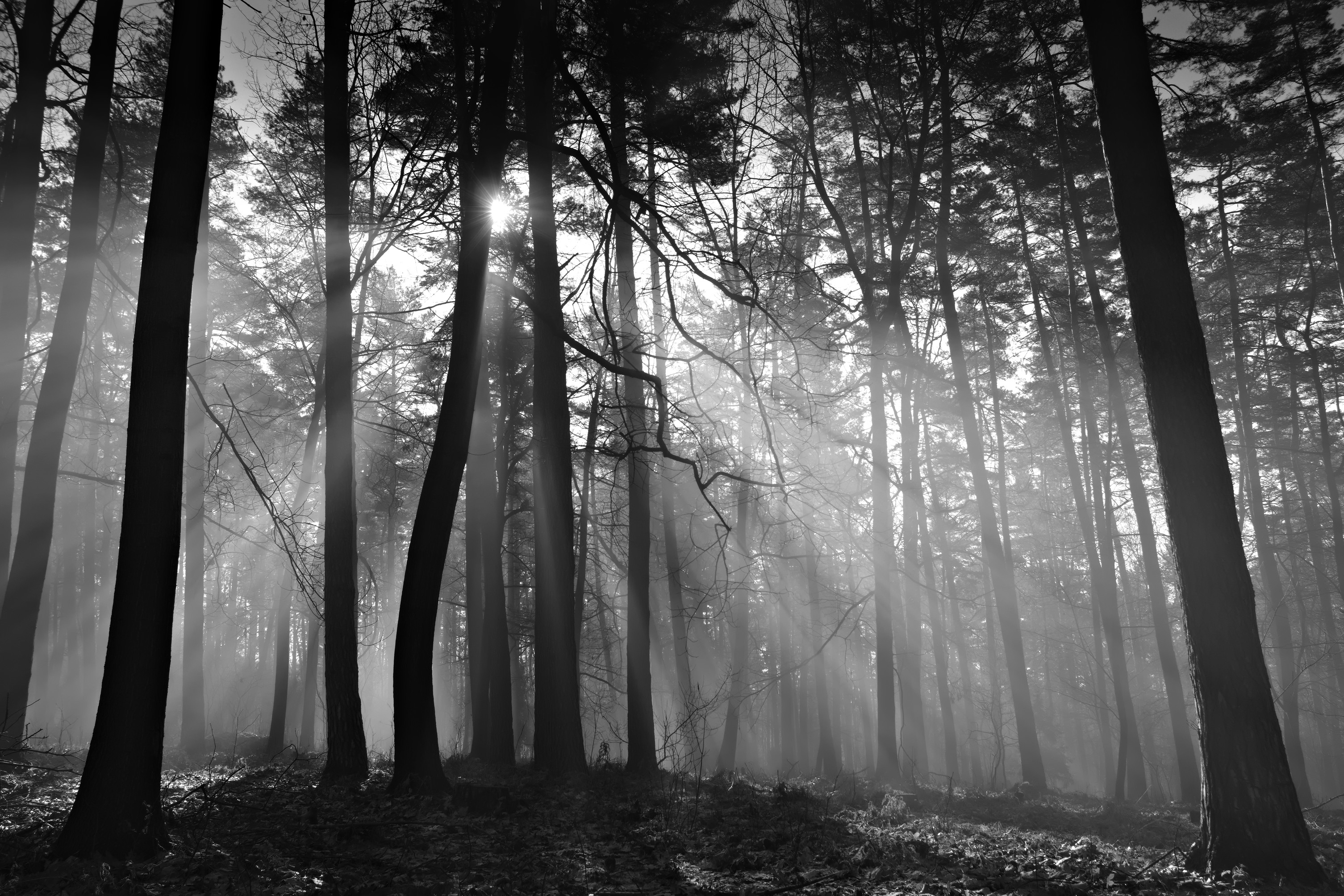
Here's another image shot with the KP and the DA 21:


 Post #211 by northcoastgreg
 Similar Threads


