This thread is not for the SMC version, which already has a thread. This is the older, first version of the 17mm f4.
This lens has SIGNIFICANT limitations. My copy may have more than others due to some torroidal scratches on the front element around the edge. They're hard to see, but seem to have some ramifications for contrast.
The first thing to know about this lens is that it's basically amazing for ultra-close work. My copy is at itse best when it's focused within two feet of the subject. In fact, at less than 18 inches, it is about as sharp as many of my best lenses (SMC-K 50mm 1.4, 77mm FA Limited, and 31mm FA Limited) Yes, that's some incredibly company to place this lens with. That said, it only performs that well up close. Add to that the fact that lighting has to be optimal for this lens and it's not quite as great as the others.
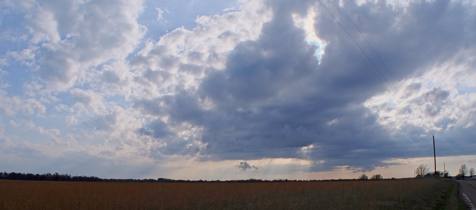
But it works well at mid-range distances, too. It's not as sharp further out, but it has nice contrast and detail. On an APS-C sensor, there's still a good deal of distortion, but not the full wrapping effect that occurs on 35mm film. Understand that and find subject with which you can work around that and you'll be generally happy.
This lens is AWFUL to meter, however. Wow. I shot about three hours of video with it today on my K-3 and the contrasts are really rough. Part of that is that it was in a contrasty setting, but part of that is just how much of the scene this lens takes in. Last night I took some test video and tat's included in this post.
Taken with the Pentax K-3:
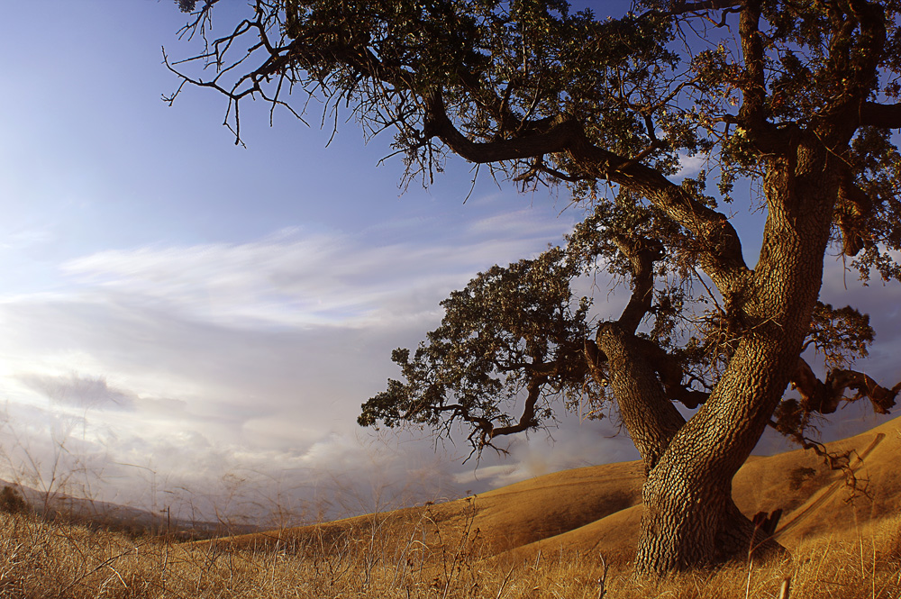
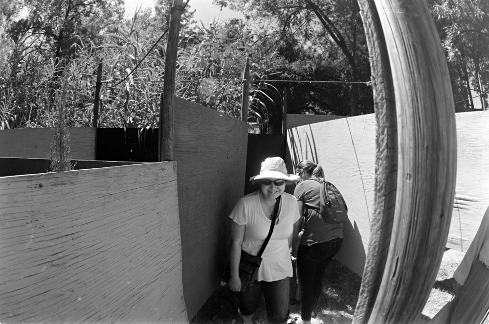
This is along the lines of what I mean by working with the lens' limitations. Clearly this image is distorted, but to my eye that's no a deal breaker. (This is my favorite image from my first real outing with this lens on a digital camera.)

Forgive the post work.
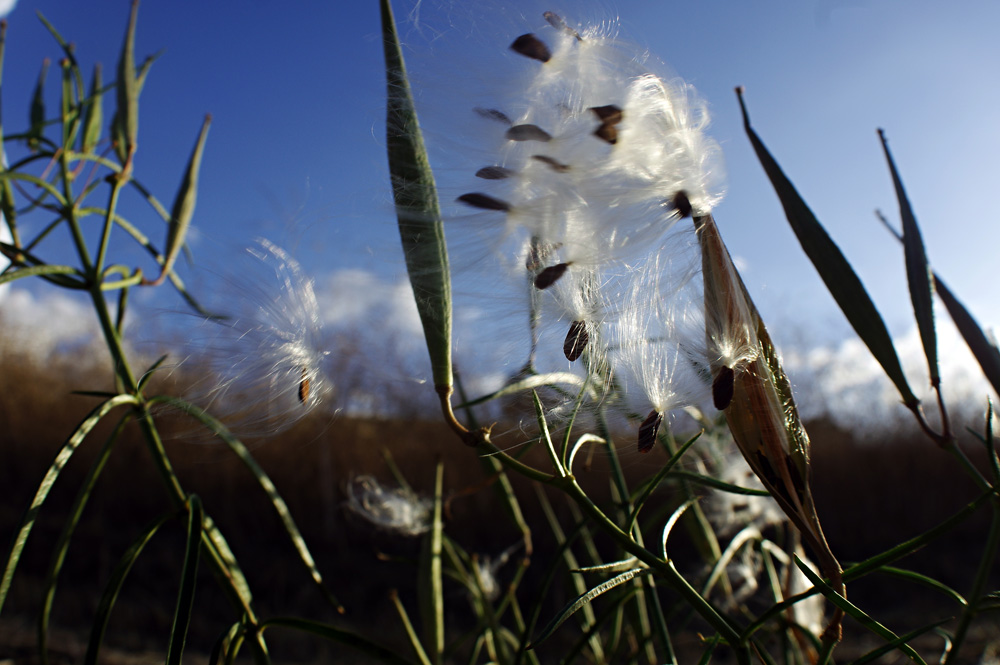
Here's an example with the lens focused almost to its closest distance. Pixel peeping, the strands on the milkweed are surprisingly sharp. I did not expect the performance from this lens that it yielded here.
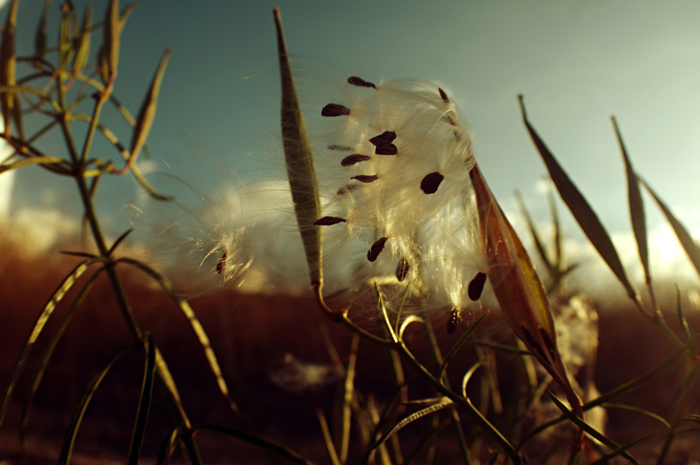
Here's one that I did by rotating the yellow filter in and then, in post, doing an automatic color balance. Trying the same with the orange filter gave me ... an orange image. It seems that the yellow filter lets enough of the spectrum through that an auto color in post make it look like sunset. That may not be true in every situation.

For fun, I wanted to see what an image looks like with the filter set between yellow and UV. This was the result.
Last edited by K David; 09-27-2014 at 08:44 PM.


 Post #7 by Pen-A
 Similar Threads


