I liken "bold monochrome" to cross processing. It's great used as a seasoning, but it shouldn't be your regular meal.
As an aside, over-souped-monochrome-look is very popular in digital B&W. I surmise this is related to the lack of tonality in digital vs film, and therefore users seek "punch" through extreme contrast. One could easily get this look on film, if so desired, bit rarely was it desired... Here's an example, shot on film (I made a calculation error in development and gave too much time in the soup)

It works ok, but there's such a lack of midtones, and the image would be better if rendered in a more full manner. From the same roll:

Doesn't work. Far too high in contrast. I feel the same of the Q image of the two boys shown above.
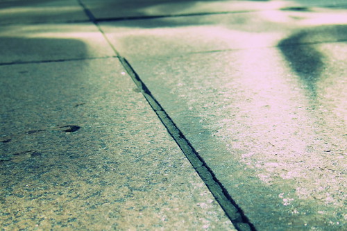
This image is pretty high contrast, but still maintains midtones:

Or this, outdoors... My scanner can't quite get the blacks or whites (it has less dynamic range than the Q!) but you should get the idea.

Midtones are very important. The forest image above would be much better IMO from the Q if exposure had been more carefully controlled (perhaps HDR mode used) and a lower contrast B&W treatment. Note I don't mean low contrast; but the almost featureless blacks with a blown out white sky don't really work for me. The Q can render much better.
Perhaps that's why I always dissuade Q users from that bold monochrome setting--unlike many digital cameras, the Q can generate a full range of B&W tones... You don't need the gimmick of adding punch by souping too long

To each his own, of course, and I'm prone to getting a wild hair on occasion. As evidence, I present a series in "cross process random" mode


As always, have fun. The Q is really good at that.


 Post #6738 by pinholecam
 Similar Threads


