Forgot Password
Pentax Camera Forums Home
 

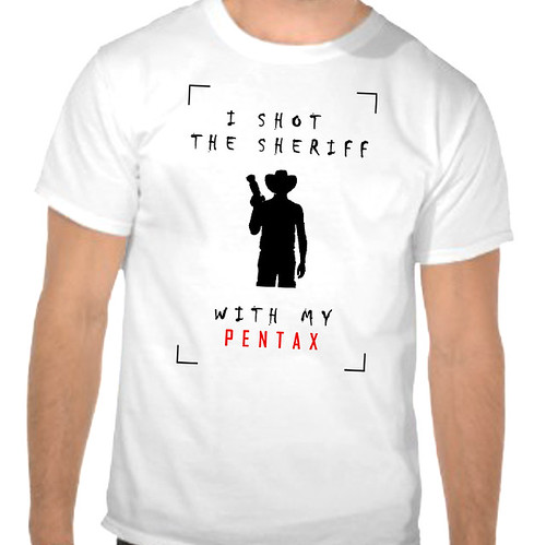
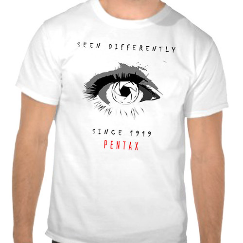
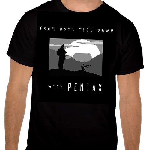
View Poll Results: Which designs do you want to see on the 2013 Pentax forum shirt?
Shirt 1 322.44%
Shirt 2 70.53%
Shirt 3 191.45%
Shirt 4 14310.90%
Shirt 5 130.99%
Shirt 6 362.74%
Shirt 7 513.89%
Shirt 8 141.07%
Shirt 9 130.99%
Shirt 10 151.14%
Shirt 11 413.13%
Shirt 12 292.21%
Shirt 13 997.55%
Shirt 14 523.96%
Shirt 15 30.23%
Shirt 16 70.53%
Shirt 17 151.14%
Shirt 18 1088.23%
Shirt 19 272.06%
Shirt 20 554.19%
Shirt 21 544.12%
Shirt 22 332.52%
Shirt 23 282.13%
Shirt 24 40.30%
Shirt 25 90.69%
Shirt 26 705.34%
Shirt 27 272.06%
Shirt 28 282.13%
Shirt 29 322.44%
Shirt 30 443.35%
Shirt 31 100.76%
Shirt 32 30.23%
Shirt 33 806.10%
Shirt 34 21716.54%
Shirt 35 141.07%
Shirt 36 312.36%
Shirt 37 483.66%
Shirt 38 80.61%
Shirt 39 261.98%
Shirt 40 493.73%
Shirt 41 1078.16%
Shirt 42 957.24%
Shirt 43 191.45%
Shirt 44 171.30%
Shirt 45 574.34%
Shirt 46 382.90%
Shirt 47 1199.07%
Shirt 48 181.37%
Shirt 49 725.49%
Shirt 50 191.45%
Shirt 51 40.30%
Shirt 52 40.30%
Shirt 53 60.46%
Shirt 54 100.76%
Shirt 55 130.99%
Shirt 56 50.38%
Shirt 57 272.06%
Shirt 58 201.52%
Shirt 59 130.99%
Shirt 60 50.38%
Shirt 61 463.51%
Shirt 62 100.76%
Shirt 63 30.23%
Shirt 64 201.52%
Shirt 65 513.89%
Shirt 66 221.68%
Shirt 67 20.15%
Shirt 68 191.45%
Shirt 69 221.68%
Shirt 70 60.46%
Shirt 71 614.65%
Shirt 72 40.30%
Shirt 73 60.46%
Shirt 74 513.89%
Shirt 75 120.91%
Shirt 76 261.98%
Shirt 77 60.46%
Shirt 78 292.21%
Shirt 79 30.23%
Shirt 80 90.69%
Shirt 81 171.30%
Shirt 82 50.38%
Shirt 83 171.30%
Shirt 84 322.44%
Shirt 85 372.82%
Shirt 86 50.38%
Shirt 87 151.14%
Shirt 88 796.02%
Shirt 89 292.21%
Shirt 90 30.23%
Shirt 91 151.14%
Shirt 92 30.23%
Shirt 93 90.69%
Shirt 94 473.58%
Shirt 95 20.15%
Shirt 96 161.22%
Shirt 97 231.75%
Shirt 98 967.32%
Shirt 99 60.46%
Multiple Choice Poll. Voters: 1312. You may not vote on this poll

Closed Thread
Show Printable Version 20 Likes Search this Thread
03-18-2013, 01:07 PM   #61
New Member


Join Date: Sep 2010
Location: Sliven
Photos: Gallery
Posts: 3
#12 is the best

03-18-2013, 01:20 PM   #62
Veteran Member
romansolar's Avatar

Join Date: Jun 2012
Location: Kosice,Slovakia
Photos: Gallery | Albums
Posts: 440
WOW! where are my designs? i sent them all in one email!

whats happening?
03-18-2013, 01:25 PM   #63
Veteran Member
romansolar's Avatar

Join Date: Jun 2012
Location: Kosice,Slovakia
Photos: Gallery | Albums
Posts: 440
could you add them please, i submitted in time and i received acknowledge via email.


Last edited by romansolar; 03-18-2013 at 01:41 PM.
03-18-2013, 01:35 PM - 1 Like   #64
New Member


Join Date: Jun 2012
Location: Houten
Posts: 15
nr. 4, why? See my motivation.

I vote for nr. 4. The new design must be complete different from the old one: not any hint may point out to the old design to prevent thoughts from outside-watchers like “They tried to do something new, but it is’nt a succes, the old one is still here.” A new design must also have a complete different style. No figurative one, showing the image of a camera, a lens, a diafragma or even a hint in that direction.

The new logo should show a different way of thinking. From my choice number four I can see a different lettering: straight, simpel, but balanced and a clear reading in different backgroundcolours.
However: when you see throug the lettering you see the contour from a camera: shoulders and lens, formed by the first letters “f-o-r”. The “r” is reversed, I noticed that in my second glimps. Second! At first I read it as I thought there was written “forums”. So, you can chance lettering without changing the read dignity but wíth the mindconnection to a camera.
That is a complete different approach to a logo. In the first place because people from the forum are not directly marketing the brand Pentax but more in a supportive way (Pentax does direct marketing, it is their living). So, pushing the brand Pentax in the market is not the mission from the Pentaxforums.
In the second place: it handles here about people who know more than average about all what Pentax has produced, included experience with their products. It is perhaps the experience what outstands members from this forum from other photoforums. Therefor: chest knocking belongs to Pentax salesmen, a humble businesscard belongs to polite advisers, hearers and fans.

The new logo should also show some intelligence from the bearer of the logo, on the man/woman’s cloth, in this case a T-shirt, but also from the foundation which edited the logo on T-shirts, and maybe on other objects: bags, badges, umbrella’s a.s.o. Intelligence is here ment also to include: smartness, cleverness, because Pentax as a brand stands for far more than only camera’s, lenses, optics, binoculairs, glassbreeders a.s.o. Pentax is for some people a livestyle, a way of seeing and watching things as they happen. That idea covers a whole lot from our modern civilisation, maybe all, as long as this all can be frozen in a photo.

pentaxior

03-18-2013, 01:41 PM   #65
Inactive Account


Join Date: Oct 2012
Location: Lietuva, Vilnius
Posts: 627
QuoteOriginally posted by romansolar Quote
WOW! where are my designs? i sent them all in one email!

whats happening?


My first thought when i scrolled through all the designs was where the hell is "I Shot a Sheriff with my Pentax"
Sad that i had to vote for design that wasn't my favorite
03-18-2013, 01:41 PM   #66
New Member
fandart's Avatar

Join Date: Oct 2012
Location: Zlin
Posts: 22
QuoteOriginally posted by pentaxior Quote
I vote for nr. 4. The new design must be complete different from the old one: not any hint may point out to the old design to prevent thoughts from outside-watchers like “They tried to do something new, but it is’nt a succes, the old one is still here.” A new design must also have a complete different style. No figurative one, showing the image of a camera, a lens, a diafragma or even a hint in that direction.

The new logo should show a different way of thinking. From my choice number four I can see a different lettering: straight, simpel, but balanced and a clear reading in different backgroundcolours.
However: when you see throug the lettering you see the contour from a camera: shoulders and lens, formed by the first letters “f-o-r”. The “r” is reversed, I noticed that in my second glimps. Second! At first I read it as I thought there was written “forums”. So, you can chance lettering without changing the read dignity but wíth the mindconnection to a camera.
That is a complete different approach to a logo. In the first place because people from the forum are not directly marketing the brand Pentax but more in a supportive way (Pentax does direct marketing, it is their living). So, pushing the brand Pentax in the market is not the mission from the Pentaxforums.
In the second place: it handles here about people who know more than average about all what Pentax has produced, included experience with their products. It is perhaps the experience what outstands members from this forum from other photoforums. Therefor: chest knocking belongs to Pentax salesmen, a humble businesscard belongs to polite advisers, hearers and fans.

The new logo should also show some intelligence from the bearer of the logo, on the man/woman’s cloth, in this case a T-shirt, but also from the foundation which edited the logo on T-shirts, and maybe on other objects: bags, badges, umbrella’s a.s.o. Intelligence is here ment also to include: smartness, cleverness, because Pentax as a brand stands for far more than only camera’s, lenses, optics, binoculairs, glassbreeders a.s.o. Pentax is for some people a livestyle, a way of seeing and watching things as they happen. That idea covers a whole lot from our modern civilisation, maybe all, as long as this all can be frozen in a photo.

pentaxior
Well you read it like this, because you know well the words "pentax forums". But if you would ask somebody, who actually does not know this, he would have hard time to read it exactly for the first time I guess. And my another note is: it was not a competition for creating a new logo, which should be very useful indeed. So If I do create this kind of competition, I would probably be glad if the design uses actual logo even if the quality of it is not that ... perfect. IMO
03-18-2013, 01:42 PM   #67
Veteran Member
romansolar's Avatar

Join Date: Jun 2012
Location: Kosice,Slovakia
Photos: Gallery | Albums
Posts: 440
QuoteOriginally posted by Apapukas Quote
My first thought when i scrolled through all the designs was where the hell is "I Shoot a Sheriff with my Pentax"
Sad that i had to vote for design that wasn't my favorite

thank you! and hey, i am sure they will add them cause i dont see reason why my designs were ignored

03-18-2013, 01:48 PM   #68
Junior Member
wafflehaus's Avatar

Join Date: Feb 2010
Location: New Orleans (go Saints!)
Photos: Gallery
Posts: 33
QuoteOriginally posted by SlickYamaha Quote
^^^^^ Voting options are above ^^^^^


Vote for your favorite shits in the poll above from among these choices:
Hmmm, it's hard to pick a favorite. I thought we were voting on clothing.

/Typo alert.
03-18-2013, 02:01 PM   #69
Junior Member


Join Date: Aug 2012
Location: Tremelo
Photos: Gallery | Albums
Posts: 38
PF shirt design 2013 : vote on 85

PF shirt design 2013 : vote on 85
03-18-2013, 02:16 PM   #70
hgk
New Member


Join Date: Jan 2013
Posts: 5
#42

Shirt #42
03-18-2013, 02:19 PM   #71
Forum Member
miklog's Avatar

Join Date: Jan 2010
Photos: Gallery | Albums
Posts: 92
QuoteOriginally posted by VTerlakyPhoto Quote
Two issues that I just noticed with this voting:

#1: for several designs multiple colour options are shown (e.g. 14, 29, 45, 57, 84, 87, 88, 97). Which one of the colour variations are we voting for? For example #14 are we voting for the white or black one? Also, does this mean that only one shirt colour will be available (since on a black shirt the black design won't work...). Or, if all colour options of these designs are going to be in print and we're voting on them as a whole, then why aren't all three colour versions of my submission shown?

#2: this was also mentioned in the submission thread, but allowing designs with the original Pentax font and trademarks in the voting thread is completely unfair. First of all, they were against the rules, and therefore in my humble opinion shouldn't have gone through the screening at all. Second, even if after the fact changing the design is easy, it does influence voting results (due to the emotional impact of seeing the same font as on your camera), and also results in final shirt that people didn't actually vote for.

My 2 cents.
Some of the shirts "shine out" because they present them self better, for example those with people wearing them. I think that using a shirt template for voting would make the choosing process somehow more objective. Also double sided shirts are likely to be favorited, no? (why one when you can get two sides
03-18-2013, 02:33 PM   #72
New Member
colinsart's Avatar

Join Date: Feb 2013
Photos: Albums
Posts: 13
Fabulous work

Not clear where or how to actually vote though.
I would vote for ten of them and happily wear all of them!
03-18-2013, 02:36 PM   #73
New Member
colinsart's Avatar

Join Date: Feb 2013
Photos: Albums
Posts: 13
found it!

For some reason, there it was, little boxes to tick!
Well done all
03-18-2013, 03:04 PM   #74
New Member
jbff1990's Avatar

Join Date: Mar 2013
Posts: 2
@pentaxior: Nice elaboration and I agree with you on certain arguments. But which also is explained earlier that it is not about a logo but just a new T-shirt design.
For me the 4th design was also the reason as you explained why I thought this was a good design, the subtlety of the design and especially the 'story' behind it as the way it lets you think about why the design is how it is, was the reason for me to put it on my list of favourits. It also let people (that aren't familiar with the forum) think about what it means and represent, thus getting their attention because they don't know...people are curious.

But it isn't catchy enough and some other design are exactly the opposite and really catch your attention. And besides that there are also some designs that combine that catchiness with the key elements of the Pentax brand and what the forum stands for.

That's why I like for instance also #20, 33, 37, 40, 44, 45, 59, 84 and 94. These are clean and catchy designs that represent what Pentaxians are for people, what the brand stands for and also the forum.

And overall I would suggest that #89 is my favourite.
03-18-2013, 03:05 PM   #75
New Member


Join Date: Apr 2008
Location: baie comeau
Posts: 2
no matter what

No matter what it will be a beautiful t shirt and i'm a buyer
Closed Thread

Bookmarks
  • Submit Thread to Facebook Facebook
  • Submit Thread to Twitter Twitter
  • Submit Thread to Digg Digg
Tags - Make this thread easier to find by adding keywords to it!
color, design, entries, issues, pentax, shirt, shirts, vote

Similar Threads
Thread Thread Starter Forum Replies Last Post
Design a T-Shirt: Win a DA 70mm Limited lens! SlickYamaha General Talk 216 03-29-2013 06:28 PM
Weekly Challenge POTW #251 27 Jan 2013 through 10 Feb 2013 Dr Orloff Weekly Photo Challenges 54 02-10-2013 11:59 AM
T+L Design Awards 2013 for Best Camera to Pentax Q10 VisualDarkness Pentax Q 3 02-08-2013 12:54 PM
Weekly Challenge POTW #250 20 Jan 2013 through 3 Feb 2013 Douge Weekly Photo Challenges 43 02-03-2013 09:45 PM
PF T-shirt Design Voting SlickYamaha General Talk 53 04-28-2011 02:14 PM


All times are GMT -7. The time now is 08:14 PM. | See also: NikonForums.com, CanonForums.com part of our network of photo forums!
  • Red (Default)
  • Green
  • Gray
  • Dark
  • Dark Yellow
  • Dark Blue
  • Old Red
  • Old Green
  • Old Gray
  • Dial-Up Style
Hello! It's great to see you back on the forum! Have you considered joining the community?
register
Creating a FREE ACCOUNT takes under a minute, removes ads, and lets you post! [Dismiss]
Top