Forgot Password
Pentax Camera Forums Home
 

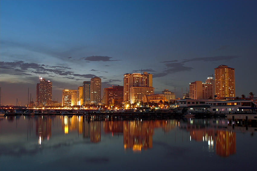
View Poll Results: Which photo should be the September Contest winner?
#1 8625.67%
#2 4914.63%
#3 13239.40%
#4 195.67%
#5 288.36%
#6 216.27%
Voters: 335. You may not vote on this poll

Closed Thread
Show Printable Version Search this Thread
  
Contest #13 Runoff
Posted By: Adam, 10-20-2007, 12:03 PM

PentaxForums.com Monthly Photo Contest #13 Runoff Poll

Because we're awarding prizes this month to the top three entries, and because many photos had a close numbers of votes, we're holding a runoff vote for the top 6 photos from the previous poll.

Thanks to everyone for voting earlier- with about 250 voters, that was our largest poll to date. Can we beat that number in this poll?

You must be logged in to vote, and you may only vote for one photo! Good luck to all six finalists!


1.


2.


3.


4.


5.


6.

Views: 9,995
10-21-2007, 10:06 PM   #16
Senior Member
skaktuss's Avatar

Join Date: Feb 2007
Location: Latvia
Photos: Gallery
Posts: 259
QuoteOriginally posted by mtnbearhug Quote

But what is the big deal about #3??? yeah its a good pic.. but to me it is very busy.. and hard to focus on.
Exactly! It is nice picture, but too much stuffed.

10-22-2007, 07:28 AM   #17
Inactive Account


Join Date: Jun 2007
Location: Fort Worth, TX
Posts: 9
Voted for #3 - very string composition, the next one would be #1. Other pictures are fine but not distinctive enough...
10-22-2007, 08:28 AM   #18
Site Supporter
Redwood10D's Avatar

Join Date: Oct 2007
Location: Claremont, CA USA
Photos: Gallery
Posts: 77
Contest #13 Runoff

I like elements of all of them, but least of all number 3. Heck, it's a great shot but pulls me in too many directions. Perhaps it is just the time of the day (early AM here) and I want no confusion.

Number 2 gets my vote. Love the tone, the "wholeness" of it all, and it "feels good" at the onset of my day. Probably will like it tonight, too.

San Diego, CA, right?

Don
10-22-2007, 08:34 AM   #19
Veteran Member
jgredline's Avatar

Join Date: Oct 2007
Location: LosAngeles, Ca.
Photos: Albums
Posts: 10,628
In regards to photo #3 I too must ask...What is so special about it..For one black and whites simply don't do anything for ''me''..I kow many folks and artist, like them, but besides the picture looks so busy..It does not go any place..I am simply trying to understand what makes that a great photo..

comments.

10-22-2007, 08:43 AM   #20
and
Veteran Member


Join Date: Mar 2007
Photos: Gallery
Posts: 2,476
Its funny so many people asking about nr #3 but its killing in the poll.
Well I did already post why I voted for #3 so I guess I dont have to repeat myself agian.
10-22-2007, 08:54 AM   #21
Senior Member


Join Date: Jul 2007
Location: Hill Country Texas
Photos: Gallery
Posts: 104
Why

I wanted to comment on the comments, and the question about the number 3 photograph more specifically. The reason that the top 3 photos are numbers 1, 2, and 3, are although the subject matter is identifiable, they also work wonderfully in a more abstract way. The lines throughout the compositions are very simple and geometric when viewed as a whole. For example:

Number 1, really three rectangles. Looking past the trees and building on the right side, you basically have a small vertical rectangle (old building) inserted into a larger dark blue horizontal rectangle (new building) inserted into a larger light blue rectangle (the sky). Wonderful, almost perfect, but I did not vote for it because the horizon is not level, and I find the slight tilt of the reflected building disconcerting. I also would have cropped out the building on the right side.

Number 2, Wonderful vertical lines that grow in thickness from left to right, bisected by a horizontal line right through the middle. I was torn about my vote here, but again I think I would have eliminated that building on the right side that is shorter and has very little reflection. Then you would have a perfect progression from small to tall, left to right. Didn't quite get my vote.

Number 3, you've basically got two thick vertical lines on each side of the photo, with that fabulous sweeping curve running through the middle. Add the angle coming from the right bottom pointing toward the center section of the curve, and that double V coming from the left, and you've got a beautiful play of geometric chiaroscuro. The black and white format adds to the simplicity of the geometry. Got my vote.
10-22-2007, 11:22 AM   #22
Veteran Member


Join Date: Jun 2007
Location: California
Posts: 426
I voted for #3 because there are many lines that point and direct you to the freeway. Fortunately those lines are directing you to the most interesting shape on the photo, the curve.

As for difficulty tho, I'd give it to #4. To get a lightning right over the freeway requires some good timing and chance.

10-22-2007, 04:19 PM   #23
Inactive Account


Join Date: Jun 2007
Location: Vadnais Heights, MN
Posts: 1
Number #2 is by eye the better. I is rich in color and detail! It has a wonderful leve of saturation in the colors and has a classic framing.
10-22-2007, 07:39 PM   #24
Veteran Member
philmorley's Avatar

Join Date: Mar 2007
Location: in a house in Armidale, Australia
Posts: 472
QuoteOriginally posted by mtnbearhug Quote
Please dont take offense to this..

But what is the big deal about #3??? yeah its a good pic.. but to me it is very busy.. and hard to focus on. The black and white does add some depth to it.

Can someone explain to me why this picture is so propular..

thanks!! Kim
its chaotic, but with very clear strong vertical lines so the chaos is not distracting as the twisting road winding through drags the eye along with it. The building on the left works like an arrow pointing to the road. The black and white helps this by removing and distraction caused by various colours. To me not a 'beautiful' image like some of the others but overall a very 'strong' image with a 'softness'? caused by the winding road. anyway thats my opinion.

So I like it a lot, but is it the best? I also really like numbers 1,2 & 5. oh! they're all good! this is really hard !!!!
10-23-2007, 05:46 AM   #25
Veteran Member
JCSullivan's Avatar

Join Date: Sep 2006
Location: Windsor, Canada
Posts: 3,056
I certainly had not thought of it as chiaroscuro but it sure supports my original decision to vote for #3.

We're definately getting more bang for the buck with this thread - people are actually dicsussing photography not the usual "nice work, well done, I love it, etc."
10-23-2007, 07:01 AM   #26
Veteran Member
jgredline's Avatar

Join Date: Oct 2007
Location: LosAngeles, Ca.
Photos: Albums
Posts: 10,628
QuoteOriginally posted by JCSullivan Quote
I certainly had not thought of it as chiaroscuro but it sure supports my original decision to vote for #3.

We're definately getting more bang for the buck with this thread - people are actually dicsussing photography not the usual "nice work, well done, I love it, etc."
I agree..I voted for number 2 and my first thought was that? ''what is three doing in this group'', then I voted and was .. So yes, people are talking about photography and I'm happy to learn,...but in saying that, I do not see how it is nicer than the other pics, truth be told it would have been my last choice..
10-23-2007, 08:16 AM   #27
Inactive Account


Join Date: Sep 2007
Location: flyover midwest, USA
Photos: Gallery
Posts: 10
Cities have people, people!

In my opinion, cityscapes should have people in them, and none of these finalists meet that measure.
10-23-2007, 01:31 PM   #28
Veteran Member


Join Date: Aug 2007
Location: Emmett, Idaho
Photos: Gallery
Posts: 1,351
Thank you!!

QuoteOriginally posted by cygnet Quote
although the subject matter is identifiable, they also work wonderfully in a more abstract way. The lines throughout the compositions are very simple and geometric when viewed as a whole. For example:

Number 1, really three rectangles. Looking past the trees and building on the right side, you basically have a small vertical rectangle (old building) inserted into a larger dark blue horizontal rectangle (new building) inserted into a larger light blue rectangle (the sky). Wonderful, almost perfect, but I did not vote for it because the horizon is not level, and I find the slight tilt of the reflected building disconcerting. I also would have cropped out the building on the right side.

Number 2, Wonderful vertical lines that grow in thickness from left to right, bisected by a horizontal line right through the middle. I was torn about my vote here, but again I think I would have eliminated that building on the right side that is shorter and has very little reflection. Then you would have a perfect progression from small to tall, left to right. Didn't quite get my vote.

Number 3, you've basically got two thick vertical lines on each side of the photo, with that fabulous sweeping curve running through the middle. Add the angle coming from the right bottom pointing toward the center section of the curve, and that double V coming from the left, and you've got a beautiful play of geometric chiaroscuro. The black and white format adds to the simplicity of the geometry. Got my vote.
QuoteOriginally posted by philmorley Quote
its chaotic, but with very clear strong vertical lines so the chaos is not distracting as the twisting road winding through drags the eye along with it. The building on the left works like an arrow pointing to the road. The black and white helps this by removing and distraction caused by various colours. To me not a 'beautiful' image like some of the others but overall a very 'strong' image with a 'softness'? caused by the winding road.
These are what I was looking for!! I am just trying to understand the "professional" side of photo taking... So that way I can create better pictures myself! To me at his point it is about what makes me feel good or bad.. but I wanting to learn more about compusition and the such..

Thank you for the feedback !! It is greatly appreciated.. Kim
10-23-2007, 02:06 PM   #29
m8o
Veteran Member
m8o's Avatar

Join Date: Jul 2007
Location: 40°-55'-44" N / 73°-24'-07" W [on LI]
Photos: Gallery | Albums
Posts: 3,092
QuoteOriginally posted by mtnbearhug Quote
These are what I was looking for!! I am just trying to understand the "professional" side of photo taking...
It reminds me of the CD-ROM I have from the late 90's called "learning to see". I'm going to have to dig that out. I wouldn't be surprised if it's so old it won't even run on a modern day WinTel system anymore...

Anyway, I too appreciate the informed and well-formed opinion of how others "see it". I for one voted for #1 as I love the contrasting of the old with the new, I liked the slight 'cock-eyed-ness' of the reflected building (which play to the distorted lines produced by the imperfect panes of glass), and thought I'd rather appreciate a "real scene" where you have object that are not under your control (the building on the right) and felt it was better to be authentic and real, rather then having it photoshopped out.

QuoteOriginally posted by bobwired Quote
In my opinion, cityscapes should have people in them...
so does "soilent green"... (lol! sorry, I couldn't resist)

Last edited by m8o; 10-23-2007 at 02:15 PM.
10-23-2007, 04:31 PM   #30
Inactive Account


Join Date: Sep 2007
Location: Columbus, GA, USA
Posts: 33
I chose number 2. To be honest, I do like them all, even number 3 (which to me looks more... "industrial"), but there was just something about number 2 I liked that I could not put my finger on until someone else mentioned it... the color! Odd how all the buildings take on a goldish hue as if every contractor coordinated the color of the buildings. I know... it has more to do with lighting and probably even filtering, but I think that's why I like it the best. Those little green ringlets lit up on some of those buildings were a curiousity I liked as well, and the reflection on the water cinched it for me. Number 6 came in a very close second for me, personally. I think due to the water reflection.
Closed Thread

Bookmarks
  • Submit Thread to Facebook Facebook
  • Submit Thread to Twitter Twitter
  • Submit Thread to Digg Digg
Tags - Make this thread easier to find by adding keywords to it!
contest, photo, photos, poll, runoff, vote

Similar Threads
Thread Thread Starter Forum Replies Last Post
Contest #21 atupdate Monthly Photo Contests 0 05-19-2008 08:22 AM
Contest #15 yeahwhatever Monthly Photo Contests 0 11-14-2007 04:22 PM
Spring Runoff Mark Castleman Post Your Photos! 8 05-20-2007 06:19 PM


All times are GMT -7. The time now is 02:22 AM. | See also: NikonForums.com, CanonForums.com part of our network of photo forums!
  • Red (Default)
  • Green
  • Gray
  • Dark
  • Dark Yellow
  • Dark Blue
  • Old Red
  • Old Green
  • Old Gray
  • Dial-Up Style
Hello! It's great to see you back on the forum! Have you considered joining the community?
register
Creating a FREE ACCOUNT takes under a minute, removes ads, and lets you post! [Dismiss]
Top