 Originally posted by WPRESTO
Is it just my imagination or do many K1 images have a "look" that's a bit different from any previous Pentax?
Could possibly be due to:
1. The K-1 has slightly different colour signature. I find it rather closer to the K-7, and different than K-3.
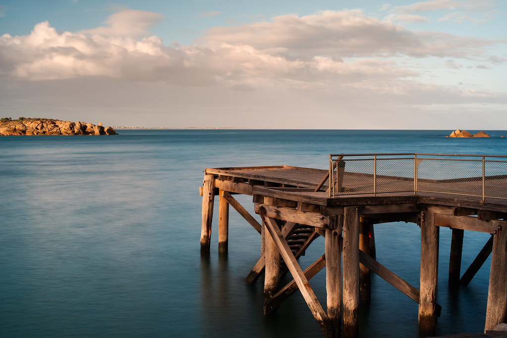
One example is the blue, which I find is rich and vibrant. The Pentax special K-1 site actually did mention that their engineers put in special care in the color output of the K-1, and they talked about blue, among other things if I recall. Don't know if they meant for ooc jpegs, or in the sensor response, or whatever.
2. For a given FOV, the pictures are (generally) being shot using a longer focal-length now than previously. Example, if on APS-C an FA31 was being used, on Full-frame an FA43 is now being used. The 31, being a wideangle focal length, would introduce some perspective distortion, which is natural. So although the FOV is the same, the shot from the 31 would, for example, slightly exaggerate converging/diverging lines, whereas the 43 would give the same FOV, but without any perspective exaggeration. This difference is perceivable in a shot.
3. Maybe a higher percentage of shots are being captured using older A, M lenses etc.? These old glass definitely have their own rendering character.
Last edited by KDAFA; 05-18-2016 at 12:48 AM.


 Similar Threads


