 Originally posted by civiletti
What differences do you see?
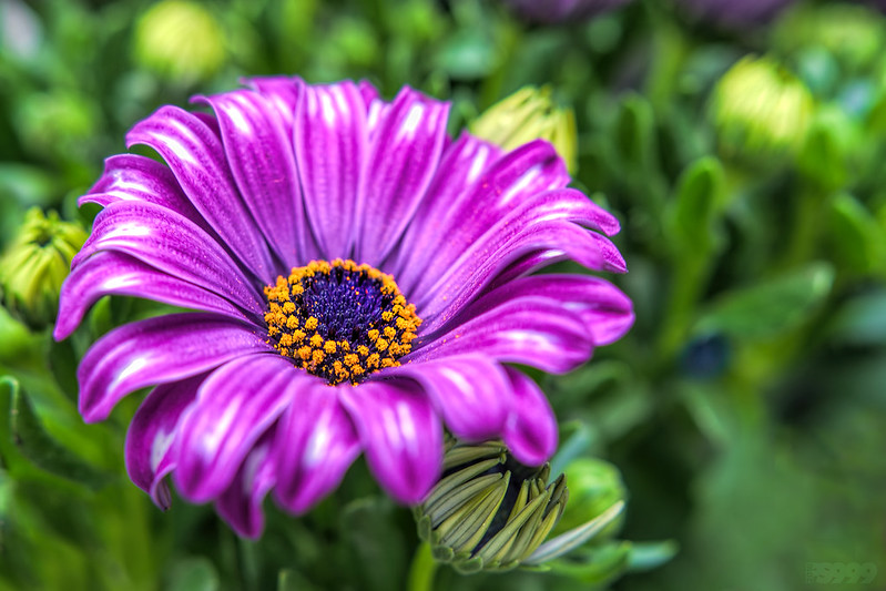
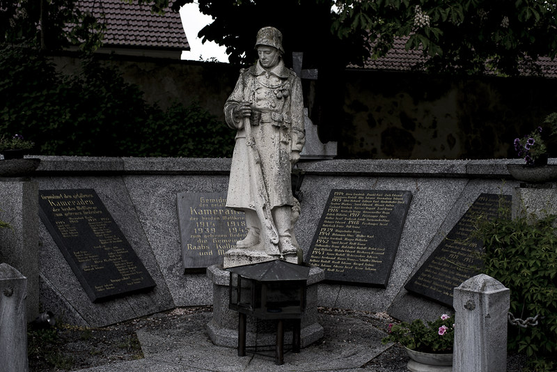
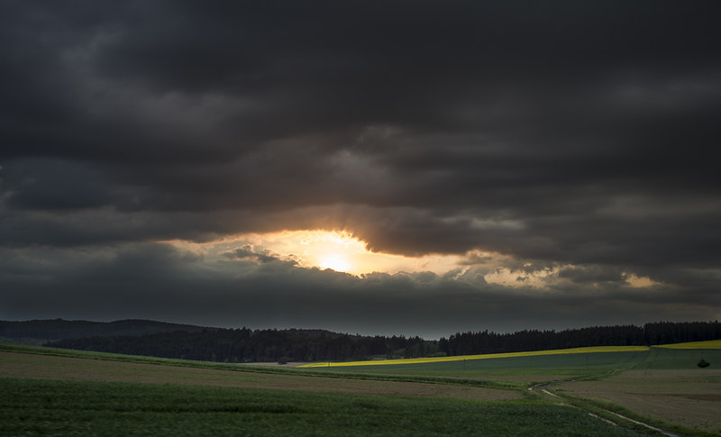
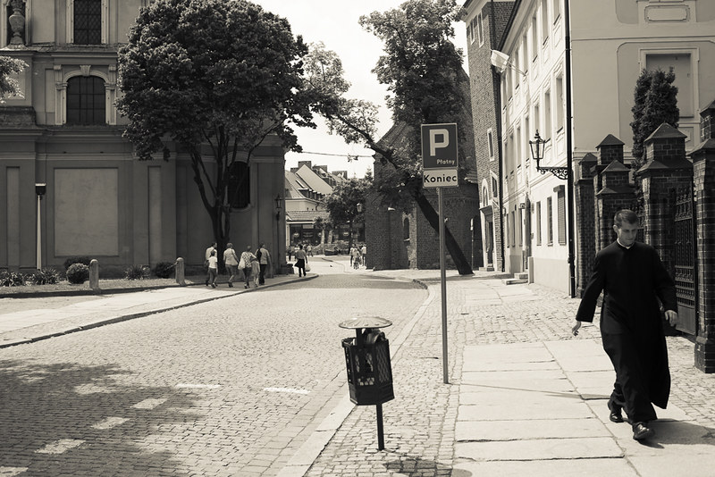
Cannot put my finger upon or verbalize it. The colors seem "deeper" or "richer." Perhaps there's a difference in which colors the sensor emphasizes, as, for example, Kodachrome had wonderful blues, and Velvia made warm colors pop in soft, dim light, but tended to look carnival-like in full bright sun. In looking at K1 images posted here, I find myself thinking "wow, look at that color, it's wonderful" more often than with images taken by any of the APS-C bodies. Maybe it's psychological, but I don't think so. Look above at the graffiti posted by sculptormic. There are many similar images on the "street art" thread, but when I came to that post, again, I was struck by the quality of the colors.


 Post #18559 by Tas
 Similar Threads


