 Originally posted by gaweidert
My only problem with editing is when people present it as a factual happening. I used to work in the printing industry. The magazine articles that always showed to supermodels fabulous "post baby" body were always heavily edited. Skin smoothed, stretch marks removed etc. In this case this was an outright lie.
The cover of Time magazine showing the Challenger explosion was the most heavily edited cover they had ever shown to that point. There was a lot of debate over it before they decided to use it. The original photo was almost completely washed out by the glare from the explosion and fire. But it was a truthful representation of what happened.
I have seen a two page spread of a major news magazine edited to remove a protest sign with offensive language. They also cleaned up some of the debris from the damage done by the rampaging protestors. Not only that, but the 250,000 copies of the magazine that were already printed were sent to the shredder and they whole run reprinted. What was removed, helped paint the protestors in a more positive light. This was highly unethical to do in a shot purporting to show the truth.
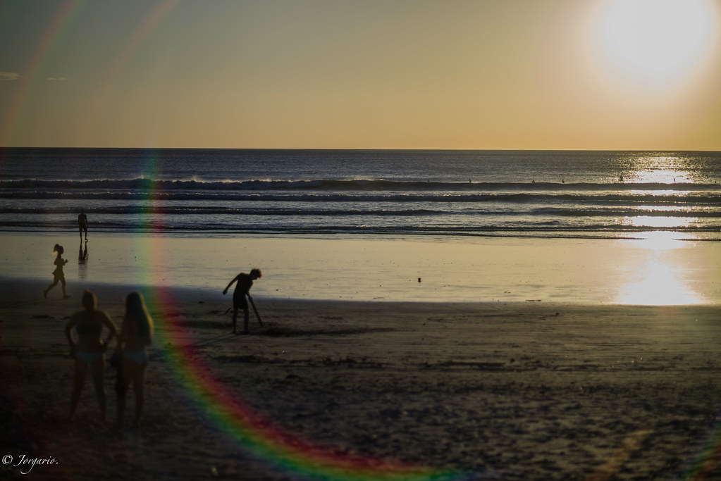
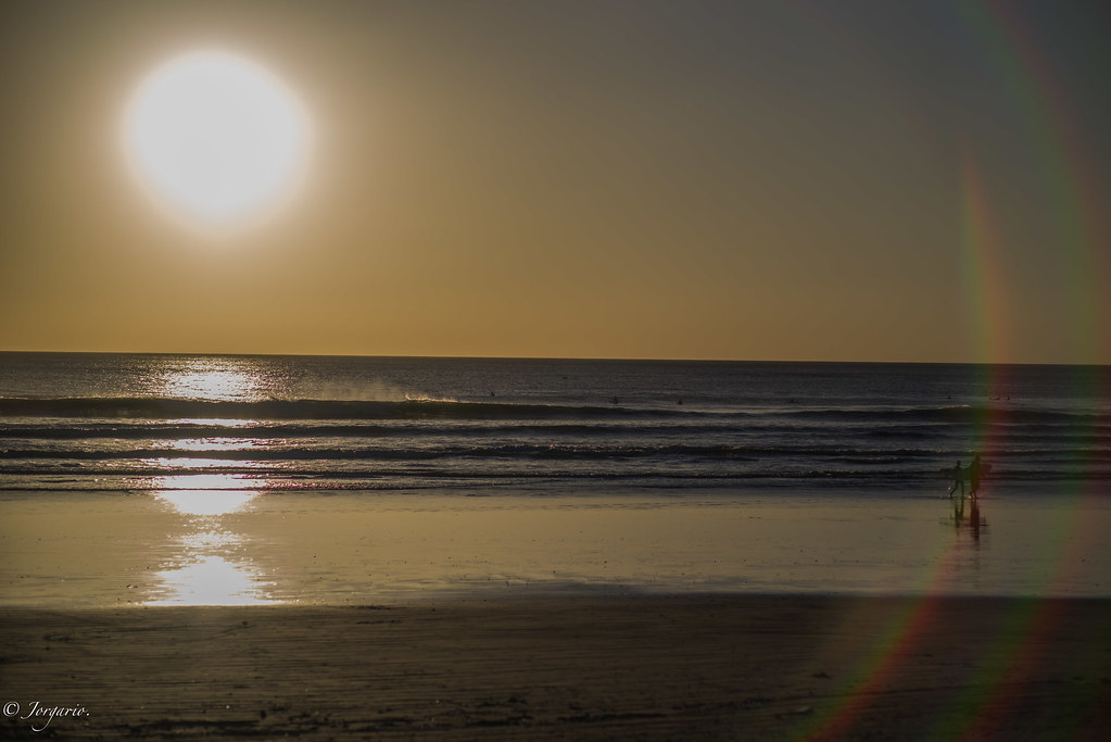
Kodak spent decades slavishly devoted to "True Colors" and they were pretty very good at it. Then Fuji came out with Velvia film. Super saturated colors. Higher contrast etc. Horrible to use when photographing people, but these same people loved it. Why? Because it appealed to them on an emotional level. When you see the Grand Canyon, you go WOW!. When you see a true color representation of it with the colors muted by the atmosphere etc, you go "Yep. I was there". When you see the Velvia representation of it with it's contrasty and over saturated colors you go "Yep!. That is exactly how I remember it" The film reminds you of your emotions at first seeing the place more than what it actually looks like from a color representation point of view.
In 1991 I was standing on Windy Ridge overlooking Mount Saint Helen's in Washington state. This was 11 years after the volcano blew itself up. It was destruction on a massive scale. I turned to my wife and said: "I have almost $3,000 is camera gear hanging on my hip and there is no way in hell that I can accurately record what I am seeing and feeling right now." It was simply impossible to convey. I took the obligatory snapshots and let it go at that. The photos showed the destruction, but do nothing to convey the scale of the disaster.
I can see both sides of this debate.
My personal take is thus: for ART, do whatever pleases you and helps you bring your artistic vision to life.
If for News reportage, then yes, I think the final output should convey the original scene as faithfully as possible, with some minor caveats. If a shot is taken in pitch black of a robber robbing a bank, you can't put a black rectangle on the front page of the newspaper, so you push the image in post process, and publish a grainy enhanced shot, but include clearly in the caption "Enhanced photo of bank robbers allows us to see them at work" or some such. With your shuttle explosion example, I'm personally fine with some enhancement to make the photo worth publishing, it is a historic moment and better than no photo, albeit I'd have like a caption that explained that the photo was enhanced to allow the viewer to better see what happened or something. When images are used to suit a political agenda, where they show a tight crop on protesters for instance, where a wide shot would show how really few there are, or a tight crop on a speaker is used to hide how large a crowd is, well, both are equally bad journalism.
As to super models and Hollywood types, heck, there has been airbrushing with REAL airbrushes even in mechanical drawings for ages (I know, I took the class) and it is just par for the course. I don't like it, nor the societal implications and pressures it puts on young girls and women in the population to meet some unreal ideal image, but, it is also a freedom of expression and the price we pay for that freedom. This is where responsible editors come in to the picture, and where certain publications will get their reputation and have to live with it. Responsible parents need to sit their kids down and explain that the perfect skin kids in their favorite Teen Beat or whatever mag have pimples too, and they removed for publication, etc. Besides, any guy who looks at that crap and expects normal people to look perfect like that at all times is in for a big disappointment and needs to reevaluate his priorities in life.
This K-1 images thread is a bit of a conundrum because it borders both Art and News/Science. We are posting images to show off the prowess of what the K-1 can do, yet, what it can do is also create Art. If you shoot JPG you are still post processing when you choose "Bright" or "Natural" and "Sharpen * or ***" etc. So, if you think about it, tweaking RAW files in post to get the closest image to what you saw is not really fudging the image, it is fudging the camera's native ability, or your ability to get it right the first time, or the ability of your lens to be sharp, or whatever, so there still is a disconnect from reality in our post processing, depending on how far we take it. I tend to process in a batch in ACR. I pull up the photo's from a session, I hit all the sliders I like for that type of photography subject, apply all, then de-select all, and go down the frames on the left one by one and look at them to see how they came out, trash the junk, maybe further tweak the ones that I think are keepers. If a shot is perfectly fine other than the red channel is blown, will I go to the individual color sliders and drag down the "red lightness" slider? You bet! I want that shot. Will it offend some people to know I did that? Maybe, but oh well, this is just for fun. I'll leave the scientific "test lab" to Adam and others who people look up to as more authoritarian sources for their camera info.
As Forest said "And that is all I got to say about that".


 Eric
Eric


 Post #18559 by Tas
 Similar Threads


