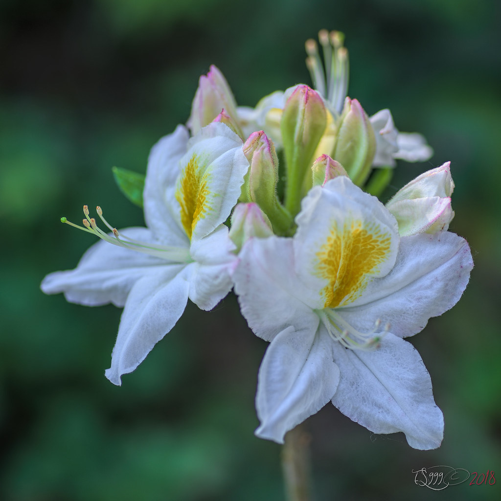
Thanks for the feedback everyone! All very useful critiques! Now I will divulge my personal fave... it was the unpopular second pic! LOL!

While part of me agreed 100% with everything said as to why the first pic should be the better choice, I am still drawn to the second shot.

FWIW, you may ask why? Because in my old fashioned film age mind, I always think it terms of print... which would I rather have on my wall? Which invokes an emotional response and doesn't look like "just another stock photo".
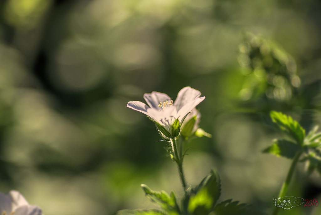
The cut off background flower doesn't really bother me, because it's not the main subject and not even in focus, it is there to add a "hint at more" and some additional bokeh colors without distracting totally from the subject. The background blossom is also hanging down, almost sad with all the rain like I was feeling, while the foreground bloom is up and reaching for sun even when there is none, giving hope and optimism. Oh well, one of my other personal rules is that if art has to be explained, it's not good art, heh, so I am not winning any arguments, even with myself here if I am being intellectually honest, heh heh.
But!... that is why I asked, because sometimes it is good to know what others think instead of being in your own echo chamber or bubble. Thanks very much to everyone who replied!

Eric


 [/url]


 Post #18559 by Tas
 Similar Threads


