Forgot Password
Pentax Camera Forums Home
 

Reply
Show Printable Version 33 Likes Search this Thread
01-10-2011, 07:17 AM   #31
Site Supporter
Site Supporter
Tamia's Avatar

Join Date: Dec 2009
Location: Here, there, and everywhere.
Photos: Gallery | Albums
Posts: 4,384
Gosh, thanks a bunch Tim and Ash, I appreciate your guidance a lot. I'm going to work on this image with your suggestions in mind. I use GraphicConverter as my photo editing app. GC is a bit limited, but I am saving pennies for PS or at least Elements for my Mac.

Thanks again, guys!

01-10-2011, 08:25 AM - 1 Like   #32
Veteran Member
yeatzee's Avatar

Join Date: Feb 2009
Location: Temecula
Photos: Gallery | Albums
Posts: 3,675
ill play....

heres two of many:


and


01-10-2011, 04:47 PM   #33
Pentaxian


Join Date: Oct 2006
Location: Dayton, OH
Photos: Gallery
Posts: 4,724
Original Poster
Wonderful shots Tanner. I love the detail in the spider.

Tim
01-10-2011, 05:38 PM   #34
Ash
Loyal Site Supporter
Ash's Avatar

Join Date: Mar 2007
Location: Toowoomba, Queensland
Photos: Gallery | Albums
Posts: 23,920
QuoteOriginally posted by Tamia Quote
Gosh, thanks a bunch Tim and Ash, I appreciate your guidance a lot. I'm going to work on this image with your suggestions in mind. I use GraphicConverter as my photo editing app. GC is a bit limited, but I am saving pennies for PS or at least Elements for my Mac.

Thanks again, guys!
You're welcome Tamia.
You probably don't need to spend that much to get PS as Elements should do the trick for most of what a photographer needs. PS is for advanced and complex multilayer work that's great for pros and significant image maniplulations. Even Paint Shop Pro may be OK. Ultimately, choose the software you'd be happy using.

QuoteOriginally posted by yeatzee Quote
ill play....

heres two of many:
Tanner, you know you've got some good work there. These two are exemplary. I saw the first one come through and made some suggestions to it that I know were probably impossible to do to improve the image.

01-10-2011, 05:51 PM - 1 Like   #35
Inactive Account


Join Date: Nov 2007
Location: In the present
Photos: Gallery
Posts: 1,870
Frozen Stubble

Well... this was published at about a 5x7 on the back page of a local newspaper, so no real loss... they titled it "Alchemy." Sometime people don't get this... it's a cornstalk that was frozen over in an ice storm. The lighting comes from the sunrise which was just creeping through the field. I was down on one shoulder in the snow, close to the subject. Tamron 28-75mm with K10D. Sharp combo.

01-10-2011, 06:00 PM   #36
Ash
Loyal Site Supporter
Ash's Avatar

Join Date: Mar 2007
Location: Toowoomba, Queensland
Photos: Gallery | Albums
Posts: 23,920
Unique image woof.
Looks like a crustacean on land.
More a descriptive and reportage-style image.
Good one.
01-11-2011, 06:33 AM   #37
Site Supporter
Site Supporter
Tamia's Avatar

Join Date: Dec 2009
Location: Here, there, and everywhere.
Photos: Gallery | Albums
Posts: 4,384
Thanks for the tip on PS and Elements, Ash. Elements will certainly be easier on the piggy bank.

Tanner, I've always found your Phidippus photo. The only thing which bothers me about it whenever I see this photo is that the black "hairs" on his(?) head are cropped.

Woof, I can feel the cold and imagine the crackle of ice as the sun begins to warm the encased stalks. Congratulations on the publication of the photo.

01-12-2011, 09:32 AM   #38
Pentaxian


Join Date: Oct 2006
Location: Dayton, OH
Photos: Gallery
Posts: 4,724
Original Poster
Today's reject.


Judge's comments:


Limited interest. Cuts off important part of apex of arch.
Dark foreground.

Nothing there to catch my eye. Dull and gray, and entrance looks crooked to me. People are not discernible enought to tell what they are doing.

Some kids in the foreground would both have offered perspective and made it more personal.
01-12-2011, 09:48 AM   #39
Veteran Member
slowpez's Avatar

Join Date: Jan 2008
Location: South Carolina, USA
Photos: Gallery
Posts: 18,462
Another one

This one was also rejected today but I was given some great feedback on how to improve it and I will take the advice and resubmit it.
Here are some of the comments:
I would suggest cropping to a vertical
Stunning photo!
the texture and detail is nice but the central composition makes the dynamic curl much less impactful.
Nice capture of the leaf's form!
Some work with increasing sharpness and contrast a little would improve it!
Unusual picture otherwise, and an unusual choice of lens for a close up!
Interresting. I nearly approve this one, but the composition does not work. Crop it differently for a better composition!

By the way, this one was accepted by the PPG.

Last edited by slowpez; 01-17-2011 at 08:55 AM.
01-12-2011, 10:06 AM   #40
Pentaxian


Join Date: Oct 2006
Location: Dayton, OH
Photos: Gallery
Posts: 4,724
Original Poster
Susan,

If you want to post your re-worked image in this thread for comments before resubmitting, it would be more than welcome.

Here are a couple of suggestions I would try:

a) rotate the image about 15 degrees to the right before cropping. That should move the main vein of the curled leaf from starting at the bottom of the image to the starting in the lower left corner.
b) change the color balance to reduce the yellow. I think the leaf will have more detail if the yellow was reduced (this will make the leaf look more green and closer to the background color).

Tim

Last edited by atupdate; 01-12-2011 at 10:44 AM.
01-12-2011, 01:14 PM   #41
Veteran Member
slowpez's Avatar

Join Date: Jan 2008
Location: South Carolina, USA
Photos: Gallery
Posts: 18,462
Unfurled fixed

Thanks for your suggestions Tim. I had already uploaded a picture with the suggestions I received from the PEG before I read yours. I am posting both here with your suggestions being the second photo. I must admit I do like what you had me do better. I'm sure it will most likely get turned down again but I will resubmit if you think it is worth it.
Again, thanks for your help; I really appreciate it.

Last edited by slowpez; 01-17-2011 at 08:55 AM.
01-12-2011, 01:17 PM   #42
Ash
Loyal Site Supporter
Ash's Avatar

Join Date: Mar 2007
Location: Toowoomba, Queensland
Photos: Gallery | Albums
Posts: 23,920
These latest two are both good. I do agree with the comments.

You worked very well to bring out the textures of the arch, Tim. I take it this is a FE capture.
Indeed what's missing is a compelling subject to grab the viewer's attention, like a couple of these kids laughing and looking into the lens, or something of the sort.

Susan, I've made comment to one of the versions of this image and have yet to see it improved in subsequent submissions. Bear in mind that such nature captures have very specific subject matter that should be judiciously composed in the frame and highlight the very reasons why this image is effective: texture, colour, microcontrast, detail and clarity. These are crucial. In this case, there needs to be a drop in the temperature and a slight positive tint in the image (as judged by the overly yellow hue cast upon the image) as well as a recovery of the clipped highlight detail in the leaf stem (which may require a drop in exposure, then working with dodging/burning, levels and curves to perform final touches in PP - the adage 'expose for the shadows, process for the highlights' applies here). I could also provide a version of your image the way I see it if you desired, but I won't do that unless invited.
01-12-2011, 01:56 PM   #43
Veteran Member
slowpez's Avatar

Join Date: Jan 2008
Location: South Carolina, USA
Photos: Gallery
Posts: 18,462
Thanks for the input Ash. My PP skills leave a lot to be desired especially when it comes to the things you suggest. I did tone down the yellow, or at least tried, but the leaf itself was that color in real life and it was starting to look unreal to me. If I may I will continue to play with it and re-post when I have done the things you suggested.
I wouldn't mind your playing with the image but doubt if it would help me much since I wouldn't have the foggiest way to duplicate it.
01-12-2011, 02:14 PM   #44
Ash
Loyal Site Supporter
Ash's Avatar

Join Date: Mar 2007
Location: Toowoomba, Queensland
Photos: Gallery | Albums
Posts: 23,920
Susan, as I don't have the RAW source file, there is a limit to what PP I could do on the image without destructive editing that would become unslightly, but here is my version generally following my above suggestion:


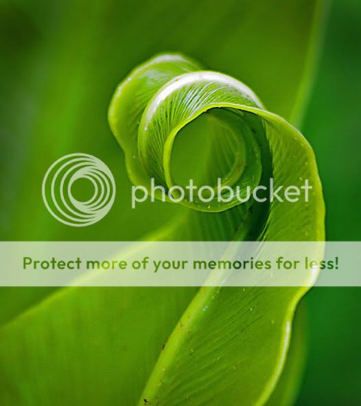
Highlight correction at 2% with 30% tonal range and 80 radius.
Free burning to create vignette (not necessary).
Selective colouring to deepen greens, remove yellows and enhance blacks.
Levels to adjust greens in particular.
Curves with medium contrast adjustment.
USM 100% at 1px and threshold 3.
01-12-2011, 02:27 PM   #45
Veteran Member
slowpez's Avatar

Join Date: Jan 2008
Location: South Carolina, USA
Photos: Gallery
Posts: 18,462
Well Ash, you lost me with most of those corrections as I feared would happen. I did understand the USM but that was about it.
Really love what you did.
Here is what I came up with after reading you last post.

By the way, I feel like I am stealing this thread away from its original purpose and will be happy to post this elsewhere is you think I should.

Last edited by slowpez; 01-17-2011 at 08:55 AM.
Reply

Bookmarks
  • Submit Thread to Facebook Facebook
  • Submit Thread to Twitter Twitter
  • Submit Thread to Digg Digg
Tags - Make this thread easier to find by adding keywords to it!
comments, gallery, post, space

Similar Threads
Thread Thread Starter Forum Replies Last Post
Pentax Gallery Rejects Mike Cash Photographic Technique 68 10-15-2008 03:04 PM
Gallery Rejects? Bramela General Talk 8 10-30-2007 05:01 AM
Some Gallery Rejects... PaulAndAPentax Post Your Photos! 13 10-21-2007 04:36 PM
Some recent Pentax Photo Gallery Rejects palmor Post Your Photos! 2 06-13-2007 10:26 PM


All times are GMT -7. The time now is 01:09 PM. | See also: NikonForums.com, CanonForums.com part of our network of photo forums!
  • Red (Default)
  • Green
  • Gray
  • Dark
  • Dark Yellow
  • Dark Blue
  • Old Red
  • Old Green
  • Old Gray
  • Dial-Up Style
Hello! It's great to see you back on the forum! Have you considered joining the community?
register
Creating a FREE ACCOUNT takes under a minute, removes ads, and lets you post! [Dismiss]
Top