Forgot Password
Pentax Camera Forums Home
 

Reply
Show Printable Version Search this Thread
01-12-2011, 02:40 PM   #46
Pentaxian


Join Date: Oct 2006
Location: Dayton, OH
Photos: Gallery
Posts: 4,723
Original Poster
QuoteOriginally posted by slowpez Quote
Well Ash, you lost me with most of those corrections as I feared would happen. I did understand the USM but that was about it.
Really love what you did.
Here is what I came up with after reading you last post.

By the way, I feel like I am stealing this thread away from its original purpose and will be happy to post this elsewhere is you think I should.
I retract one of my statements, with the darker green that Ash obtained, I don't think rotation of the image is necessary. With his processing, there is a very nice corner to corner leading line.

No need to worry about stealing the thread, we are all here to learn and this thread is open to any discussion to help make someone's images look better.

Tim

Tim

01-12-2011, 03:11 PM   #47
Ash
Loyal Site Supporter
Ash's Avatar

Join Date: Mar 2007
Location: Toowoomba, Queensland
Photos: Gallery | Albums
Posts: 23,920
Susan, please consider my own edit as just one version of so many possible versions that can improve RAW shots. Now I don't mean to confuse you with the process I applied, but depending on the software you use, I would strongly suggest you learn about the important image correction methods and how they can be applied to improve your own images.

Tools such as Levels, Curves, Dodging and Burning should be ubiquitous in all the software packages, but highlight/shadow adjustment and smart sharpen may be differently worded, or not offered in software other than PS. Nevertheless, I'd urge you to learn of the powerful tools of levels and curves as well as free dodging and burning since these alone can transform your PP to new heights.
01-13-2011, 08:57 AM   #48
Veteran Member
slowpez's Avatar

Join Date: Jan 2008
Location: South Carolina, USA
Photos: Gallery
Posts: 18,462
Thanks a lot Tim and Ash. I appreciate your taking the time. Not sure I can get used to the darker green PP has added to the image as one of the things I liked about it was the new spring yellow/green the leaf had.
I will continue to work on my PP skills however as I realize how far behind I am in that department.
Thanks again.
01-13-2011, 01:52 PM   #49
Ash
Loyal Site Supporter
Ash's Avatar

Join Date: Mar 2007
Location: Toowoomba, Queensland
Photos: Gallery | Albums
Posts: 23,920
Again Susan, this is what makes photography so subjective, but it does help to know what works for most people. Correcting the greens in nature captures, seeing as though colour is a vital component of such an abstract image, is vital. Use your histogram to guide you, and make adjustments to both enhance the colour and shift them to the more natural side. Some PP challenges might show you the results of such editing.

01-13-2011, 04:44 PM   #50
Site Supporter
Site Supporter
jheu02's Avatar

Join Date: Aug 2009
Location: North Carolina
Photos: Gallery | Albums
Posts: 3,027
Ash,

Hope things are going OK for you and all our friends in Oz. Just read another newspaper article and Toowoomba was mentioned as having a quick flood come sweeping through, and now Brisbane having major flooding as well.
01-13-2011, 04:49 PM   #51
Ash
Loyal Site Supporter
Ash's Avatar

Join Date: Mar 2007
Location: Toowoomba, Queensland
Photos: Gallery | Albums
Posts: 23,920
QuoteOriginally posted by jheu02 Quote
Ash,

Hope things are going OK for you and all our friends in Oz. Just read another newspaper article and Toowoomba was mentioned as having a quick flood come sweeping through, and now Brisbane having major flooding as well.
Thanks John, the city's recovering alright. Just to keep the thread on topic - see the effects of the floods here: https://www.pentaxforums.com/forums/post-your-photos/128863-nature-toowoomba-floods.html
01-14-2011, 11:49 AM   #52
Veteran Member
thoughton's Avatar

Join Date: Jul 2009
Location: Saffron Walden, Essex
Photos: Gallery
Posts: 362
Here's mine


Comments:
Unique aerial view of the world.
Please resubmit with the horizon straightened if possible.
Amazingly sharp photo - I'd love to have it on my wall! Where is it from?!

01-14-2011, 12:18 PM   #53
Ash
Loyal Site Supporter
Ash's Avatar

Join Date: Mar 2007
Location: Toowoomba, Queensland
Photos: Gallery | Albums
Posts: 23,920
It is a good one, no doubt, thoughton, and I've made my comments on this image elsewhere. But as explained, there would be more to it than the horizon, which framing would indeed solve in this image - being so high up, there is a lot of haze, which is difficult to overcome, but with added clarity in the RAW conversion, then an application of curves and perhaps sharpening, this one may have a better chance of getting through.
01-17-2011, 05:56 AM   #54
Veteran Member
thoughton's Avatar

Join Date: Jul 2009
Location: Saffron Walden, Essex
Photos: Gallery
Posts: 362
Here's another rejection

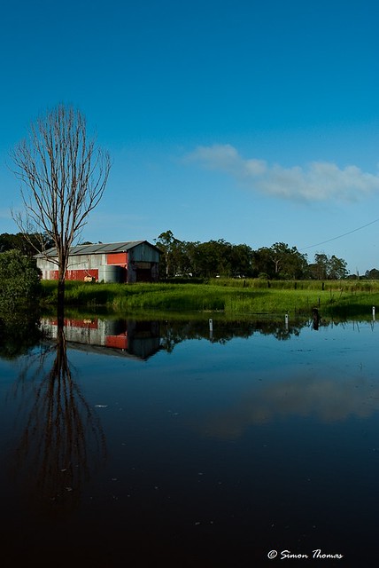
Slow Day At the Office


Some more comments below.

- Flat B&W conversion. Not a compelling scene to attract the viewer with interest.

- Exposure seems slightly over, Depth of field slightly off.

- What could make this more dynamic? It needs it.

- Like the idea but the converson lacks pop/contrast.


I must say that some of the comments are puzzling. For one thing I never realised my BW conversions were so poor, as I've had this sort of 'flat bw' comment on all of my BWs so far, even my one acceptance. I don't really get the 'over exposed' comment either.

Last edited by thoughton; 01-17-2011 at 06:12 AM.
01-17-2011, 08:29 AM   #55
Veteran Member
slowpez's Avatar

Join Date: Jan 2008
Location: South Carolina, USA
Photos: Gallery
Posts: 18,462
Thanks Ash and Tim for your help. The leaf finally was approved. I had another approved also and the funny thing is, there were more complaints about it than some of my rejects. Go figure. thoughton, I am not sure what they were referring to in their critique of that shot. It is a wonderful B&W conversion. I also don't see any overexposure or a problem with DOF. I think they missed the boat with this one. Loved the building you did have accepted by the way.
01-17-2011, 09:20 AM   #56
Veteran Member
thoughton's Avatar

Join Date: Jul 2009
Location: Saffron Walden, Essex
Photos: Gallery
Posts: 362
Thanks for the kind words Susan I loved your first antelope canyon one too, the one with the shaft of light. (The 2nd was pretty damn good too, but the I preferred the first).

I've still got a couple submitted at the same time as the fisherman above which are still pending, we'll see what happens there! I've had a couple of other rejects as well, but at least the objections to those ones had (IMHO) some merit, even if I didn't personally agree.
01-17-2011, 01:05 PM   #57
Pentaxian


Join Date: Oct 2006
Location: Dayton, OH
Photos: Gallery
Posts: 4,723
Original Poster
QuoteOriginally posted by thoughton Quote
Here's another rejection


Some more comments below.

- Flat B&W conversion. Not a compelling scene to attract the viewer with interest.

- Exposure seems slightly over, Depth of field slightly off.

- What could make this more dynamic? It needs it.

- Like the idea but the converson lacks pop/contrast.


I must say that some of the comments are puzzling. For one thing I never realised my BW conversions were so poor, as I've had this sort of 'flat bw' comment on all of my BWs so far, even my one acceptance. I don't really get the 'over exposed' comment either.
Here is a B&W conversion tutorial I found very helpful. I use the channel mixer method the most.

Methods of Black and White Conversion - Tutorials

I think the over exposure comment comes from the lack of detail in the top of the wall he is sitting on.

Tim
01-17-2011, 01:42 PM   #58
Ash
Loyal Site Supporter
Ash's Avatar

Join Date: Mar 2007
Location: Toowoomba, Queensland
Photos: Gallery | Albums
Posts: 23,920
Just remember, PEG submitters, the gallery is all about showcasing the 'wow' of life and 'pop' of Pentax IQ that would bolster the brand if the gallery were promoted as a product of Pentax gear. Images submitted to the gallery should be reviewed before clicking that 'Submit' button to see if they truly meet those requirements - a sharp and well-exposed image is simply not enough (but it helps. ).

Create the extraordinary from the ordinary, striking and compelling imagery from the world around us, and there will be more success.
01-17-2011, 06:57 PM   #59
Ash
Loyal Site Supporter
Ash's Avatar

Join Date: Mar 2007
Location: Toowoomba, Queensland
Photos: Gallery | Albums
Posts: 23,920
And one for me, due to needing more DoF play, and a head apparently not in focus (but is quite sharp on the original):

Tettigonia viridissima


and here it is on flickr...


...striking difference (but it was uploaded with >1000px width, so it's going to be soft... no way to get around that if height needs to be 900-950px).

Last edited by Ash; 01-17-2011 at 08:34 PM.
01-17-2011, 11:05 PM   #60
Veteran Member
TOUGEFC's Avatar

Join Date: Nov 2009
Location: Brisbane
Photos: Gallery
Posts: 3,561


Comment:
QuoteQuote:
The wire and its refelction cold perhaps be cloned out Looks almost like a painting - nice! Good colours, but lacking in decent contrast and detail. Small subject matter with limited interest. Reflection OK but not made to be a clear catch point for the image. Slightly underexposed to me.Beautiful reflection. Subject hard to define here. Is it the tree or the barn. Also the power line in the middle right should have been cloned out as it is distracting in the full size image. ruleof 3rds
My notes: Without wading into very deep flood water, i couldnt have framed it any better than what I did, to the left was alot of trees that i already cropped out. As for the relection there's not alot i could do to help the dirty debris filled water.

Last edited by TOUGEFC; 01-17-2011 at 11:26 PM.
Reply

Bookmarks
  • Submit Thread to Facebook Facebook
  • Submit Thread to Twitter Twitter
  • Submit Thread to Digg Digg
Tags - Make this thread easier to find by adding keywords to it!
comments, gallery, post, space
Thread Tools Search this Thread
Search this Thread:

Advanced Search


Similar Threads
Thread Thread Starter Forum Replies Last Post
Pentax Gallery Rejects Mike Cash Photographic Technique 68 10-15-2008 03:04 PM
Gallery Rejects? Bramela General Talk 8 10-30-2007 05:01 AM
Some Gallery Rejects... PaulAndAPentax Post Your Photos! 13 10-21-2007 04:36 PM
Some recent Pentax Photo Gallery Rejects palmor Post Your Photos! 2 06-13-2007 10:26 PM


All times are GMT -7. The time now is 08:20 AM. | See also: NikonForums.com, CanonForums.com part of our network of photo forums!
  • Red (Default)
  • Green
  • Gray
  • Dark
  • Dark Yellow
  • Dark Blue
  • Old Red
  • Old Green
  • Old Gray
  • Dial-Up Style
Hello! It's great to see you back on the forum! Have you considered joining the community?
register
Creating a FREE ACCOUNT takes under a minute, removes ads, and lets you post! [Dismiss]
Top