Forgot Password
Pentax Camera Forums Home
 

Reply
Show Printable Version Search this Thread
07-31-2011, 08:03 PM   #1
Site Supporter
Site Supporter
Just1MoreDave's Avatar

Join Date: Feb 2007
Location: Aurora, CO
Photos: Gallery | Albums
Posts: 6,340
PP Challenge #46

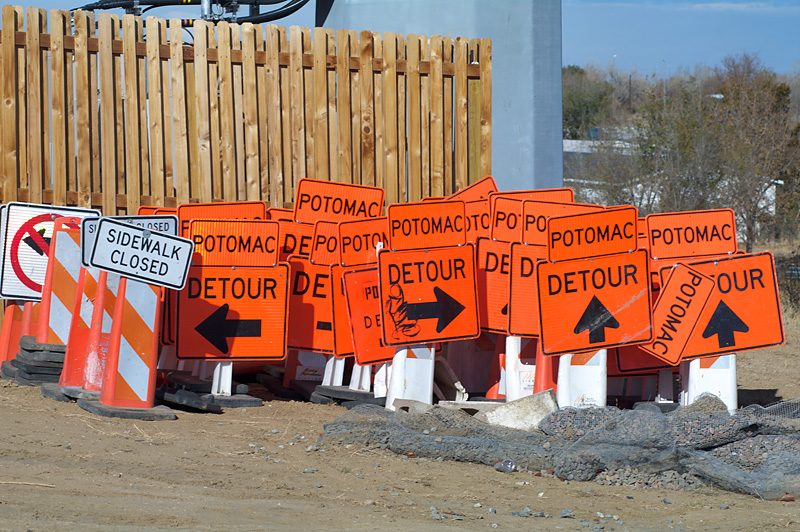
Welcome to the Post Process Challenge #46

I took this at a construction site last fall, just as they were beginning to move a road and a bridge. I like the "detour in all directions". I intended to use it as a starting point for post-processing, so I left myself some room in composition. My original idea is selective color, but so far I haven't really liked any of my attempts.


I think this will work; it's my first experience with it so let me know if you have trouble.

http://dl.dropbox.com/u/36884784/IMGR1686.PEF

Have fun with it. The challenge will be open until midnight on Monday, August 8.

07-31-2011, 09:17 PM   #2
Veteran Member
yeatzee's Avatar

Join Date: Feb 2009
Location: Temecula
Photos: Gallery | Albums
Posts: 3,675
I'll have a go


A lot of subtle changes, including saturating the arrow signs and desaturating the others, blurring the background, other random stuff I normally do to my photos, etc.
08-01-2011, 03:32 AM   #3
Veteran Member


Join Date: Sep 2010
Location: Canberra
Photos: Gallery | Albums
Posts: 739
First time playing - be gentle

As soon as I saw the pic before I'd read your intro Dave I was thinking "Selective Colour"

Denoise, raw sharpening, conversion with Silver Efex II, Masking for Colour, Output Sharpening and then a final Crop.


Last edited by adr1an; 08-01-2011 at 03:39 AM.
08-01-2011, 05:53 PM   #4
Inactive Account


Join Date: Aug 2008
Location: Michigan, USA
Photos: Gallery | Albums
Posts: 7,484
I decided to just isolate the color.. Looks like I still missed a few spots. 3rd time is not the charm. Congrats to whoever wins


08-02-2011, 07:40 AM   #5
Veteran Member


Join Date: Sep 2010
Location: Canberra
Photos: Gallery | Albums
Posts: 739
Only our 3 so far ? Did I scare everyone off with my first attempt ?
08-02-2011, 08:48 AM - 1 Like   #6
Pentaxian


Join Date: Oct 2006
Location: Dayton, OH
Photos: Gallery
Posts: 4,723
Here is my attempt.


Tim

Last edited by atupdate; 08-03-2011 at 04:24 AM.
08-02-2011, 09:37 PM   #7
Veteran Member


Join Date: Jun 2009
Location: Bridgetown West Australia
Photos: Gallery | Albums
Posts: 903
Tweaked in Lightroom.


08-03-2011, 05:36 PM   #8
TZH
Senior Member
TZH's Avatar

Join Date: Aug 2010
Location: Kuala Lumpur
Photos: Gallery | Albums
Posts: 118
Here is my attempt.
Name:  IMGR1686-1.jpg
Views: 256
Size:  235.9 KB
Tan
08-03-2011, 07:39 PM - 1 Like   #9
New Member


Join Date: Jul 2011
Location: Ohio
Posts: 11
I know it's not the greatest work, but it is my first go at post production.
Attached Images
 
08-09-2011, 08:29 PM   #10
Veteran Member


Join Date: Sep 2010
Location: Canberra
Photos: Gallery | Albums
Posts: 739
I think atupdate has the charm!
08-10-2011, 03:54 AM   #11
Loyal Site Supporter
baro-nite's Avatar

Join Date: Aug 2011
Location: North Carolina, USA
Photos: Gallery | Albums
Posts: 5,294
Can't really compete with atupdate but here's another:

Started by shifting the color temp way cooler, to get a little more range in the orange. Took advantage of the nice linear arrangement of the signs to make a simple bi-linear gradient mask for a blurred b&w layer to give a nostalgic tilt-shift effect.

Name:  IMGR1686.jpg
Views: 441
Size:  107.2 KB

Last edited by baro-nite; 08-10-2011 at 04:00 AM.
08-10-2011, 05:45 AM   #12
TZH
Senior Member
TZH's Avatar

Join Date: Aug 2010
Location: Kuala Lumpur
Photos: Gallery | Albums
Posts: 118
QuoteOriginally posted by baro-nite Quote
Can't really compete with atupdate but here's another:

Started by shifting the color temp way cooler, to get a little more range in the orange. Took advantage of the nice linear arrangement of the signs to make a simple bi-linear gradient mask for a blurred b&w layer to give a nostalgic tilt-shift effect.

Attachment 99984

Seems like a dream .
08-12-2011, 03:31 PM   #13
Site Supporter
Site Supporter
Just1MoreDave's Avatar

Join Date: Feb 2007
Location: Aurora, CO
Photos: Gallery | Albums
Posts: 6,340
Original Poster
Disclaimer #1: I apologize to all entrants for being overly optimistic about my schedule. I really
thought I'd be getting to this right away.

Disclaimer #2: Who am I to judge? Treat these comments like I would - feel free to disagree.

When I have tried this myself, I am never really satisfied with my color of the signposts, the shadows and any of my black and white conversions.

yeatzee: First reaction, it made it look more like fall/winter, I like the crop, and the blur seems realistic. On second look, the shadows cast on the detour signs are oddly orange, I might not have done that.

adr1an: First reaction: I like the b/w parts, and limiting the selective color solves the shadow problem nicely. If it were me, I would have made the orange from each colored sign match, though admittedly they don't in the original.

JeffJS: First reaction: Actually, I laughed, because it was really different. I really like it. If you hadn't mentioned the spots you missed, I would probably not pay too much attention to them. I might have tried to include the signposts somehow, since you have them on the left.

atupdate: First reaction: I laughed at this one too. The season of the background seems to match the original, it's a clever idea, and I even start to worry about the safety of the people in the distance. How could they miss the signs? The sun angle difference between the two photos is distracting, though.

ozlizard: First reaction: I like the b/w conversion, the crop is a good solution to the background, and I like retaining the reflective surface of the sign on the left. It would look good on a wide screen.

TZH: First reaction: wow, it has texture - like it was printed on fabric. This one has a hot summer feel to it. It does have the almost-pink shadows that I don't like in my attempts. I had to check: I never hold the camera that level!

mjbasner1978: First reaction: Yes, this looks quite like my attempts, so it's very difficult for me to judge. I like the choice of where the orange stops, which eliminates the shadow problem I have mentioned. The blue-tinted trees look odd enough to me to be a mistake. I would add more of those areas because only one is not enough.

baro-nite: First reaction: I like the tilt-shift effect and the color temperature trick. I might have cropped off the "no left turn" sign because it has too much contrast next to the other signs, fighting against the blur a bit. Nice ideas, but I am going to exercise my absolute power as judge and leave this one out of the running because it was past the announced deadline. That's only because someone might have seen the deadline then not entered.

OK, the really tough part is choosing one winner. Before I change my mind again, I am going to go with ozlizard. This is the one I'd like to see in a large print in a gallery. Excellent work from all the entrants, and thanks for your patience in letting me play judge!
08-12-2011, 07:55 PM   #14
Inactive Account


Join Date: Aug 2008
Location: Michigan, USA
Photos: Gallery | Albums
Posts: 7,484
QuoteQuote:
JeffJS: First reaction: Actually, I laughed, because it was really different. I really like it. If you hadn't mentioned the spots you missed, I would probably not pay too much attention to them. I might have tried to include the signposts somehow, since you have them on the left.
Thanks for the contest. By the time I finally came up with that one, I was, well, rather upset at myself for missing things but wanted to show where I was going with it. Good entries from everyone, glad I didn't have to judge it.

Congratulations Ozlizard!

08-12-2011, 07:58 PM   #15
Veteran Member


Join Date: Sep 2010
Location: Canberra
Photos: Gallery | Albums
Posts: 739
Cheers for the feedback Dave - I did think about balancing the oranges but then decided to leave it 'au naturel' so to speak

QuoteOriginally posted by JeffJS Quote
Congratulations Ozlizard!
Indeed - Nice job ozlizard!
Reply

Bookmarks
  • Submit Thread to Facebook Facebook
  • Submit Thread to Twitter Twitter
  • Submit Thread to Digg Digg
Tags - Make this thread easier to find by adding keywords to it!
challenge, pp challenge
Thread Tools Search this Thread
Search this Thread:

Advanced Search


Similar Threads
Thread Thread Starter Forum Replies Last Post
Post-Processing PP Challenge #25 TOUGEFC Mini-Challenges, Games, and Photo Stories 18 05-30-2010 01:46 AM
Post-Processing PP Challenge #23 JeffJS Mini-Challenges, Games, and Photo Stories 33 05-07-2010 09:01 PM
Post-Processing PP Challenge #22 Graham V Mini-Challenges, Games, and Photo Stories 16 04-24-2010 06:04 AM
Post-Processing PP Challenge #21 Kryosphinx Mini-Challenges, Games, and Photo Stories 24 04-11-2010 11:24 AM
PP Challenge #6 SWEngineer Mini-Challenges, Games, and Photo Stories 20 10-05-2009 09:03 PM


All times are GMT -7. The time now is 01:08 PM. | See also: NikonForums.com, CanonForums.com part of our network of photo forums!
  • Red (Default)
  • Green
  • Gray
  • Dark
  • Dark Yellow
  • Dark Blue
  • Old Red
  • Old Green
  • Old Gray
  • Dial-Up Style
Hello! It's great to see you back on the forum! Have you considered joining the community?
register
Creating a FREE ACCOUNT takes under a minute, removes ads, and lets you post! [Dismiss]
Top