Apologies for the delay. Let's get to it ...
nosliwmit: welcome back to the Seattle area - even if only vicariously! the PNW really does sink in deep, eh? Nice overall version of the falls. Silly detail, but I appreciate the way you dealt with the "sticks" in the foreground, didn't just chop that one off at the ledge. (a little more natural, and not so lawn-care-crew-manicured.)
dcshooter: COFFEE & PIE! Thanks for taking the bait - it looks like it really could have happened!. Actually - I like the tones you were getting in the rest of the photo, and was really hoping to see another version with the rest of the scene of "Where pies go to die."
atupdate: and there HE is. I've missed our dear friend Godzilla!! I keep secretly wishing we'd see him again, honored he'd show up here.
JHfwp: Snow - Nice. Makes me wish I'd gotten up there when it really was snowing - it's specatular!
todd: I feel your pain on the skyline. I actually tried to bracket this, but with all the wind / water movement, and me without my tripod it just wasn't working. I checked out the link to your lesser-cropped version, and it's beautiful also. (far less halo-ing than a lot of pro shots I've seen!) Very nice b&w.
Glenn5995: Very nice job of bringing out the wet-rocks on both versions. To the naked eye it's what you see when you are there. Excellent job of getting that "on fire" sky dropped in there too. That treeline can make that task a pain!
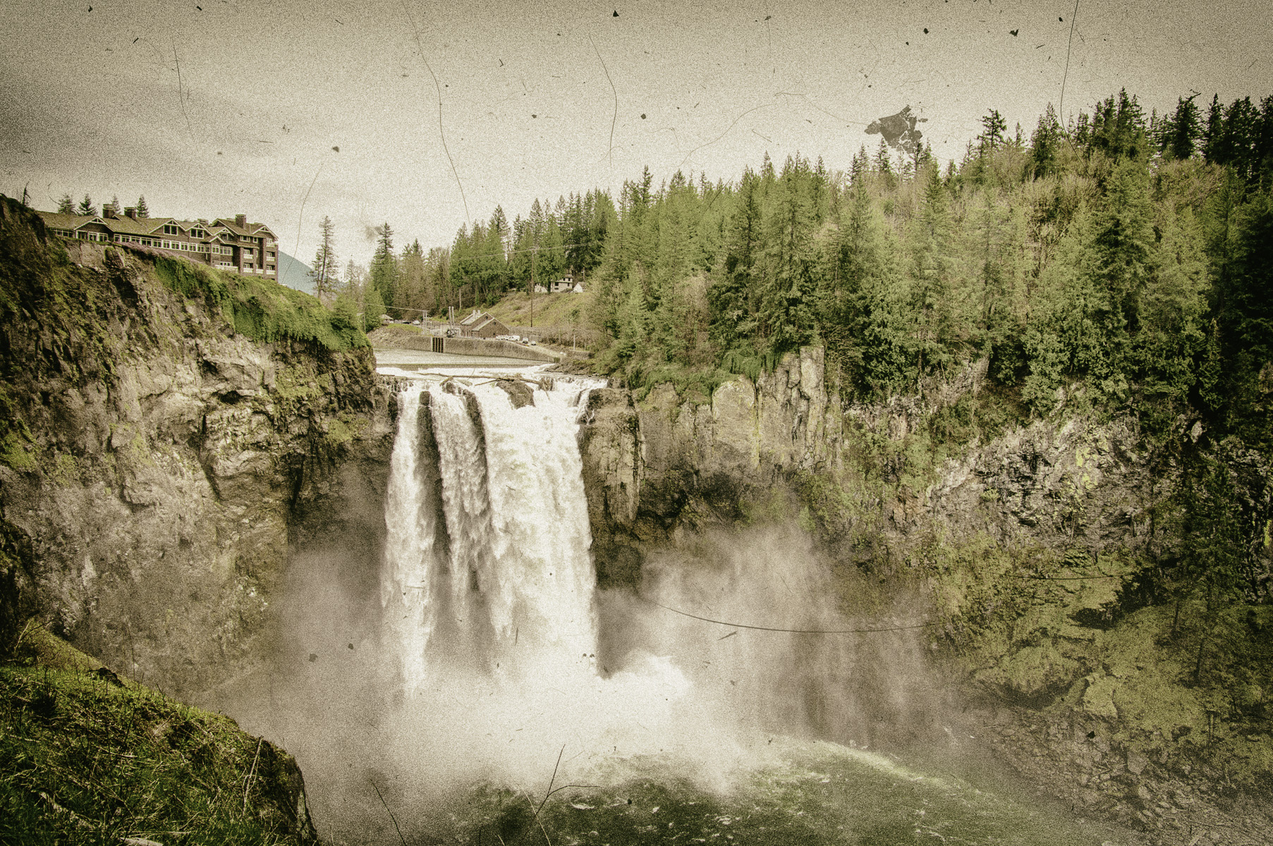
D1N0: Nice job of going vintage - the original lodge was built in the early 1900's and your photo looks like it came right out of the archives. The one tiny thing struck me on this one though is the choice of "dirt & scratches" overlay.... I'm a cat-person, and know all too well the trials of cat hair getting into everything. I kinda wanted to brush off the photo. LOL - it's all good, because that REALLY makes it "authentic" in my house! It really is a nice version, and I do like it a lot.
AzDave: Another beautiful B&W. No question at all that you really made it all about the water. Low-key with the "water" pop really brings that home. There's a good lesson in this one - first thing to ask when you are making pictures: "What is this a picture of?" As short of an answer as possible & go from there. Sometimes the rest is "just framing' (is it falls with rocks, or rocks with falls???)
jcomely: Nice job of bringing out the details. Again - those wet rocks ! And it may seem cartoonish, but the water at the bottom is naturally so very blue/green like you've got there.
Dartmoor Dave: another very nice example of a very "natural" processing. You did a great job of dealing with the foreground ledge for sure!
BigDave: Lots of color ! Nice. Sometimes with the persistent clouds around here, we need a little extra color boost. One thing that seems to work - I noticed when I was playing with this picture is that when bumping the saturation, that background hill to the right of the lodge became way too blue and out of place. The blue-tones in your sky made it blend in quite a bit better - it wasn't so all alone.
******************************
Soo..... yet another tough decision, and I'm going to do something a bit unconventional here. The one I like the best wasn't *exactly * an official entry here, BUT you referenced it and let it loose in the world.... It's
TODD and his beautiful linked B&W picture. You really nailed the "falls with rocks" concept - skyline be damned ! (I re-posted in case anyone missed that link)
Honorable mentions with the prize of "virtual pie & coffee" go to both dcshoooter & atupdate... BECAUSE !


 Post #7 by todd
 Similar Threads


