Ok... time to decide on a winner! But first I'd like to make a few comments about some of the edits as I found this really tough to decide which artistic direction won.
First up,
Glenn5995. I enjoyed this version, to my eyes it looks like you made the image cooler and punched the clarity whilst pulling back on the lights (highlights), it certainly makes the center of the image where most of the lights converge clearer.
Patroit, yours feels very similar approach to Glenn5995's, but instead going in the opposite direction and invoking warmer tones. Nicely done.
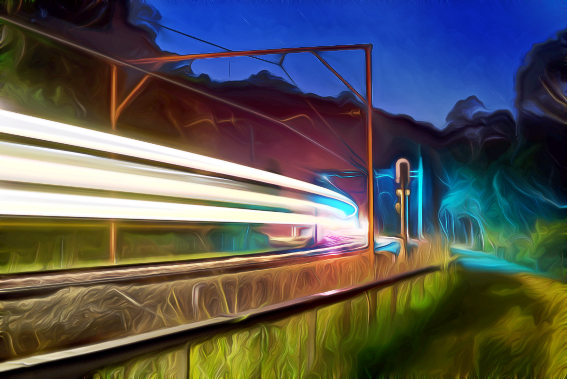
JHfwp, I really enjoyed these two versions, with the second one feeling more refined than the first. The 'squishing' of the aspect ratio I wasn't so sure about, till I saw the second one which had less emphasis in this regard, and I feel it really works well here. You also added stars (how did you manage that?!) and gave the whole scene a more dreamy/eerie sci fi feel, I love it! Well done.
todd, of the two you submitted I really liked the watery effect one, which piece of software did you use to manage this effect? I quite often like tinkering with Topaz Simplify plugin, and often remove some of the effects it creates to leave a contrast in the shot, I keep wondering if this watery effect could have been used to an even greater effect such as part of the light train/trail normal but heading into a weird and watery portal on the other side! It's a fun effect for sure.
Tas, I liked all three textured images you provided, I found it hard to pick one I liked the most. I was waiting on someone delivering an accurate b&w version and here you have done very well, the texture effect adding to the piece. It feels like a time line, b&w being the earliest, then a kinda 'polaroid' version and then a future version last. Great stuff!
jcomley, a pleasing edit here, similar to some others with what looks like even more punch and clarity as well as reduced highlights. Nicely done.
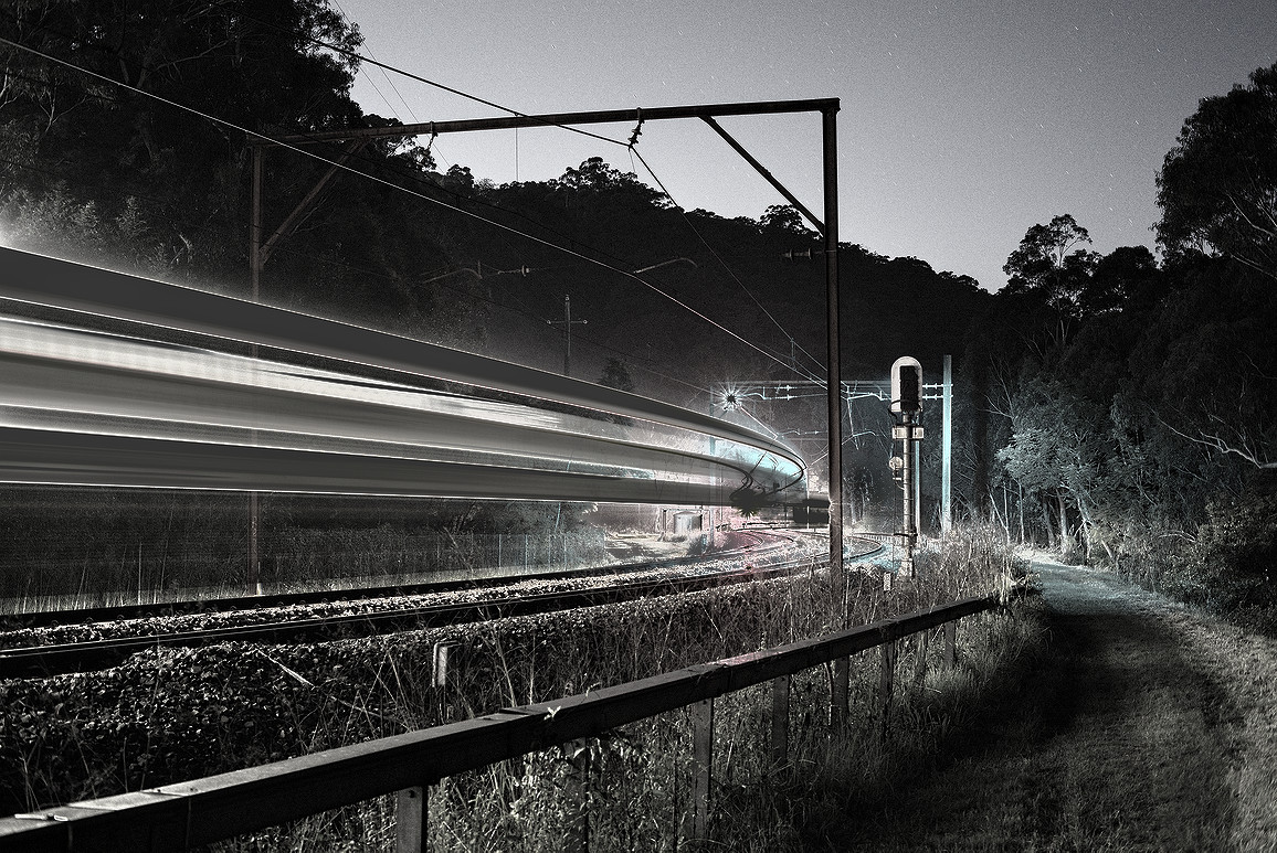
Arizona Dave, Another superb b&w variant, strong train trails and darken silhouette background emphasize the lights. I really
really liked this one. The 'Psychedelic Art' one is pretty crazy but those colours are very striking and work really well together. Your last submission I feel closely resembles my own edit found
here.
chunkiness, another superb take, once again moving far away from the original source to making something surreal and dreamlike.
I've never done anything like this before (pick a winner) especially from an artistic perspective, so I found it all the harder to judge and decide. In the end I found myself drawn back to JHfwp's second entry. The decision to change the aspect ratio (and a second time improve upon it) and then the added stars (something I aim to actually do for real at that same spot someday), and then the dreamy sci fi reduced clarity feel about it, I feel they all gelled together and really worked and moved quite far from the original shot, I am impressed. So yeh...
this weeks winner shall be JHfwp's no.2 entry  congrats
!
Runners up are so close, I like to think one of Tas's would be there, as well as Arizona Dave's B&W edition.


 Post #5 by todd
 Similar Threads


