Forgot Password
Pentax Camera Forums Home
 

Reply
Show Printable Version 5 Likes Search this Thread
08-07-2017, 09:15 PM   #1
Loyal Site Supporter


Join Date: Mar 2012
Location: Phoenix, AZ
Posts: 835
PP Challenge #230

Welcome to Post Processing Challenge #230!

Thank you BruceBanner for hosting the last challenge and many thanks to each of you who participate and keep this great challenge going.

It has been mentioned a few times that there is an interest for portraits. I share that interest, but do little portrait work and therefore have limited resources to draw from, but thought this one of a couple on their wedding day might be a good selection. I hope you find it worthy of your efforts and I look forward to seeing what you do with it. I will close this challenge in a week on the evening (Arizona time) of Monday August 14. Let the fun begin!

Camera: K3
Lens: DA* 50-135mm 2.8

JPG Preview:


DNG Image


A note to the winner: Please copy and post this info into the next challenge.

*************

The mediafire website is: mediafire.com
The login name is: ppchallenge@tmphillips.com
The password is: postprocessing

*************

08-07-2017, 11:08 PM   #2
Site Supporter
Site Supporter


Join Date: Sep 2014
Location: SF Bay Area, CA
Photos: Albums
Posts: 1,037
08-08-2017, 12:51 AM   #3
Unoriginal Poster
Loyal Site Supporter
iheiramo's Avatar

Join Date: Nov 2016
Location: Espoo
Photos: Albums
Posts: 3,182
08-08-2017, 01:27 AM   #4
Site Supporter
Site Supporter
BruceBanner's Avatar

Join Date: Dec 2015
Posts: 5,404
I'll try with a softer vibrant feel;

Hmmm this attached version looks quite a bit worse than the final version I have worked on, interesting, I haven't noticed a deterioration in quality quite as much as this in my other attachements. Oh well, nvm.

Attached Images
View Picture EXIF
PENTAX K-3  Photo 
08-08-2017, 01:36 AM   #5
Pentaxian


Join Date: Aug 2015
Photos: Gallery
Posts: 1,841
Tried to boost the figures whilst subduing the background.

Last edited by photomax7; 08-22-2017 at 02:54 AM.
08-08-2017, 03:12 AM   #6
Pentaxian
D1N0's Avatar

Join Date: May 2012
Location: ---
Photos: Gallery
Posts: 6,802
Vintage look with Color Efex:
08-08-2017, 06:59 AM   #7
Pentaxian


Join Date: Oct 2006
Location: Dayton, OH
Photos: Gallery
Posts: 4,723
Wedding Crasher


Tim

08-08-2017, 03:15 PM - 3 Likes   #8
Pentaxian
Dartmoor Dave's Avatar

Join Date: Aug 2012
Location: Dartmoor, UK
Photos: Gallery
Posts: 3,882
Pretty much straight from the raw file, with just a tiny bit of cloning. . .
Attached Images
View Picture EXIF
PENTAX K-3  Photo 
08-08-2017, 03:49 PM   #9
Site Supporter
Site Supporter


Join Date: Sep 2014
Location: SF Bay Area, CA
Photos: Albums
Posts: 1,037
QuoteOriginally posted by Dartmoor Dave Quote
Pretty much straight from the raw file, with just a tiny bit of cloning. . .
Thanks for the laugh!
08-08-2017, 10:31 PM   #10
Site Supporter
Site Supporter
todd's Avatar

Join Date: Jul 2008
Location: Arizona
Photos: Gallery
Posts: 6,791
08-09-2017, 09:22 AM   #11
PEG Moderator
Loyal Site Supporter
Kerrowdown's Avatar

Join Date: Aug 2008
Location: Highlands of Scotland... "Hold Infinity in the palm of your hand" - William Blake
Photos: Gallery
Posts: 57,816
Old School

He's my version.
Attached Images
View Picture EXIF
PENTAX K-3  Photo 

Last edited by Kerrowdown; 08-14-2017 at 04:11 PM.
08-09-2017, 05:05 PM   #12
Tas
Site Supporter
Site Supporter


Join Date: Aug 2013
Location: Brisbane, QLD
Photos: Gallery | Albums
Posts: 2,202
An interesting series of images created here, good luck with the judging Glenn.

All PP done in On1 Photo RAW.

This first image was processed using a split tone.


Moving on from the split tone to process as B&W but bringing back a small amount of colour after colours were adjusted underneath the B&W effect. The square crop provided less background.


Tas
08-14-2017, 10:45 PM - 1 Like   #13
Loyal Site Supporter


Join Date: Mar 2012
Location: Phoenix, AZ
Posts: 835
Original Poster
And the winner is........

It is time to bring this challenge to a close. I appreciate everyone's contributions. It is usually difficult for me selecting the next host and such it is with this challenge. In many instances it is a matter of splitting hairs when choosing one entry over another. Another issue is the color/tint of an image varies from one monitor to another. I have calibrated my monitor and viewed the images on other monitors, but what I am seeing may well not be what you are seeing on your monitor, so take any of comments about skin tones with a grain of salt. As always, the judging is subjective to my preferences. You will most likely see a preference throughout the comments about the detail of the wedding dress.

So let's get started:

caliscouser - You chose one of the tighter crops, but still retained the full image of the bride and groom, which I like. I like that you retained the detail of her dress. Your image seems a little dark to me, but otherwise nicely done.

iheiramo - A nice choice for crop and I like that you retained the detail of the dress. Skin tones look a little orange to me, but otherwise well done.

BruceBanner - A nice entry, but as you mention, their faces are a little too soft. It also appears a bit of a green tint exists with the skin tones. I like that you preserved the detail for her dress.

photomax7 - I really like that you tried something different. I like the cameo look, with the desaturated background. However, somehow in your processing, you created a shadow outline on the right side (as viewed) of his head and arm. My personal preference would have been to have retained more detail in her dress.

D1N0 - You tried for a different "vintage" look with more grain and a tint to the overall image. You accomplished that and like or dislike is a matter of personal choice.

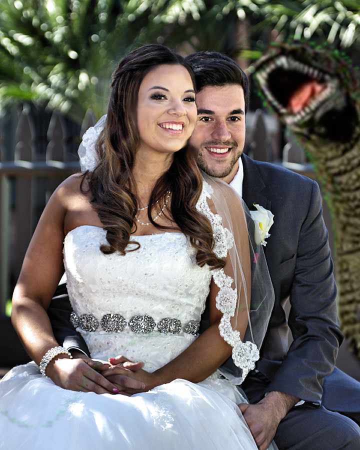
atupdate - A post processing challenge would not be complete without the appearance of Godzilla. Fortunately he kept his presence hidden during the ceremony and only appeared briefly for the photo bomb.

dcshooter - Your entry I find the most difficult to comment on, because my thoughts are very similar to what you expressed about my entry in Challenge #228 and I fear it might sound like I am mocking you, but I assure you I am not. Your entry has a very professional appearance and as you state, you gave it the "wedding photographer treatment" and indeed the look is that which I would expect from a professional wedding photographer. I like the simulated bokeh. I like the choice of a light vignette. You have demonstrated that you possess great skills with processing.

There are only two thing which detract from the image and I admit they are my personal choice. The first is making the wedding dress so white that you lose the detail. I know this is common and accepted in wedding photography, but it always seems a shame to me for the bride to select a beautiful pattern/design for her dress only to have it lost in the photography. The other item is that I don't like the crop that cuts off the tip of her elbow. It just looks awkward to me. Other than those two nit piks, I really like the rest of the photo.

jcomley - I like what you attempted to do to emphasize their faces, but it appears a little too extreme and harsh to me. I think a more subtle difference in exposure with a larger circle and more feather would have worked a little better.

Dartmoor Dave - Perhaps a bit too much contrast, the bride's face seems a tad darker and rougher than I remember. You succeeded in receiving the most likes, in fact yours was the only entry to receive any likes.

todd - A good choice for the crop and well done overall on the processing. I like that the detail is retained for her dress. On my monitor, the skin tones seem to have a bit of a green tint.

Kerrowdown - I like the de-saturation of the background to focus on the couple, however his face and her neck and arms look dark compared to her face.

tas - You have two entries, a color entry and a sort of black and white image. Color - Overall, well done. You have good skin tones and retained the dress detail. I think a little more contrast would have helped, but well done overall. Black and white - Not a true black and white as you retained some color, but I enjoy seeing different things being attempted.

It is not an easy decision, but my selection for the host of the next challenge will be........


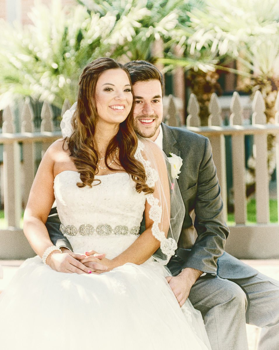
tas! (color version)
08-14-2017, 11:08 PM   #14
Site Supporter
Site Supporter
BruceBanner's Avatar

Join Date: Dec 2015
Posts: 5,404
Well done Tas! And thanks Glenn for hosting
08-15-2017, 03:09 AM   #15
Pentaxian


Join Date: Oct 2006
Location: Dayton, OH
Photos: Gallery
Posts: 4,723
Congratulations Tas and thanks to Glenn for the hosting and commenting on all of the entries.

Tim
Reply

Bookmarks
  • Submit Thread to Facebook Facebook
  • Submit Thread to Twitter Twitter
  • Submit Thread to Digg Digg
Tags - Make this thread easier to find by adding keywords to it!
challenge, post, pp challenge

Similar Threads
Thread Thread Starter Forum Replies Last Post
AF360GZ II much cheaper in Japan ($230) hurricane Flashes, Lighting, and Studio 5 11-01-2016 07:55 PM
DFA 150-450 is 230-690mm on APS-C? colonel00 Pentax SLR Lens Discussion 15 01-02-2016 09:27 PM
For Sale - Sold: Pentax K-01 body, like new (shutter count 230) with all originals - Free post in Aus Quazimoto Sold Items 7 10-08-2013 02:46 PM
For Sale - Sold: Canon fs4000us dedicated film scanner. Reasonable offer over $230 *scanned examples* slip Sold Items 8 01-27-2013 07:33 PM
For Sale - Sold: Vivitar/Kiron/Komine 100mm 1:1 Macro $230 only!!! thomasxie Sold Items 5 05-25-2009 04:19 PM


All times are GMT -7. The time now is 10:41 PM. | See also: NikonForums.com, CanonForums.com part of our network of photo forums!
  • Red (Default)
  • Green
  • Gray
  • Dark
  • Dark Yellow
  • Dark Blue
  • Old Red
  • Old Green
  • Old Gray
  • Dial-Up Style
Hello! It's great to see you back on the forum! Have you considered joining the community?
register
Creating a FREE ACCOUNT takes under a minute, removes ads, and lets you post! [Dismiss]
Top