This contest is over and here are the results:
jcomley - nice tight crop and interesting gradient and texture applied, taking the image in a unique and catchy direction.
D1N0 - i like your grainy silvery tinty bw and the crop and the colorful cloudish bits you added. you even made the (assuming bird) junk on the side look interesting! your edit does well with the every aspect of the details. well played.
 BruceBanner
 - i like it, well done. the frame works. there's nothing about it that has me thinking it's a standout entry though.
Glenn5995 - masterful work as always with all aspects of the image. balanced cool blue sky, with detailed silver statue with warm tones of flowers and background lights. right balance of delivering detail where needed and smoothness where needed. Like D1N0 you also made the poop look interesting and not distracting. well cropped and straightened.
iheiramo - nice tight crop and purplish tint. works well contrasted with silvery statue and flowers and below.
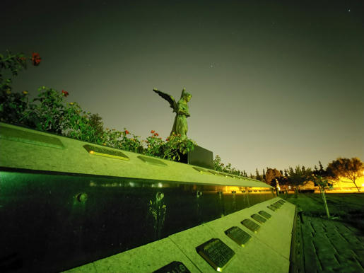
dcshooter - nice crop, first to include the left upper flower which i liked and did't find distracting as others must. nicely managed details and noise and colors. vignette works well. your color version causes me to look at the reflections a bit more than the others so far. i like your bw too but prefer the color version over it. the bw version seems a little too dark for me in spots and too bright in a spot that doesn't work for me.
noelcmn - i like the crop in general, especially for leaving in the far right tree in the background but think maybe the angle doesn't work with it for me. just feels unbalanced to the point of distracting. the details are too washed out for me compared to other entries without really bringing anything interesting in return.
astonm - interesting abstract take. the type of entries i was hoping for more of. angelic rays, colorful mixture of cool and warm tones and textural variations. subtle 'rainbow flare' as Tas put it. an interesting bold saturation to the flowers. appropriately detailed statue. the foreground element is interesting. at first i thought 'ocean' then saw the 'dirt' and thought foliage but then allowed myself to think all of the above together..
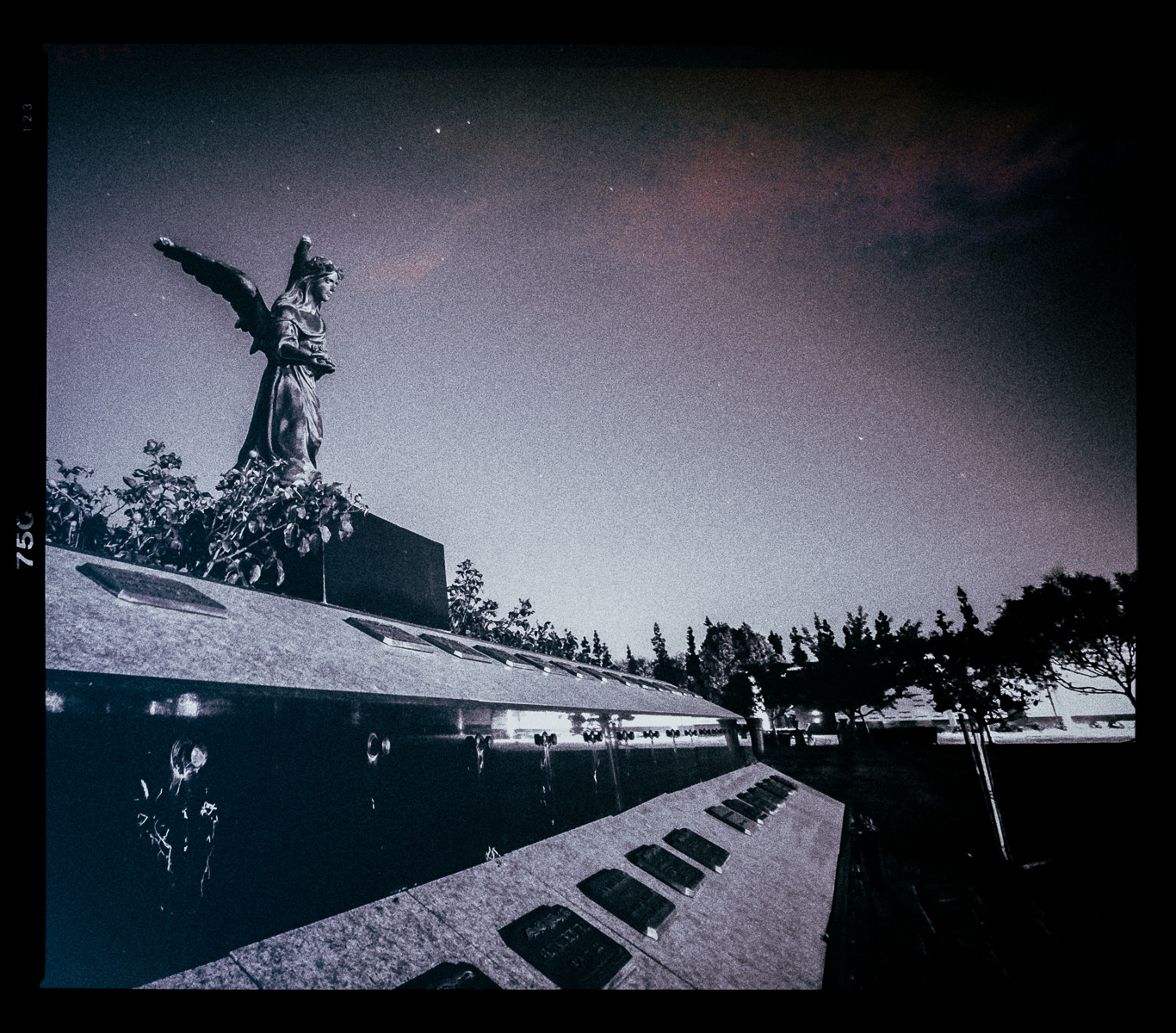
Tas - i like the cross processed look here. the framing is very nice too. crop and correction is effective, allowing you to keep the far right tree in the background which is something i liked about the image and didn't want to lose. also got rid of the bird decor which while some made look interesting, is probably better removed. impressed by the detail brought out in the background and the way it brings the reflections forward to the viewer adding another dimension similar to how dcshooter's does.
3rd place - dcshooter (color)
2nd place - astonm
1st place -
Tas
Congrats Tas! Thanks all for contributing. I enjoyed each entry. Thought I was too quick to pick a shot. Usually I overthink it and this time I underthunk, but at least it was challenging, right!? As always, looking forward to the next round.


 I think I meant to come back and adjust that comment and forgot! As is it was a note for my judging proces haha.. In other words your processing was very nicely done but was just looking for something more exploratory from the winner.. Thanks for laughing it off!
  I am appreciating yours more this time too. I like the filmishness and crop and yours actually works the reflection well too..


 Post #8 by astonm
 Similar Threads


