Forgot Password
Pentax Camera Forums Home
 

Reply
Show Printable Version Search this Thread
11-11-2017, 03:08 PM   #16
Master of the obvious
Loyal Site Supporter
savoche's Avatar

Join Date: Jun 2011
Location: Lowlands of Norway
Posts: 18,311
Gave Color Efex a good run, think it needs time to cool down


11-11-2017, 03:27 PM   #17
Tas
Site Supporter
Site Supporter


Join Date: Aug 2013
Location: Brisbane, QLD
Photos: Gallery | Albums
Posts: 2,202
Original Poster
QuoteOriginally posted by tuggie76 Quote
I couldn't access the raw file, the web page would not open.
Mate, sorry I forgot about getting back to you on this earlier. If you want to try again, can you please try to access the RAW image again? (just to confirm that is by clicking on the link below the example photo called 'My Files' in the original post)

When hosting these challenges you can either post links to the RAW & JPEG files as separate links to a single link to the folder they're sitting in. I usually post separate file links but this time I went with a link to the folder which I checked before posting the challenge and have just checked it again. It's worked both times so I don't know what could be causing the problem but I'd be interested to know if you're still having problems making the link work.

Tas
11-12-2017, 10:21 AM   #18
Pentaxian


Join Date: Oct 2011
Photos: Gallery
Posts: 1,214
QuoteOriginally posted by Tas Quote
Mate, sorry I forgot about getting back to you on this earlier. If you want to try again, can you please try to access the RAW image again? (just to confirm that is by clicking on the link below the example photo called 'My Files' in the original post)

When hosting these challenges you can either post links to the RAW & JPEG files as separate links to a single link to the folder they're sitting in. I usually post separate file links but this time I went with a link to the folder which I checked before posting the challenge and have just checked it again. It's worked both times so I don't know what could be causing the problem but I'd be interested to know if you're still having problems making the link work.

Tas
That seemed to work, although it was a tiff file and was gonna take 20 minutes to download. As I'd already done the contest I stopped there.

Tuggie
11-12-2017, 11:07 AM   #19
Site Supporter
Site Supporter


Join Date: Jul 2009
Location: South Africa-Johannesburg
Photos: Gallery | Albums
Posts: 46,166
Playing with some saturation


Last edited by noelcmn; 11-12-2017 at 11:19 AM.
11-12-2017, 02:52 PM   #20
Tas
Site Supporter
Site Supporter


Join Date: Aug 2013
Location: Brisbane, QLD
Photos: Gallery | Albums
Posts: 2,202
Original Poster
QuoteOriginally posted by tuggie76 Quote
That seemed to work, although it was a tiff file and was gonna take 20 minutes to download. As I'd already done the contest I stopped there.

Tuggie
Tuggie,

Okay mate, but I think there's something going on somewhere between the host site and your end as I only posted DNG RAW and JPEG versions. I don't even have a TIFF version so I'm confused with that.

If you would like to explore this more you could try downloading the DNG from challenge #238 here: PP Challenge #238 Arty Portrait. - PentaxForums.com

Let us know if you can see/access the DNG RAW from there.

---------------------------------------

G'Day Everyone,

Only a couple hours to go if there's anymore for anymore. I'll get this challenge wrapped up quickly and hand the baton over to.....?

Tas
11-12-2017, 04:10 PM - 2 Likes   #21
Tas
Site Supporter
Site Supporter


Join Date: Aug 2013
Location: Brisbane, QLD
Photos: Gallery | Albums
Posts: 2,202
Original Poster
PP Challenge #240 has left the building!

G’Day Everyone,
Thanks very much for participating in PP Challenge #240, the challenge is now CLOSED. And so begins my mountain to climb to decide who’ll become the host for PP Challenge #241.
The number of participants for #240 has been great to see, though the task of picking one out of many brilliant submissions is I must admit, particularly daunting. The photo for this challenge was fairly Spartan in details or exposure issues and I think that has meant those accepting the challenge looked for interpretations from a fairly bland canvas.

Anyhoo, enough of the stalling, it’s down to business.

BruceBanner
- Old Bruce was quick out of the blocks, probably inspired by it being the eve of the Melbourne Cup. So out of the gates Bruce submitted a strong interpretation of the scene opening up the shadows and providing a balance to the illumination for the reflection against the bright sky. Apparently Bruce doesn’t like people so they disappeared completely making the scene all about nature. There’s lots of detail drawn out in the clouds which I like, but it is worth noting that the horizon for this image leans to the right. Sorry mate that was my fault.

jbinpg
- It was several days before another submission but this one really took me by surprise. The high contrast mono created a bleak and lonely appearance to the scene, and being the ignoramus that I am I had to Google ‘chiaroscuro’. I believe this is a good interpretation of that style and as a fan of a square crop the combination allows the central tree to remain the primary subject without the distraction of the other elements. An original interpretation indeed.

alamo5000
- This is closer to how I see this type of scene, it removes the distraction of colour and relies on a warm monotone to impart warmth in what is a somewhat barren landscape. The choice to leave the trees dark means that they stand out more against the similarly warm toned sky and the luminance in the reflection takes a more prominent place in the scene. The clouds could almost be storm clouds, so I like this too but again will point out the leaning horizon.

Glenn5995
- Two strong versions created here with bold colours in the first submissions and a strongly lit reflection. I think the whites could be slightly overcooked but then it could just be how I’m seeing it. The extra luminance in the reflection really draws the cloud detail out beautifully in the left foreground, I really like that in this version. The second version could be from an image captured in the mid 19th century. The strong contrast in the centre is blended nicely to the white vignette so reminiscent of images from that era. This second version is hauntingly brilliant and my favourite of the two.

D1N0
– There’s a warm almost summery feel to this interpretation. Some cropping tightens the scene more drawing the eye to the stronger elements like the person, the central cloud and tree and the reflection. This is a good example of how a crop can reimagine a scene and focus on specific elements. The lighter exposure has opened up the trees nicely and highlights the clouds in the reflection wonderfully. Again I must accept my inability to stand upright to capture a level horizon.

iheiramo
– Yet another bold interpretation taking out one of the strong elements to focus on the wonderful cloudscape that was there that day. I love cloudscapes and this really does become the central focus here, and despite losing the foreground, by leaving the person on the left there is a feeling of how large and lonely the vista is and helping the emphasis on the clouds. I like this. By retaining a slightly darker tone in the trees they stand out boldly against the sky nicely. Something I thought you might have noticed with the pano framing is the crooked horizon I managed to capture.

todd
– The low key mono version here has lifted the horizon removing the expansive cloudscape to emphasise the ground detail whilst retaining strong structural elements in the sky. This type of version could have closed down the detail in the trees but the exposure has been balanced well to not leave them too heavy and dark. The darker scene emphasises the reflection more and really needs a darker environment to view it in in order to enjoy the detail that the strong contrast provides, like the softness of the billowing clouds against the acuteness in the ground detail.

jcomley
– Just when you think you’ve seen all the interpretations of a scene we are rewarded with a detail extracted from the scene and rendered like a painting. The fractal effect here works really well on the trees and appears almost like a jigsaw in the sky. The lighter exposure allows a warmer scene with plenty of detail available through the filter effect. I know this type of filter can be polarising but the great thing about these challenges is there’s no right or wrong interpretation, just the one you’ve chosen to allow others to see the scene through your eyes, including the unique emphasis and effect created here.

dcshooter
– two versions of the same crop focusing on the main components within the scene. The colour version retains strong contrast whilst lightening the scene to capture detail in the trees and foreground. The person really stands out here and would convey that sense of isolation in the environment if they were the only evidence of a human in the scene. Compared to the colour version my eye tends to be drawn to the sky due to the stronger contrast darkening the sand. I like the way the reflection is better emphasised here but think there’s a real focus on the person in the first image that the darker sand in the mono detracts from. I usually prefer a mono in this type of scene but I think your colour version works better for me as my eye is drawn to the person.

tuggie76
– Sorry to not get back to you earlier about the failed link, the K-1 RAW files are really great to work with and can be pushed and pulled in many ways. Despite that hiccup you’ve created an original version, and whilst I don’t get the sense of a sunrise there’s some really strong elements here that I would like to mention. The flare you’ve added has created a wonderful rainbow appearance in the reflected clouds in the lower left of the frame. Adding the flare then masking out the strong sections but leaving some subtle colour like that in the reflection would be brilliant. The blue sky works well in the area below the blown out part and the lighter horizon near the lone person looks obvious but the essence of what you’re trying to create there is really good. Maybe a larger brush with a more generous feather and lower opacity would work better when emphasising this type of scene within a scene. I must admit also to a sense of wonder at the glow you’ve added to the trees. It doesn’t give me a sense of sunrise light filtering through the trees but a crop onto that cluster of trees would look like an early morning mist lit by a sunrise and could be from a bayou. Some real silver lining creations in this scene to consider for another challenge.

astonm
– Just when I thought I’d seen a great variety to make my decision harder you came along with an almost whimsical interpretation creating a real 3D look and making my job harder. Thank you for both, I’d not considered this technique and probably wouldn’t have without your submission. The decision to desaturate the sky elements and lighten the colours in the trees and sand direct the eye away from the distractions. And whilst I like the reflection in this scene the blur and minor crop have added to emphasising the beach scene and the lonely person in a vast landscape. There appears to be some smeared colour in the clouds but this interpretation is quite inspiring.

caliscouser
– This challenge just keeps on giving, and in this case two strong and dramatically different versions. I’m a big fan of using complimentary colours and like the combinations of yellow or orange with blue, particularly for this type of scene. There’s a dream-like quality to your first image with the warmth of summer present in the lightest part of the scene. I’m a bit distracted by the bright white in the sky and would like to see the warmth in the sand extend into the left of frame as a personal preference. Again this version really emphasises the lone person who’s almost walking from the blue night on the left into the warmer day. The second version is yet another I didn’t see coming, yet the execution of the moonlight interpretation has been done so well. There’s a bit of blooming around the trees that could be done better, but the bluish green tone, strong contrast and selective luminance adjustments have created night out of day. I really like the white highlights on the clouds and whilst there’s strong elements I your first version moonlight is definitely my favourite.

savoche
– The crop to the top of the image really emphasises the strong elements captured yet retains the openness of the scene at Nudgee. The sky has plenty of blue/white contrast as a backdrop against a warm sandy beach with only subtle lightening of the tree cluster due to the vignette. The eye for me is drawn more to the sky and reflection and I think a low opacity lightening of the beach and water could help emphasise the person more. Having said that I’m viewing your image in a well-lit room and this might again be an interpretation that rewards the viewer more in a darker room. The rule of thirds has been broken nicely here with the horizon as for me the person seems to be on an endless journey to the sky. Nice work mate, glad you fixed up my mistake with the crooked horizon.

noelcmn
– Another couple of submissions to round out the challenge have worked strong contrast in two markedly different colour tones but similar crops. Beyond this the blown out sky in the first version loses the lovely cloudscape but doing so creates a simpler image that focuses on a triangle of detail between the person, trees and the reflection. So whilst I like the cloudscape in version two I think your first version has stronger elements working in the scene.
------------------------------------------------------------------------------------------------------------------------------------------------------------
Typically I’m loathe to be a Negative Nancy in reviewing the submissions but hopefully there’s still some benefit to the feedback provided. Judging by the word count in this closing post I think I should have become a writer. At least I won’t have to worry about crooked horizons.
Okay so to the final decision. This was a particularly hard decision to make with strong submissions being a hallmark of the challenge this week. Thank you to each and every one of you who’ve taken this challenge, but to again paraphrase the tag line of ‘Highlander’: “There can be only one.”
I have several favourite images from the challenge but the one I really felt demonstrated thought outside the box, a plan to create it and a subtleness to make it work is the ‘moonlight interpretation’ by caliscouser.
Congrats mate, I look forward to see what you choose for PP Challenge #241.

Tas
11-12-2017, 11:16 PM   #22
Site Supporter
Site Supporter
BruceBanner's Avatar

Join Date: Dec 2015
Posts: 5,404
QuoteOriginally posted by Tas Quote
G’Day Everyone,
Thanks very much for participating in PP Challenge #240....

BruceBanner
- Old Bruce was quick out of the blocks, probably inspired by it being the eve of the Melbourne Cup. So out of the gates Bruce submitted a strong interpretation of the scene opening up the shadows and providing a balance to the illumination for the reflection against the bright sky. Apparently Bruce doesn’t like people so they disappeared completely making the scene all about nature. There’s lots of detail drawn out in the clouds which I like, but it is worth noting that the horizon for this image leans to the right. Sorry mate that was my fault...
Tas
Bahahah! Damn straight! HULK SMASH PUNY HUMANS!

But in all seriousness, great interpretation of the results, yer bang on the mark with all of them (imo) and made a good choice.

Congrats caliscouser!

PS: I didn't actually notice the horizon was wonky, perhaps cause my monitor is on a movable swivel and rotatable arm! lol

11-12-2017, 11:17 PM   #23
Site Supporter
Site Supporter


Join Date: Sep 2014
Location: SF Bay Area, CA
Photos: Albums
Posts: 1,037
Thanks very much Tas for hosting and taking the time to write up that very thoughtful and comprehensive feedback.
Kudos to everyone who took part. Really strong diverse entries this week.

Challenge 241 is up and can be found here: PP Challenge #241 Farm Window - PentaxForums.com

Hopefully the image is worthy of the great work we saw in this challenge.
11-13-2017, 01:28 AM   #24
Master of the obvious
Loyal Site Supporter
savoche's Avatar

Join Date: Jun 2011
Location: Lowlands of Norway
Posts: 18,311
Thanks to Tas for thorough and well thought through feedback, I'm impressed! And congrats to caliscouser!

As for the horizon, I'm always checking it in post as I'm notoriously bad at getting them straight. (I'm a bit better now that I have the ever-present level in the viewfinder, though.)
11-13-2017, 01:58 AM   #25
Pentaxian
D1N0's Avatar

Join Date: May 2012
Location: ---
Photos: Gallery
Posts: 6,802
Congrats caliscouser and Thanks Tas. Didn't even notice the crooked horizon, but the K-1 can level it for you as long as you use the indicator in the VF
11-13-2017, 02:01 AM   #26
Site Supporter
Site Supporter


Join Date: Jul 2009
Location: South Africa-Johannesburg
Photos: Gallery | Albums
Posts: 46,166
Congrats Caliscouser, impressive stuff you've accomplished there! I like it! And thanks to our host, a budding writer indeed. Go for it . Lovely challenge, so diverse.
11-13-2017, 03:00 AM   #27
Tas
Site Supporter
Site Supporter


Join Date: Aug 2013
Location: Brisbane, QLD
Photos: Gallery | Albums
Posts: 2,202
Original Poster
QuoteOriginally posted by D1N0 Quote
but the K-1 can level it for you as long as you use the indicator in the VF
Yeah it's turned on but I don't always remember to pay attention to that.

Something I said I'd do when I started this challenge was to post my version which is actually the frame before or after the one used in the challenge. This is it here, and I have to say you guys got more out of it than I did.


Of course as I'm experimenting with textures from time to time (inspired by the people at Photomorphis) I have tended to process my Nudgee photos with textures or other styles. And I've been there a bit, so if you're interested here's some other Nudgee images with their own style of processing.

Together alone | A family and their puppy are together with ? | Flickr
Journey to the horizon | Three in the middle of two trees he? | Flickr
Walking the dog | Taken a little while ago, this is a photo ? | Flickr
Shadows and storms along the shore | Have been lacking the m? | Flickr
Nudgee swing | Grant | Flickr (the natural look)

Tas
11-13-2017, 09:35 AM   #28
Pentaxian


Join Date: Oct 2011
Photos: Gallery
Posts: 1,214
That's pretty impressive Taz, and thanks for the feedback.

My niece lives in Brisbane and is always taking about 'nudgee', what is it?

Tuggie76
11-13-2017, 03:07 PM   #29
Tas
Site Supporter
Site Supporter


Join Date: Aug 2013
Location: Brisbane, QLD
Photos: Gallery | Albums
Posts: 2,202
Original Poster
QuoteOriginally posted by tuggie76 Quote
My niece lives in Brisbane and is always taking about 'nudgee', what is it?
It's a small world indeed.

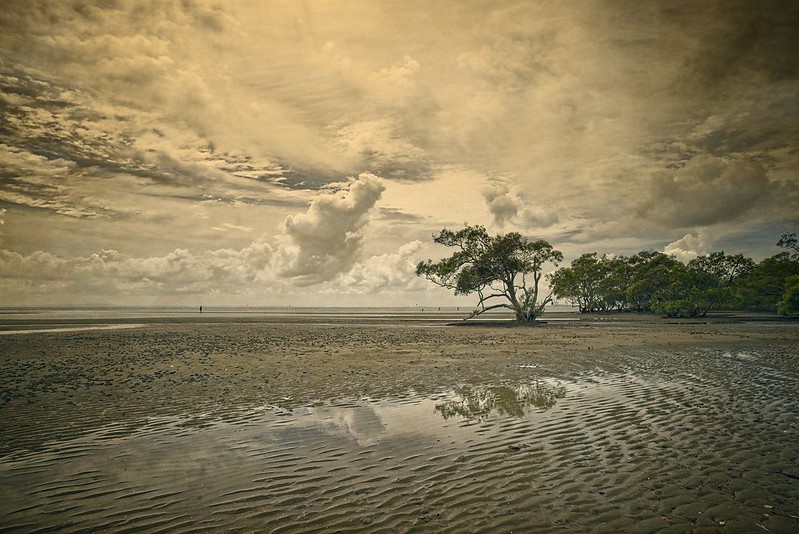
Nudgee is a suburb that sits on Moreton Bay, north of the Brisbane River. Moreton Bay is a Ramsar Wetland, and Ramsar wetlands are those that are representative, rare or unique wetlands, or are important for conserving biological diversity. In reality it means it's a Mangrove Swamp and a great place for donating blood to the local Mosquito population. The suburb itself is very small, but the area has waterways for kayaking, walking tracks and bike tracks, some good fishing spots, and a recreational area with decent loo facilities and BBQ facilities. But I think the biggest draw card for many people are the sand flats at low tide. This makes it popular for the locals and visitors to get the dog out for a good walk off leash. There's always people walking dogs there when the tides out, sometimes you see people riding horses, and then there's those people like the one if the challenge image who must be called Nigel as they're on their own.

The location is popular with photographers too as the sand flats create an open expanse at low tide and when the tide is in the water can be like a mirror. Try a Flickr search using Nudgee, there's way better images of the place than anything I've ever captured, like this: Clearing From Grey | **Explore #3 June 2, 2010** ISO100 | 18? | Flickr

For a more formal description of Nudgee here's what smarter people than me have to say about the place: Nudgee | Queensland Places

Tas
11-13-2017, 03:43 PM   #30
Site Supporter
Site Supporter
BruceBanner's Avatar

Join Date: Dec 2015
Posts: 5,404
QuoteOriginally posted by Tas Quote
Yeah it's turned on but I don't always remember to pay attention to that.

Something I said I'd do when I started this challenge was to post my version which is actually the frame before or after the one used in the challenge. This is it here, and I have to say you guys got more out of it than I did.


Of course as I'm experimenting with textures from time to time (inspired by the people at Photomorphis) I have tended to process my Nudgee photos with textures or other styles. And I've been there a bit, so if you're interested here's some other Nudgee images with their own style of processing.

Together alone | A family and their puppy are together with ? | Flickr
Journey to the horizon | Three in the middle of two trees he? | Flickr
Walking the dog | Taken a little while ago, this is a photo ? | Flickr
Shadows and storms along the shore | Have been lacking the m? | Flickr
Nudgee swing | Grant | Flickr (the natural look)

Tas
Nice shots, followed I also hope you added a few of these shots to our Thematic Trees page!

I shall now google Photomorphis...
Reply

Bookmarks
  • Submit Thread to Facebook Facebook
  • Submit Thread to Twitter Twitter
  • Submit Thread to Digg Digg
Tags - Make this thread easier to find by adding keywords to it!
capture, challenge, image, post, scene
Thread Tools Search this Thread
Search this Thread:

Advanced Search


Similar Threads
Thread Thread Starter Forum Replies Last Post
240 dpi K David Pentax K-3 & K-3 II 18 03-02-2016 12:26 PM
Pentax SMCP-D FA 50mm f/2.8 under $240 TropicalMonkey Pentax Price Watch 3 12-22-2015 03:22 PM
85mm F1.4 $240 Adam Pentax Price Watch 5 11-19-2012 07:22 AM


All times are GMT -7. The time now is 01:44 AM. | See also: NikonForums.com, CanonForums.com part of our network of photo forums!
  • Red (Default)
  • Green
  • Gray
  • Dark
  • Dark Yellow
  • Dark Blue
  • Old Red
  • Old Green
  • Old Gray
  • Dial-Up Style
Hello! It's great to see you back on the forum! Have you considered joining the community?
register
Creating a FREE ACCOUNT takes under a minute, removes ads, and lets you post! [Dismiss]
Top