photocles - grittiness achieved. i like the out of the norm approach. causes me to take the image in differently in a positive way. I like the increased visibility of the passenger too.
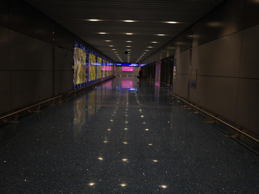
Glenn5995 - Great job a correcting the exposure with a great balance of detail and noise management. (This is Sky Harbor Terminal 4)
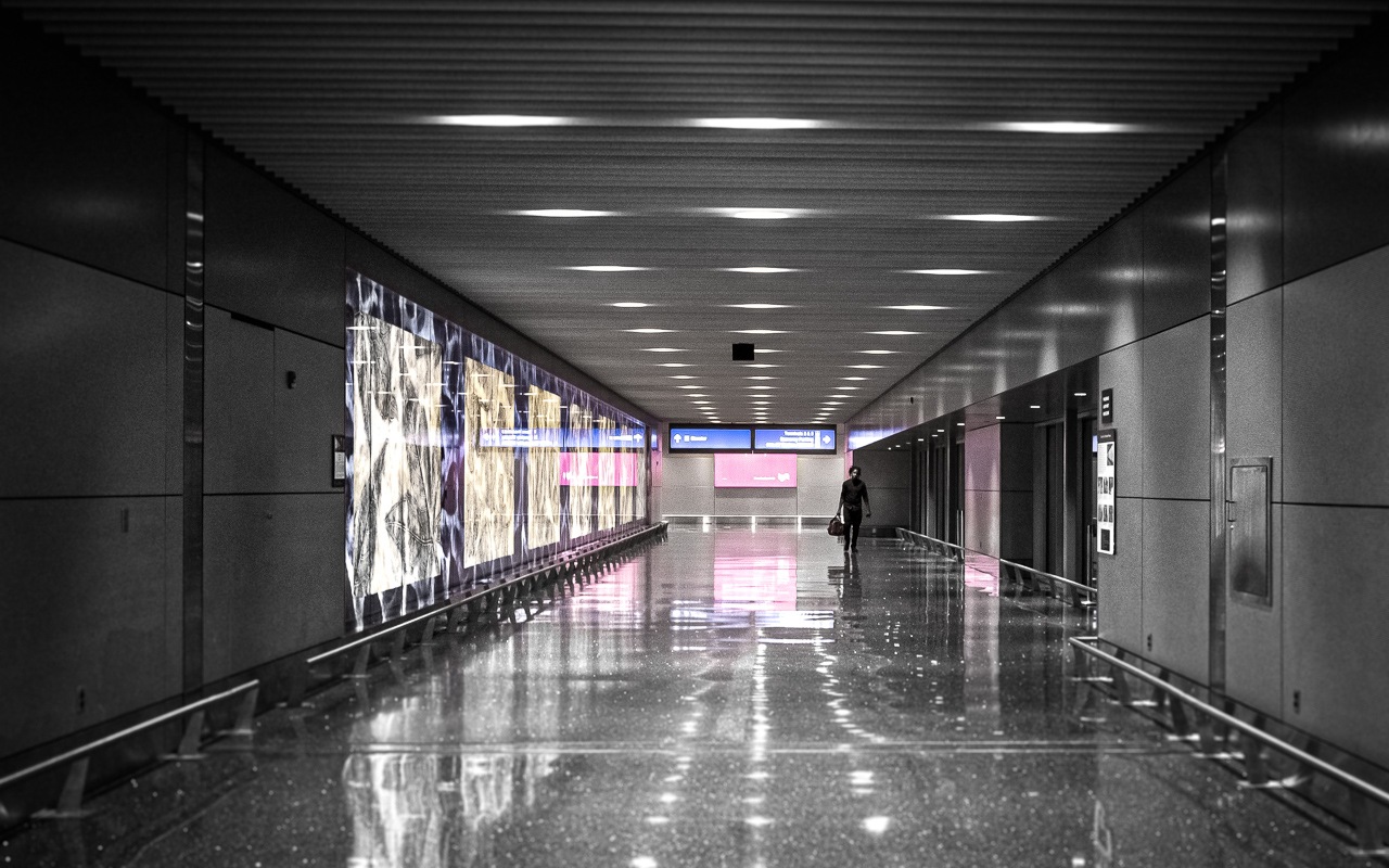
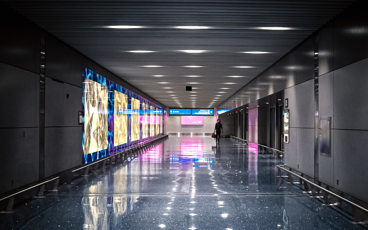
Tliivo - interesting desaturated entry #1. Just me but thinking I'd like it more all the converted. Entry #2 I agree with you. I like it and it's an interesting subtle touch with the desaturation that works for the overall image.
noelcmn - nice work with the colors and corrections.
ffking - both entries are bold and pack the punch. I really like how you brought out and attention to the reflections. I hadn't even noticed some of the 'bonus' reflections that are there, like for the sign on the right. I thought a bw would be the winner of this round because it was my subjective choice when I took my pass at it, but of your two, the color takes my vote.
Tomzohh - nicely done bw. the only thing that catches my eye to comment on is the blown detail in the signs on the left. not a deal breaker, but just saying I noticed it.
jmacias - I'm also a long time RT user, so you get bonus points for that.

i like the exposure adjustment and noise control but think a could use a little more rotation/perspectice correction.
Tas - i don't noir why but i like it!
nicely done.
So which entry do I like best? I'm sorry ffking, but it's your color entry, despite your successful effort to be diluted in your statistical chances of being selected.
Congrats!
 Originally posted by ffking
fun
 Here's
 what I did with it. (Here's
large if you have a big monitor)


 Post #14 by todd
 Similar Threads


