I'll start off by thanking you for spending time working on my image. I'm thrilled to see so many interpretations, and most of them quite far from my own attempts. I have to revisit my Namibia images with new eyes now.
A few quick words to each entry:
bertwert
Good to see you joining in on the fun

I hadn't really considered cropping to 1:1, but I think it works well. So does the well balanced and natural look.
mariwalt
Certainly an otherworldly take on things. The dramatic lifting of the shadows really pulls the dead tree forward, despite the lively colours on sky and dunes.
Glenn5995
B6W was another approach I hadn't considered - I've been too focused on the red dunes. Then going for a portrait crop really puts the emphasis on the tree. The sloping U shape of the dunes adds to this, I think.
JHfwp
Beautiful work on the tree. The darkened sky puts me more in an evening mood than a morning mood. Interesting effect. Nice ripples in the dunes.
todd
Another nice b&w. Good detail in the tree but also distinct ripples in the dunes as a balance. The 4x5 crop works well, too.
jmacias
Another portrait crop! I did not expect that. Slightly more centred, but still with the U shape of the dunes "supporting" the tree. Excellent work on bringing up those shadows. 10 years on the K-5 still has a fantastic sensor.
Old Dog
Welcome to the game! Not afraid of jumping in with both feet - good! The most radical crop of the day. I'm beginning to think I framed this all wrong
I think the high-key processing gives a slightly eerie mood, and maybe letting the background trees get some more attention. And of course the flip makes the image stand out, especially for one who has spent too many hours on these desert images!
tuggie76
Very close to how I remember the colours on the dunes and the sky that day, buth in hue and intesity (but hey, I love these arid landscapes, I might have a vivid recollection...). The cooler tint on the tree separates it well from the background.
Tas
Namibia is well worth a visit
Interesting "vintage" approach on your edits. You've managed to deviate from the natural colours but still make them feel real. I find your second image strangely appealing even though I don't usually like added paper structures. I guess I need to get some matte cotton canvas, now...
pixie
A convincingly natural look, IMO. The still relative high contrast between tree and background does it, I think. I can almost feel the still chilly morning as it gives way to a scorchingly hot day.
noelcmn
As if this wasn't difficult enough already you had to bring three edits

Three quite distinct edits at that. I'm not sure the rangers would look kindly upon your tidying up Deadvlei! Admittedly it does give the scene a cleaner look, though. Good cloud details in all of them, but I think the dunes look best in the two last ones.
Umm, that ended up with more than a few words, didn't it

Oh well, on to the hard part...
To my surprise I ended up with b&w edits for the two top spots; the runner up being todd with all the lovely detail, but with the top spot going to Glenn5995 and the crop I liked the most.
Cograts to @Glenn5995


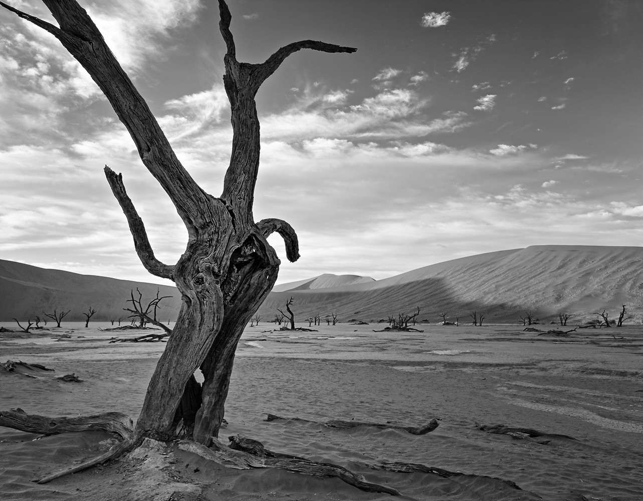


 Post #5 by Glenn5995
 Similar Threads


