Well folks, here's the moment you've been waiting for! The highlight of your week! The day where you can finally release the breath you've been holding! The thread where you will finally see if your hard work has paid off, or if you're just another entry. The place where you'll see if you've gained international recognition, or have been merely forgotten!
Okay, that's enough.
Original Contest Runner Up: Perrumpo 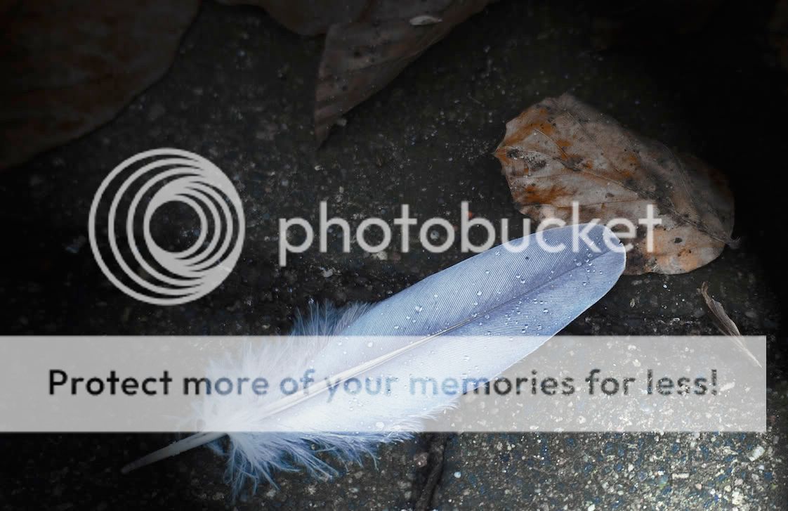
I like this one very much. I especially like how the leaf almost looks like it's covered in blood splotches. The sidelighting effect is great as well. The blue cast on the feather is a bit bothersome though.
Aaaaaand finally, the winner!
Winner: Graham V 
This is wonderful! It's a simply pleasing rendition. It has the feeling of reading by the fire, sipping tea. Warm and inviting. I'm not sure, but I think at this resolution, the sharpness in the feather makes that banding effect? In any case, it bothers me at this resolution, but I won't take it into account, as I assume it would be gone at full size.
And for everyone else, here's my response:
Joeyc: I like the B&W and the cropping very much. I would have liked to see some of the blown highlights in the feather brought back, but it's a very nice interpretation in any case.
Ash: Thanks for the compliment.

I also like this rendition. I think I can see some desaturation in the leaves, which works nicely, and I like the idea of the vignette. Although I think the vignette is a tad bit too heavy.
Atupdate: Detail in the droplets is great, as are the colors. IMO, the leaf is a bit too saturated, and the ground at places is distractingly sharp. It may have worked better to extend that weird blur in the top left closer to the feather and then to create a similar effect on the bottom right.
ozlizard: A very interesting look. I do like the pseudo HDR look, but the square crop and vignetting just don't work for me. A bit more subtle or gradual with the vignette would have been nice. It might just be me, but I can't stand square crops unless the subject demands it, like if the subject was symmetrical around more than one axis.
SWEngineer: Whoa. Strange. It's cool though!
xs400: Nice! The details in feathers (in general) always has fascinated me.
bumbibop: I want to love this sooo much! But the blown hightlights on the feather... Otherwise, I love the muted colors.
Mithrandir: Very very interesting perspective. I can't decide which I like better. I like the softness painty feel of the second one, but I think the bricks and the leaves are too dark. But yes, wonderful interpretation.
Tamia: Good idea to go close, although I think this picture may have a few too few megapixels to make this degree of magnification. I admit, I should have gotten at least one shot up close, but I had no macro or near-macro lenses on me. Those droplets are scintillating!
Ramseybuckeye: That's awesome! Haha! So different! Definitely NBC-like.
xs400 (again): There's a distracting feather in the corner of this photo. You ought to have cropped it out or creatively cloned it out. Otherwise, I like how the image draws me in and makes me want to walk to the end, just to see what was there.
song hm: Black and white definitely suits this image. However, I can't decide whether you were going for a darker look or a lighter look. It may have been better had you chosen to depict this as a darker image by deepinging shadows and such, or a ligher image by bringing out the lighter portions and highlights.
Thanks everybody! It was a very good contest!
I look forward to the next one!


 Similar Threads


