Forgot Password
Pentax Camera Forums Home
 

Reply
Show Printable Version Search this Thread
10-05-2010, 07:23 PM   #1
Forum Member


Join Date: Jan 2010
Location: South SF Bay, CA
Posts: 71
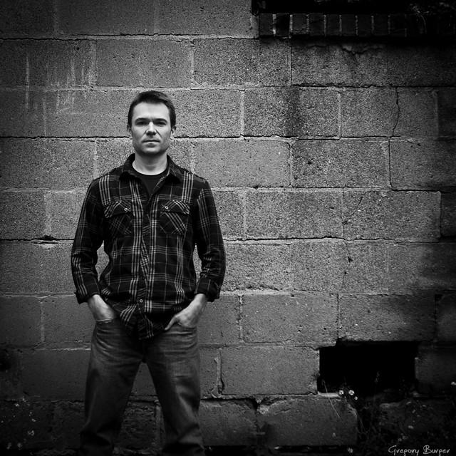
Self Portrait
Lens: DA 18-55 WR Camera: K-7 Photo Location: Outdoors ISO: 100 Shutter Speed: 1/90s Aperture: F4.5 

My first post in the Critique forum, my first self-portrait, and my first conversion to black and white where I actually adjusted the various colors to try to create depth and draw the eye.


10-05-2010, 10:12 PM   #2
Loyal Site Supporter
DWitte's Avatar

Join Date: Sep 2010
Location: North of KCMO
Photos: Albums
Posts: 84
Looks good to me. One thing I have yet to do is take even a decent self portrait.
10-05-2010, 11:04 PM   #3
Veteran Member


Join Date: Sep 2009
Location: Texas
Photos: Gallery
Posts: 3,507
I have no complaints. It looks good. The tones are just right, and you are drawn right to the subject. There are other details in the wall, but not too much to be a distraction. If anything they add to the photo. Nice work.
10-06-2010, 05:00 AM   #4
Pentaxian


Join Date: May 2009
Location: North Carolina
Posts: 836
Dodge your eye sockets and I would like to see a version without the vignette, not sure if I like it or not.

Other than that, well done!

10-06-2010, 05:01 AM   #5
K-9
Veteran Member


Join Date: May 2009
Location: USA
Photos: Albums
Posts: 1,971
Overall, pretty good effort. To be picky, your eyes could be a little better lit, and I am just not a fan of the vignetting look.
10-06-2010, 05:08 AM   #6
Forum Member


Join Date: Sep 2010
Location: Dallas
Posts: 52
Overall good job. As mentioned before, the eyes are a little dark but I think it adds to the mood you are trying to create. A couple of technical nits on the crop ... should not crop at a joint (knees) and there is unnecessary space above the head.
10-06-2010, 06:08 AM   #7
Forum Member


Join Date: Jan 2010
Location: South SF Bay, CA
Posts: 71
Original Poster
Here's a version with a much lighter vignette and with my eye sockets a bit lighter. Myself, I think I still prefer the first version. This second one looks good also, but I was/am going for the slightly darker look.

I think I learned quite a bit just by making the change the comparing the two side-by-side.

(Click for larger)


10-06-2010, 03:40 PM   #8
Pentaxian


Join Date: May 2009
Location: North Carolina
Posts: 836
Greg:

What you want the photograph to look like is all that really matters at the end of the day; you're the one with the vision.

I enjoy your second one (at least on a technical basis), but I appreciate your reasoning behind sticking to the first.

It's a great thing to do; prepare two versions of an image, look at them side by side, and compare. Many times you won't stick with one or the other. Most times I take pieces from each version to make a final output.
10-07-2010, 12:11 AM   #9
Veteran Member


Join Date: Sep 2009
Location: Texas
Photos: Gallery
Posts: 3,507
QuoteOriginally posted by digadv Quote
should not crop at a joint (knees) and there is unnecessary space above the head.
In this case, where would one crop at? Above or below the knee's?
10-07-2010, 01:13 AM   #10
Inactive Account


Join Date: Oct 2010
Posts: 6
i like the second version more
10-07-2010, 10:34 AM   #11
Forum Member


Join Date: Sep 2010
Location: Dallas
Posts: 52
QuoteOriginally posted by r0ckstarr Quote
In this case, where would one crop at? Above or below the knee's?
Most say mid-thigh. Somthing like this (image attached hopefully) ...
Attached Images
 
10-07-2010, 11:09 AM   #12
Forum Member


Join Date: Jan 2010
Location: South SF Bay, CA
Posts: 71
Original Poster
QuoteOriginally posted by digadv Quote
Most say mid-thigh. Somthing like this (image attached hopefully) ...
Hmmm... I have to say, I do like that crop. I just hate that the bricks from the window are no longer there.

Even though I "know" I should be more ruthless, I still have trouble with cropping "for the overall good of the photo" as opposed to leaving things in that I really like, and in this case, are what drew me to this particular wall in the first place.
10-07-2010, 04:48 PM   #13
Forum Member


Join Date: Sep 2010
Location: Dallas
Posts: 52
Hey, I really liked the wall also. The question is where do you want the viewers eyes to go? The eye will naturally move to areas of high contrast. In your original crop, three areas competes for the eye: top and bottom right and of course you. Even in the last crop you still have the lower right area that competes for you eye.

Do you have any room to move back to take a shot? Sometimes a wide/distance shot can create an image where everything works.
10-07-2010, 05:34 PM   #14
Forum Member


Join Date: Jan 2010
Location: South SF Bay, CA
Posts: 71
Original Poster
QuoteOriginally posted by digadv Quote
Do you have any room to move back to take a shot? Sometimes a wide/distance shot can create an image where everything works.
Yeah, I thought of going back to that wall to try some other variations of distance - me to the wall, camera to wall, and camera to me.

Or, just keep it in mind the next time I try a self-portrait.
10-07-2010, 08:10 PM   #15
Senior Member
privateryan's Avatar

Join Date: Nov 2009
Location: Atlanta
Posts: 209
Your hands aren't symmetrical. That was the first thing I noticed. I would probably dodge the eyes as well. But I think its probably a matter of a preference cause they kinda add to the overall effect of the photo as is. Overall good photo.
Reply

Bookmarks
  • Submit Thread to Facebook Facebook
  • Submit Thread to Twitter Twitter
  • Submit Thread to Digg Digg
Tags - Make this thread easier to find by adding keywords to it!
critique, photography

Similar Threads
Thread Thread Starter Forum Replies Last Post
When you take a picture in a portrait shot do you rotate it back to portrait and save rustynail925 Troubleshooting and Beginner Help 24 08-22-2010 08:29 AM
People Portrait G-Diesel Post Your Photos! 2 02-10-2010 11:30 PM
Portrait sureshgvv Post Your Photos! 2 01-08-2009 06:28 PM
Portrait xandy Post Your Photos! 6 11-11-2007 06:50 PM
Portrait, Self-Portrait and a Bonus, all in one shot! Buddha Jones Post Your Photos! 7 05-07-2007 05:52 AM


All times are GMT -7. The time now is 08:33 PM. | See also: NikonForums.com, CanonForums.com part of our network of photo forums!
  • Red (Default)
  • Green
  • Gray
  • Dark
  • Dark Yellow
  • Dark Blue
  • Old Red
  • Old Green
  • Old Gray
  • Dial-Up Style
Hello! It's great to see you back on the forum! Have you considered joining the community?
register
Creating a FREE ACCOUNT takes under a minute, removes ads, and lets you post! [Dismiss]
Top