Forgot Password
Pentax Camera Forums Home
 

Reply
Show Printable Version Search this Thread
12-08-2010, 11:20 AM   #1
Senior Member


Join Date: Nov 2009
Location: Moldova, EU
Posts: 150
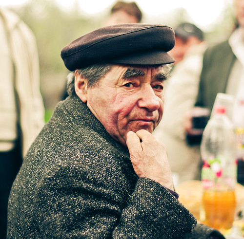
old man
Lens: FA 50mm F1.4 Camera: Pentax K-x Photo Location: Moldova ISO: 200 Shutter Speed: 1/750s Aperture: F2 


haven't yet decided which one i find better... any thoughts?

12-08-2010, 12:31 PM   #2
Ash
Loyal Site Supporter
Ash's Avatar

Join Date: Mar 2007
Location: Toowoomba, Queensland
Photos: Gallery | Albums
Posts: 23,920
The stronger contrast in the B&W version accentuates the skin texture much better. It may be a little overdone, but I do find the B&W version more striking.
12-08-2010, 01:00 PM   #3
Senior Member


Join Date: Nov 2009
Location: Moldova, EU
Posts: 150
Original Poster
thank you. i'm starting finding the B&W version having smth the coloured lacks.
12-09-2010, 07:35 PM   #4
Senior Member
applejax's Avatar

Join Date: Jan 2008
Photos: Albums
Posts: 271
Tough call - I like them both. The sharpness and "pop" of the old guy is great despite the background. The B&W definitely has a different feel to it while muting the background.

After looking at them both, I'm leaning towards the B&W, but that may just be due to Ash's influence.

12-09-2010, 07:44 PM   #5
Senior Member


Join Date: Nov 2009
Location: Idaho
Photos: Gallery | Albums
Posts: 102
Thank you for the images. I don't typically reply here because I have no expertise, but I looked at both of your picss for about five minutes trying to decide between the two. I have to call the BW as my favorite. Is there any way to reduce the highlights in the background? I think that would strengthen the BW. My bits.
12-10-2010, 05:16 AM   #6
Senior Member


Join Date: Nov 2009
Location: Moldova, EU
Posts: 150
Original Poster
applejax, J-Rod: thank you for your comments!

and yes, you are quite right. i have to do smth with the background.

p.s. B&W is my favorite, too. 100%
12-13-2010, 05:37 AM   #7
smf
Pentaxian
smf's Avatar

Join Date: Feb 2008
Location: Midland, MI
Photos: Gallery | Albums
Posts: 4,083
Here's another vote for the b/w.

12-13-2010, 06:12 AM   #8
Senior Member


Join Date: Nov 2009
Location: Moldova, EU
Posts: 150
Original Poster
thank you!
12-17-2010, 09:06 PM   #9
Inactive Account


Join Date: Mar 2009
Location: Halifax, Nova Scotia
Photos: Gallery | Albums
Posts: 1,521
B & W just makes him look unfairly older. Here's to Colour and Youth.
12-18-2010, 01:03 AM   #10
Site Supporter
Site Supporter


Join Date: Mar 2008
Location: Prince George, BC
Photos: Gallery | Albums
Posts: 3,546
#1 looks like a Polaroid from 1967. I like it if only for that
12-18-2010, 02:20 AM   #11
Veteran Member
KarenH's Avatar

Join Date: Jun 2010
Location: Berkel en Rodenrijs
Photos: Gallery | Albums
Posts: 828
I like them both, they both have their own moods and beauty.
If it had been my shot, I would have added a bit of vignetting in both the shots, so the background would be a little less distracting.
12-18-2010, 02:50 AM   #12
Senior Member
Ameiji's Avatar

Join Date: Aug 2010
Location: North Caucasus
Photos: Gallery | Albums
Posts: 205
Color version is a winner IMO. The scene looks like some kind of outdoor event, thus soft colors talk about season change, nature and maybe a good time, they tell the story. BW version is silent to me.
12-18-2010, 07:27 AM   #13
Senior Member


Join Date: Nov 2009
Location: Moldova, EU
Posts: 150
Original Poster
QuoteOriginally posted by Sparkle Quote
Here's to Colour and Youth.
good point! thanks.

QuoteOriginally posted by jbinpg Quote
Polaroid from 1967.
thanks!

QuoteOriginally posted by KarenH Quote
a bit of vignetting in both the shots, so the background would be a little less distracting
a very good point. noted for future. thanks!

QuoteOriginally posted by Ameiji Quote
soft colors talk about season change, nature and maybe a good time,
noted. thanks!
12-18-2010, 08:22 AM   #14
Junior Member


Join Date: Jun 2010
Location: New York
Photos: Gallery | Albums
Posts: 37
Film-like qualities of #1 look fantastic. I would make it a bit more contrasty.
12-19-2010, 02:07 PM   #15
Senior Member


Join Date: Nov 2009
Location: Moldova, EU
Posts: 150
Original Poster
QFish, thanks. noted for future!
Reply

Bookmarks
  • Submit Thread to Facebook Facebook
  • Submit Thread to Twitter Twitter
  • Submit Thread to Digg Digg
Tags - Make this thread easier to find by adding keywords to it!
critique, flickr, photography

Similar Threads
Thread Thread Starter Forum Replies Last Post
People my man w003txz Post Your Photos! 0 02-16-2010 10:31 PM
Misc A Man Gets Old Sailor Post Your Photos! 23 10-03-2009 01:27 PM
Old Man cupic Post Your Photos! 13 02-18-2009 04:10 AM
Outside man xs400 Monthly Photo Contests 0 01-21-2009 01:35 PM
Little man hooppjs Post Your Photos! 7 03-28-2008 03:37 PM


All times are GMT -7. The time now is 11:34 PM. | See also: NikonForums.com, CanonForums.com part of our network of photo forums!
  • Red (Default)
  • Green
  • Gray
  • Dark
  • Dark Yellow
  • Dark Blue
  • Old Red
  • Old Green
  • Old Gray
  • Dial-Up Style
Hello! It's great to see you back on the forum! Have you considered joining the community?
register
Creating a FREE ACCOUNT takes under a minute, removes ads, and lets you post! [Dismiss]
Top