Hey guys, here I have another portrait of a friend that I'm rather fond of, I'd like to know what you guys think of the post processing. Also, how do you feel about the borders? Thanks!
And perhaps to spark some discussion, I'd been following a fellow's portrait 365, and I think his results are quite extraordinary. After I finished processing this shot, I realized that the look I achieved is somewhat similar (even the borders, I never really noticed that he simply makes it square, I was doing it for simplicity), although his work seems more refined. How do you guys think he gets that look? (full frame and L glass or equivalent probably helps

)
365 / 2010 - a set on Flickr 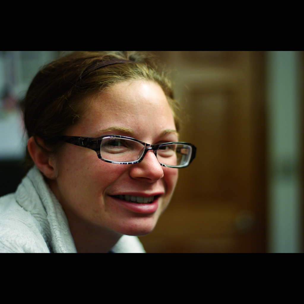


 Similar Threads


