 Originally posted by shooz
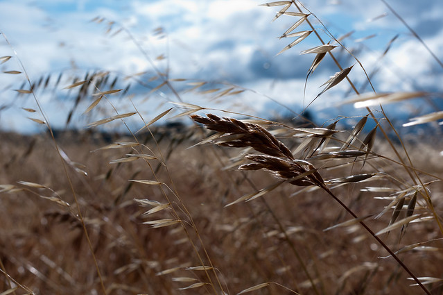
One is the best one.
Subject is in focus and aligned well with the rule of thirds.
It's a little under exposed though and that takes a lot away from the photos effectiveness.
Try a larger aperture to help blur the back ground and give it around +1 ev, or if you want to preserve the sky, use a smaller aperture and shoot it from the other side, so that it's better lit .
Ok shooz ... weekend is here and I've tried to improve the photo along the lines discussed. Of course, there is only so much PP can do to an image, particularly when you want to selectively change the exposure and bokeh; but here's my attempt.

I've boosted the overall exposure as suggested, and I have increased the fill light a tad to help bring out the grass-ear details. I also boosted the blacks just a little to add some contrast to the detail.
To keep the moodiness of the sky, I added a graduated exposure filter to preserve the original skyline exposure.
Finally, to increase the effect of bokeh on the background grass, I reduced the clarity, washing out all but the sharpest, most contrast detail. I also boosted the saturation a little, warming the grass color and setting a pleasing harmony with the blue/grey of the sky.
From my own perspective, I like it, a lot. BUT ... it is now an entirely different picture and does not quite capture the moodiness of the original. At the end of the day, I think that was always going to happen, but it was a great exercise and I learned a lot.
Would love to hear your thoughts.
Thanks.


 Similar Threads


