 Originally posted by NicoleAu
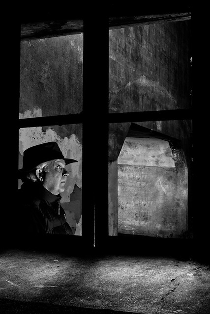
I quite like this shot, the expression is (to me) one that fits the atmosphere. Although I can also see a version with the head tilted down more and perhaps the hands up, as though warding something off, that is beyond the viewers sight...
dramatic thinking - i like it
Originally posted by Wombat The concrete structure hasn't any clearly-defined meaning, yet it's lit up so that you can't avoid looking at it. It shares the limelight with the figure. ...
Pls go to the youtube site and search for interviews with NY Photographer Gregory Crewdson. In one of his interviews, he talks about the use of "ambiguity" in his images, e.g. providing clues, but letting the viewer decide the story. I have this favorite image from Henri Cartier Bresson and showed it to a friend one day. The interpretation i got back was totally different from mine. Is this bad...I'm coming around to Crewdson's point of view that its a useful tool. (PS-where do i send the check for the comparison to Hitchcock

)
Originally posted by Ash I think it's a very classic look with unique lighting. The framing whilst intentional doesn't add enough context, but that'd be a location limitation - it's a very well captured image.
Context is something i worry about, is there enough there to make some sense of it. Do you see the cavern or tunnel as a feature? I don't care if one can reach a conclusion about the story, but it needs to be recognizable as a feature. If not, then thats a problem and i should work on it.
Originally posted by Myn.pheos I think the window frame helps to separate the figure and fits with the title, the frame makes the person outside alone. But at the same time, there might be something inside (other than the photographer

). The facial expression (or the lack of any expresion) is also fine. But what is distracting is the small bright line in the frame and the A-like sign on the corridor wall (or what it is).
A-like sign. Hadn't thought too much about that scratching, but if anything, i'd enhance it. the bright line is a warped frame, but i think you're right about it being distracting - i'll probably get rid of it.
Originally posted by pjthiel I looked at this picture before stepping out this morning for a few hours, and I've been pondering it ever since.
The lighting is just too bright, causing an excess of light on the man's face (thus reducing the character in his expression) and creating a subject of the wall outside, where I suspect none was intended.
....Thoughts?
I'm not seeing excess light on the man's face, are you sure you don't have the monitor too bright? I'll do a test print at a local printing service to confirm its ok. Pardon me for saying so, but the fact that you've been thinking about it is a big success. Apparently the average time for a contest judge to look at any one picture is about 7 seconds. Thank you! (i can't lose the wall, its a part of the subject)
In general: I appreciate the give and take on these critiques - worth the price of admission to PF for sure!!!!


 Post #13 by pjthiel
 Similar Threads


