Forgot Password
Pentax Camera Forums Home
 

Reply
Show Printable Version Search this Thread
11-08-2007, 06:41 PM   #1
Veteran Member
Tom Lusk's Avatar

Join Date: Sep 2006
Photos: Gallery
Posts: 973
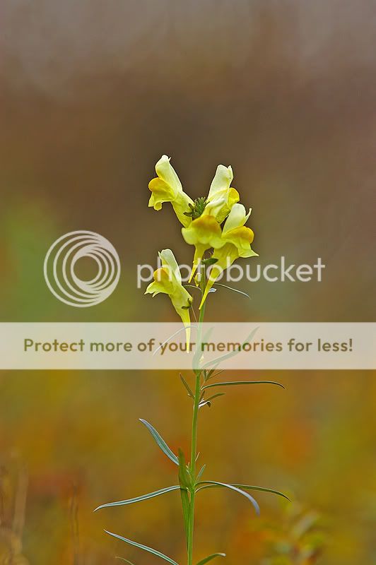
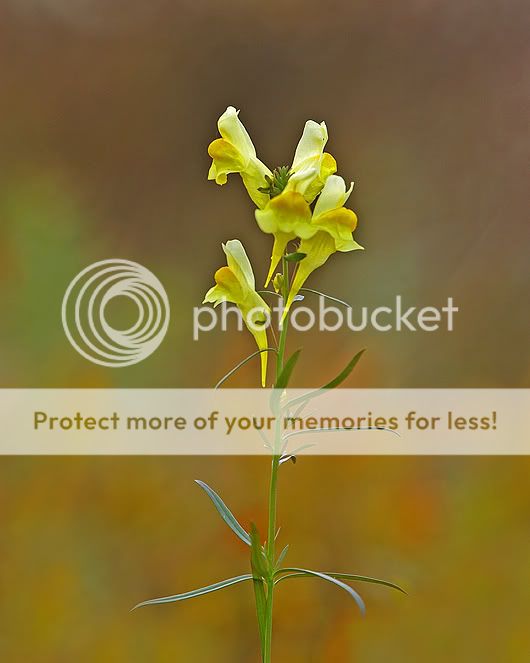
Same, but different...

I'm looking for C & C on these two photos- same subject, slightly different exposures and PP. Best shot and why?

No. 1:


No.2 (slightly different DOF and crop):


11-08-2007, 06:45 PM   #2
Veteran Member
vievetrick's Avatar

Join Date: Sep 2006
Location: Easthampton - Massachusetts - USA
Photos: Gallery
Posts: 5,183
I prefer #2. Less open space on top and background I find more pleasing.
11-08-2007, 07:29 PM   #3
Veteran Member


Join Date: Feb 2007
Location: Rockford, Illinois
Posts: 2,027
Wow Tom, from birds to flowers, something is always so incommon. I believe that the common entity in all your shots is they are all so amazing. I love the first shot with its almost surreal sharpness and vision, but number 2 stands out more to me because of it's natural look and feel. The only beef I have with the shots is the beautiful background is taken away by the two plants at the bottom corners of the shot and if those dissapeared you'd have something super amazing.

Thanks for sharing Tom!
11-08-2007, 07:36 PM   #4
Igilligan
Guest


I actually like the first one the best. I think the balance of color in the Bokeh is really good. I love the splash of light green on each side, more than the solid green behind the flower in #2. Does that make sense?
But I would crop the top to be more like the top of #2...

Beautiful colors....

11-08-2007, 08:08 PM   #5
JMR
Veteran Member


Join Date: Oct 2007
Location: Toronto, Canada
Posts: 3,332
The first shot has a much more ethereal and overall soft quality. The background, I think, suits the flower better and the yellow of the flower is almost reproduced in the out of focus area (orangy-yellow), which makes for a surreal and pleasing pattern of colours. The second photo appears not only to have more depth of field, but also is slightly more underexposed.

I like the first, but whether you crop a bit off the top or not, is matter of taste. Photo agencies like the space at the top because they can insert writing and commentary.

JMR
11-09-2007, 03:12 AM   #6
Veteran Member
bc_the_path's Avatar

Join Date: Mar 2007
Location: Ankara, Turkey
Photos: Gallery
Posts: 401
I also liked #1. The #2 has a more "conventional" look, if that is the right word. I would also consider cloning the distracting leaves and branches on the sides.
11-09-2007, 07:11 AM   #7
Veteran Member
Tom Lusk's Avatar

Join Date: Sep 2006
Photos: Gallery
Posts: 973
Original Poster
Thanks!

This kind of feedback is invaluable! I've looked at the options and suggestions and have come up with this:


I like it better than the first two - comments?

11-09-2007, 08:04 AM   #8
Veteran Member


Join Date: Feb 2007
Location: Rockford, Illinois
Posts: 2,027
Perfect! isolated, great comp, great lighting, tack sharp. You nailed it Tom!
11-09-2007, 08:27 AM   #9
Veteran Member
bc_the_path's Avatar

Join Date: Mar 2007
Location: Ankara, Turkey
Photos: Gallery
Posts: 401
This is it!
Reply

Bookmarks
  • Submit Thread to Facebook Facebook
  • Submit Thread to Twitter Twitter
  • Submit Thread to Digg Digg
Tags - Make this thread easier to find by adding keywords to it!
critique, photography


All times are GMT -7. The time now is 04:43 PM. | See also: NikonForums.com, CanonForums.com part of our network of photo forums!
  • Red (Default)
  • Green
  • Gray
  • Dark
  • Dark Yellow
  • Dark Blue
  • Old Red
  • Old Green
  • Old Gray
  • Dial-Up Style
Hello! It's great to see you back on the forum! Have you considered joining the community?
register
Creating a FREE ACCOUNT takes under a minute, removes ads, and lets you post! [Dismiss]
Top