Forgot Password
Pentax Camera Forums Home
 

Reply
Show Printable Version Search this Thread
11-20-2007, 05:01 AM   #1
Site Supporter
Site Supporter
distorted_vision's Avatar

Join Date: Nov 2007
Location: Moving around Australia
Photos: Gallery
Posts: 1,308
sunsets from the weekend..

hey people
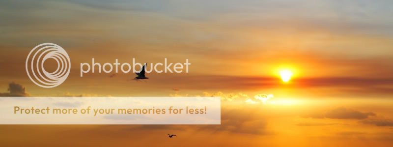
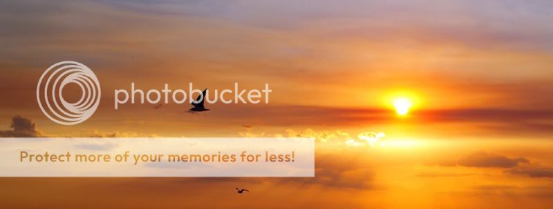
.. i had a bit of a sunset session over the weekend , and i was wondering what you guys/girls thought of them,, any suggestions/feeback/crit would be greatly appreciated..
cheers, kev

1..

2..

3..

4..


...

now,., i am completely useless at photoshop etc, so all of my images have only basic contrast/colour saturation and levels adjusted slightly. i really need to learn photoshop. but at the same time, i think its better to have an un-edited image, rather than a PIMP MY PICTURE treatment. it sort of takes away to art of photography in my oppinion..


Last edited by distorted_vision; 11-20-2007 at 05:31 AM.
11-20-2007, 05:07 AM   #2
Pentaxian
Moderator Emeritus


Join Date: May 2007
Location: Edmonton Alberta, Canada
Photos: Gallery | Albums
Posts: 10,643
This is a very good series but I'd make a suggestion. Limit your submission to this sub form to 1-2 shots only. This many shots are to hard to view and critique individually. For now I'll say that the 4th shot is a winner for me and compared to the first and last shots, the swimmers make the shot. The B&W sunset just doesn't work for me. I like B&W shots but this is an area that B&W doesn't do well at IMO.
11-20-2007, 05:20 AM   #3
Site Supporter
Site Supporter
distorted_vision's Avatar

Join Date: Nov 2007
Location: Moving around Australia
Photos: Gallery
Posts: 1,308
Original Poster
QuoteOriginally posted by Peter Zack Quote
This is a very good series but I'd make a suggestion. Limit your submission to this sub form to 1-2 shots only. This many shots are to hard to view and critique individually. For now I'll say that the 4th shot is a winner for me and compared to the first and last shots, the swimmers make the shot. The B&W sunset just doesn't work for me. I like B&W shots but this is an area that B&W doesn't do well at IMO.
hey peter, thanks for the quick feedback.. so you like the 4th shot?,,, yer im also quite partial to that one aswell., the people in the water certainly put the icing on the cake so to speak.. as far as black and white.. yes, i understand where you are coming from,. i am just trying to experiment atm.. but i have a feeling you are correct,,..
thanks once again..
kev
11-20-2007, 12:24 PM   #4
Administrator
Site Webmaster
Adam's Avatar

Join Date: Sep 2006
Location: Arizona
Photos: Gallery | Albums
Posts: 51,594
Hi Kev,

While I don't care much for the first, second, and fourth shots, I find #3 to be fascinating! It's a perfect blend of camera technique, smooth colors, and good composition! Great work! Saturate the blues a bit more and blow that one up!

I think the other three photos, especially #2 and #4, are lacking in composition and therefore don't stand out at all.


Adam
PentaxForums.com Webmaster (Site Usage Guide | Site Help | My Photography)


PentaxForums.com server and development costs are user-supported. You can help cover these costs by donating or purchasing one of our Pentax eBooks. Or, buy your photo gear from our affiliates, Adorama, B&H Photo, KEH, or Topaz Labs, and get FREE Marketplace access - click here to see how! Trusted Pentax retailers:
11-20-2007, 07:17 PM   #5
Pentaxian


Join Date: Apr 2007
Location: Warwick, RI
Photos: Gallery
Posts: 740
I like 2 and 4 with the swimmers/surfers.
11-20-2007, 11:29 PM   #6
Site Supporter
Site Supporter
distorted_vision's Avatar

Join Date: Nov 2007
Location: Moving around Australia
Photos: Gallery
Posts: 1,308
Original Poster
QuoteOriginally posted by Mo Quote
Hi Kev,

While I don't care much for the first, second, and fourth shots, I find #3 to be fascinating! It's a perfect blend of camera technique, smooth colors, and good composition! Great work! Saturate the blues a bit more and blow that one up!

I think the other three photos, especially #2 and #4, are lacking in composition and therefore don't stand out at all.
hey there mate.. thanks alot for the feedback.. yer i love #3 also!! im going to get it blown up and frame that one.. (something i dont do often)... i appreciate your comments about the other pics also.. i tryed to bring out the colours a bit, like you suggested (but to be honest, im hopeless at PS,, purely trial and error with me.)

heres an attempted edit and blown up..
11-21-2007, 09:56 PM   #7
Ole
Administrator
Ole's Avatar

Join Date: Sep 2006
Location: Copenhagen, Denmark
Photos: Gallery | Albums
Posts: 4,408
#4 has potential. I would suggest cropping the left one third out; then I think that the eye would follow the line formed by the surfers to the sun and it would be a very pleasing photo!

11-22-2007, 03:13 AM   #8
Site Supporter
Site Supporter
distorted_vision's Avatar

Join Date: Nov 2007
Location: Moving around Australia
Photos: Gallery
Posts: 1,308
Original Poster
QuoteOriginally posted by Ole Quote
#4 has potential. I would suggest cropping the left one third out; then I think that the eye would follow the line formed by the surfers to the sun and it would be a very pleasing photo!
thanks alot for the feedback mate...
hows this??

11-22-2007, 09:52 AM   #9
Ole
Administrator
Ole's Avatar

Join Date: Sep 2006
Location: Copenhagen, Denmark
Photos: Gallery | Albums
Posts: 4,408
Much better! You could even crop a bit from the bottom to get the sun further off the center axis. Then you'd have a real keeper! Print it and put it on the wall! Very nice!
11-23-2007, 04:49 AM   #10
Site Supporter
Site Supporter
distorted_vision's Avatar

Join Date: Nov 2007
Location: Moving around Australia
Photos: Gallery
Posts: 1,308
Original Poster
QuoteOriginally posted by Ole Quote
Much better! You could even crop a bit from the bottom to get the sun further off the center axis. Then you'd have a real keeper! Print it and put it on the wall! Very nice!
thanks alot OLE... i will do that
11-25-2007, 10:57 PM   #11
Veteran Member


Join Date: Jun 2007
Location: Sydney, Australia
Posts: 2,891
I really like the 3rd shot ... I think the crop has really made this shot my favourite in this series.
11-26-2007, 03:06 AM   #12
Veteran Member


Join Date: Feb 2007
Location: Auckland
Photos: Gallery
Posts: 452
3rd shot looks surreal.... 4th shot cropped was a great suggestion, definetly working. Hope to see more.
Reply

Bookmarks
  • Submit Thread to Facebook Facebook
  • Submit Thread to Twitter Twitter
  • Submit Thread to Digg Digg
Tags - Make this thread easier to find by adding keywords to it!
critique, photography, photoshop

Similar Threads
Thread Thread Starter Forum Replies Last Post
Landscape A few sunsets justDIY Post Your Photos! 2 03-16-2010 07:52 PM
Landscape Sunsets tootall Photo Critique 15 03-10-2010 10:08 AM
Sunsets -=JoN=- Post Your Photos! 1 06-21-2009 11:06 AM
Sunsets sureshgvv Post Your Photos! 7 03-20-2009 05:21 AM
Sunsets JahJahwarrior Post Your Photos! 1 09-07-2008 02:34 PM


All times are GMT -7. The time now is 08:27 PM. | See also: NikonForums.com, CanonForums.com part of our network of photo forums!
  • Red (Default)
  • Green
  • Gray
  • Dark
  • Dark Yellow
  • Dark Blue
  • Old Red
  • Old Green
  • Old Gray
  • Dial-Up Style
Hello! It's great to see you back on the forum! Have you considered joining the community?
register
Creating a FREE ACCOUNT takes under a minute, removes ads, and lets you post! [Dismiss]
Top