I like the feel of the bw conversions!
That being said, subjectively, if it were mine, there are things I would change.
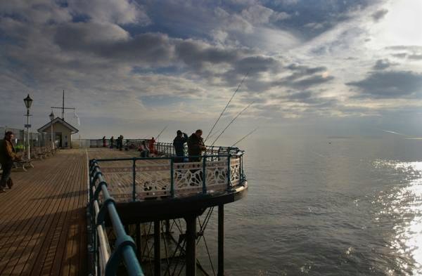
In your color photo - your conversion has saved highlight detail at the expense of your midtone contrasts - making the deck and the people look relatively "muddy". Also, the top right corner is burnt out. Highlights tend to draw the eye and my gaze is drawn off the subject and then off the image... which leads me to the BW conversions.
Both the BWs have large areas of blocked shadows and highlights - although they work much better in your favor as a BW than in color. The gaze of the fishermen draw you out to sea and into the sunset quite nicely.

I really like the tones in the deck in your second conversion best - probably from an increased use of the red channel. However, the dodging/burning you used around the fishermen are a little too obvious. A softer edged brush, or a more feathered selection would have been less clashing.
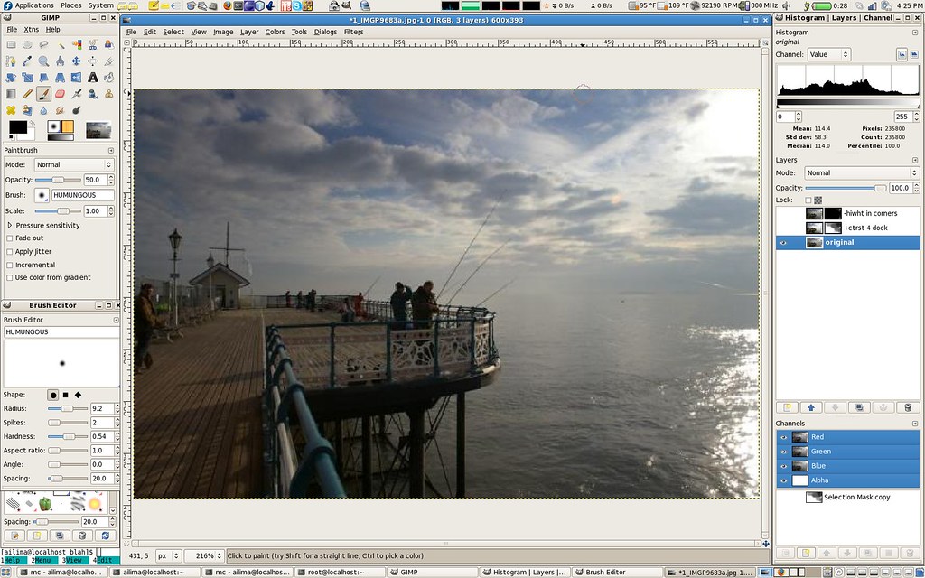
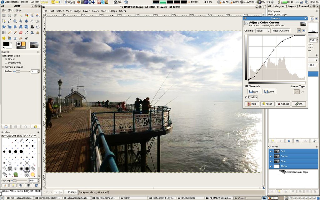
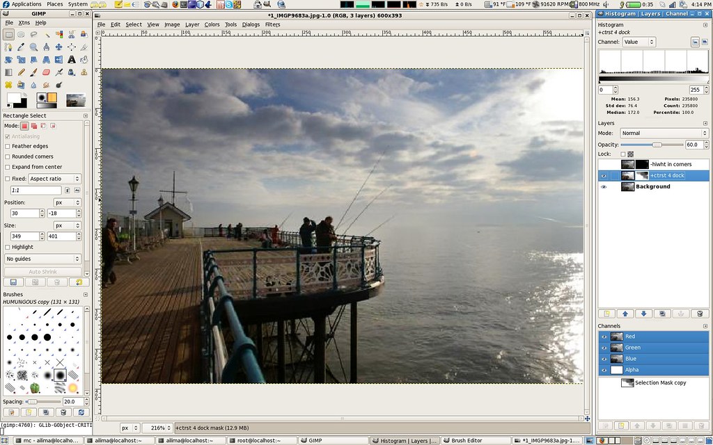
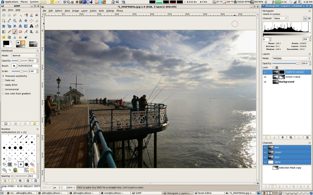
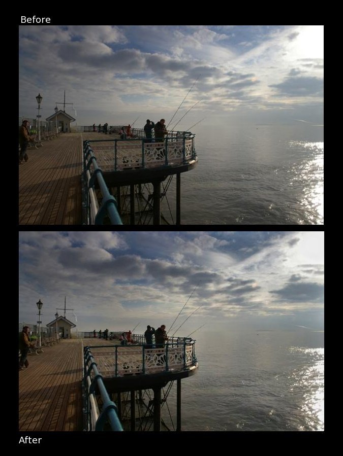
Just for kicks, I did something dangerous on these forums, I did my own 5 minute take on the color one. A BW conversion would not have been useful here because I am using the Gimp instead of Photoshop. If you want to see the slight edit i made, feel free to contact me - as I find it quite rude to edit somebody elses artwork in a public forum without express permission. I do have screenshots of the step-by-steps.
Once again, congratulations - I definitely feel the BW conversions work better for me than your original color!
Frank.


 Similar Threads


